Monday, October 31, 2011

Spending, Transfer Payments, and Taxes

As the chart below shows, personal outlays (i.e. spending) has grown significantly faster than wages over the past decade. Even before the crisis, consumers spent more of what they earned.

Since the 2008 crisis, wages initially declined (and have since remained stagnant) and the level of savings has moved higher (both of which are negative for consumption on a stand-alone basis), but spending remains strong.

How is this possible?

Well, when one adds in transfer payments (i.e. money provided by the government) and subtracts less taxes from wages, we see a different story... growth that has actually outpaced consumption since the downturn.

The reduced tax burden is a result of lower incomes to tax, a lower tax rate via the progressive tax structure, and tax cuts enacted to stimulate demand.


Telling (to me) is that over the last 10 years, wages plus transfer payments less taxes have grown at pretty much the exact same rate as personal outlays, despite weak wage growth. Going forward, unless there is change in the austerity sentiment that has been the focus of both Republicans (less spending) and Democrats (higher taxes), expect the boosts we have seen, to soften.

If that happens, we'll likely need actual wage growth via an employment recovery in order for the consumption rebound to continue.

Source: BEA

Thursday, October 27, 2011

Economy Grows at 2.5%, Led by Spending and Investment

BusinessWeek details:
The U.S. economy grew in the third quarter at the fastest pace in a year as Americans reduced savings to boost purchases and companies stepped up investment in equipment and software.

Gross domestic product, the value of all goods and services produced, rose at a 2.5 percent annual rate, up from 1.3 percent in the prior three months, Commerce Department figures showed today in Washington. Household purchases, the biggest part of the economy, increased at a 2.4 percent pace, more than forecast by economists.
Looking at the chart below, another potential bright sign is the pickup in non-residential investment in the quarter showing that corporations may finally be using all that cash to reinvest in their businesses (though they also appear to have "paid" for this investment by delaying inventory purchases).


If the next step in this cycle is an inventory rebuild and (don't want to jinx it) hiring, we may be in business.

Source: BEA

Unsustainable... Transfer Payments

Transfer payments are defined simply as:
Money given by the government to its citizens.
As long-time readers know, I am all for government involvement / income distribution for projects / policies that attempt to provide:
  • Everyone (specifically youth) with the same chance
  • A needed shared service
  • A positive return on investment (education, security, infrastructure, etc...)
In addition, I do believe that a safety net (such as unemployment benefits) provides additional security that allows the broader system (in the case of unemployment benefits, the labor market) to work more efficiently.

BUT, many of these projects / policies have been extremely neglected (education, infrastructure are two easy examples) and/or are being threatened with further cuts, as a way to put off answering tough questions. Tough questions such as "should we be spending our national wealth on programs that will provide for the betterment of society in the future or should we use it to allow individuals to retire while they are still productive / to extend the life of a sick elder by another six months?".


As unfortunate as it may be... does anyone really think the chart above looks sustainable?

Source: BEA

Wednesday, October 26, 2011

The Rich Get "Slightly Less Baller"

Greg Mankiw points out that we've been forgetting about a demographic that has been hit extra hard by the economic downturn... the rich:
Here is a fact that you might not have heard from the Occupy Wall Street crowd: The incomes at the top of the income distribution have fallen substantially over the past few years.
That's right kids... in 2009, the top 1% of earners made only 13.2x more on average than the rest of the top 50% (i.e. by definition those that are themselves better off than the average), down from a peak of 16.3x in 2007. Ignore the fact that this is still almost twice the level seen in the early 1980's.


I should also point out that the title of his post is "The Rich Get Poorer", so before I sign off why don't we quickly take a look at the definition of poorer:
  1. Having little or no wealth and few or no possessions.
  2. Lacking in a specified resource or quality: an area poor in timber and coal.
  3. Not adequate in quality; inferior.
  4. Lacking in value; insufficient.
  5. Lacking fertility.
  6. Undernourished; lean.
  7. Humble.
  8. Eliciting or deserving pity; pitiable.
Way to show those Occupy Wall Streeters some perspective!

Tuesday, October 25, 2011

Monday, October 24, 2011

On the Seasonality of Equities

EconomPic has outlined the seasonal performance of the equity market (with a "secret sauce" twist) a number of times (most recently here).

The Big Picture details equities seasonal phenomenon since 1959:
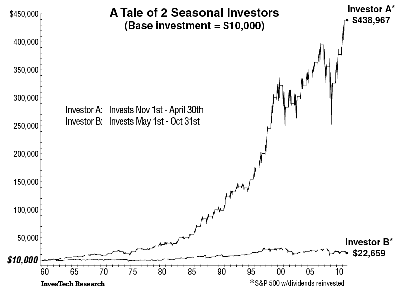
Here are the specifics of seasonality: Imagine we start with two $10,000 accounts, and use them to make investments in an S&P 500 Index fund. One account invests in one 6-month period, the other invests in the remaining 6-month period. Account A is invested from November 1st through April 30th each year, while Account B is invested from May 1st through October 31st.
Here are the numbers:

• Account A portfolio grew from $10,000 to over $438,967. That is a 42-fold increase.
• Account B portfolio barely doubled to $22,659.
A chart outlining the above phenomenon going back to 1959 can be found here, but I thought I'd take some alternative looks.... one that goes back further in time (all the way to 1871) to see when this seasonality started and one taking a look at the real return (i.e. after inflation) of each leg since 1959.

140 Year Rewind

Using S&P data from Professor Shiller's Irrational Exuberance site, I constructed the below chart going all the way back to 1871. The outperformance of the November - April time frame since 1959 can be seen, but interestingly enough before that date both periods had almost the exact same performance. Begging the question... what changed around 1959?


Real Seasonality (1959 - 2011)

You thought the original May - October figure looked bad in nominal terms? After inflation, total returns for that six month period over 52 years (312 months) were negative, while the November - April time frame posted annualized real returns ~10%.


Sunday, October 23, 2011

Below Trend Growth

The WSJ details:

It looks as if, despite everything, gross domestic product picked up in the third quarter, easing fears that the U.S. was on the cusp of another recession. But that doesn’t mean the economy is anywhere near where it needs to be.

Economists expect Thursday’s GDP report from the Commerce Department will show the economy grew at a 2.7% annual rate in the third quarter. That would still leave economic output 6.7% below what the Congressional Budget Office estimates its potential is. In other words, in a world where employment and economic activity were as high as they could be without the economy running into inflationary trouble, the U.S. would be producing about $900 billion more in goods and services a year than it is now.

Experts quibble about exactly where potential GDP is these days, and that’s especially true in light of all the damage the economy has suffered.
As the last portion of the article outlines, experts quibble where potential GDP is these days. I (a non-expert) will outline an alternative way to project potential GDP... past performance. While past performance does not guarantee future performance for investments, it also does not guarantee where the economy should be today. That said, it does represent a growth rate that Americans and American systems (tax levels, spending, debt accumulation) were used to dealing with / expected.

Below is a chart outlining just that... real GDP going back to mid-1971, along with what real GDP would look like today if it grew at the 3.1% pace of growth it saw on average between June 1971 and June 2007. In addition, the yellow line is the difference between the two.


In this case, the differences implies current GDP is 11% below potential.


Source: BEA

Friday, October 21, 2011

EconomPics of the Week

Investing


Economic Data

Other
RIP Steve Jobs

And your video of the week. Sublime with Badfish.

Explaining the Retail Sales / Confidence Dislocation

My buddy Sami Mesrour (from Blackrock) had a write up earlier this month titled Follow What I Do, Not What I Say; Consumer Spending and Consumer Confidence that outlines the surprise rebound in retail sales (bold mine):

The US consumer is feeling down. Several indicators of confidence collapsed over the summer with the declines beginning in May as job growth slowed, and the bulk of the drop in sentiment occurring during August. It is likely that the intense focus on the country’s deficit problem and the attendant prospects of lower government spending going forward were the main drivers in the decline of consumer expectations. Forecasters are concerned over this development because of what it implies for the growth of consumer spending—historically sentiment has been a good reflection of sales in the US.
This time, however, something strange is going on: consumers are apparently saying one thing, but doing another
Very timely analysis, as this was ahead of last Friday's report that showed retail sales surprised, significantly, to the upside (September was up a 1.1%, while June and July were revised higher as well).


The year over year figure is even more impressive, up more than 8%.

Sami outlined (in detail - go to his report for more) the following four drivers:
  1. Borrowed time (ability for the consumer to once again borrow to spend)
  2. Income distribution (the rich keep getting richer and are driving spending, while individuals struggling are driving the confidence surveys lower)
  3. Transfer payments (outlined at EconomPic here)
  4. Foreclosures (squatters and those moving home with their parents are effectively not paying rent, increasing their ability to spend on goods)
I broadly agree with these points, especially #2 and #3, and I'll lay out a fifth... inflation. While inflation may be the best (and only) politically viable option to reduce the level of nominal debt in the system, there are always interesting implications.

The below chart outlines the nominal year over year change in retail sales, along with my best effort in matching the applicable inflation figures for each category (by all means imperfect). The real retail sales change is simply the difference between the two.


Building this out further with data going back to the mid 1990's, the below chart outlines the year over year change in the following consumption measures:
  • Nominal goods (very closely aligned with retail sales)
  • Nominal consumption (includes the less inflationary services sector)
  • Real consumption (i.e. less inflation)
  • Real per capita consumption
In addition, the dotted lines show the average for each category from 1996 to 2008 (i.e. pre-crisis).


What we see is that while the "spike" in retail sales (via nominal goods consumption) is higher than pre-crisis, all other measures are below their historical levels of growth.

In other words, the growth in the amount that individuals are consuming is lower, but individuals are paying more for what they are consuming. For those individuals where food and energy are a higher percent of their consumption basket (i.e. those that earn less), this is an even bigger impact.

Makes a lot more sense why individuals would be unhappy.

Source: BEA / BLS / Census

Thursday, October 20, 2011

Leading Economic Indicators

Bloomberg details:

The index of U.S. leading economic indicators increased in September at a pace that suggests a slower rate of growth in the coming months.
The Conference Board’s gauge of the outlook for the next three to six months climbed 0.2 percent after a 0.3 percent gain in August, the New York-based research group said today. The September increase, the lowest since a decline in April, matched economists’ projections, according to the median forecast in a Bloomberg News survey.
A Federal Reserve survey published yesterday said the economy maintained its expansion last month even as more companies reported more doubt about the strength of the recovery. An acceleration in growth is needed to support the job gains that drive household spending, the biggest part of the U.S. economy.

Wednesday, October 19, 2011

Inflation


Source: PPI / CPI

Monday, October 17, 2011

Industrial Production "Inflection" to Lead Equities Higher?

The WSJ reports:

U.S. industrial production grew in September but the gain was small, underscoring the economy's lack of vigor.

Production rose by 0.2%, with a modest gain in manufacturing and a sharp drop in utilities caused by moderating weather. The Federal Reserve report on Monday showed overall production was flat in August, revised down from a previously estimated 0.2% increase.
Manufacturers in the U.S. have been feeling the weight of a lackluster economy, hamstrung by high unemployment. While it is still growing, the factory sector has, with the overall economy, slowed.
While the rebound in industrial production may be lacking the ideal punch, the index (which tends to have a positive relationship with the S&P 500) did turn positive this month on a three year rolling basis.


More interesting (to me) industrial production appears to have led the S&P 500 higher when rolling three year industrial production turned positive (i.e. the "inflection" point). The below chart strips out the S&P 500 rolling returns and replaces it with the three year forward (annualized) performance of the S&P 500 following the inflection point.


Tuesday, October 11, 2011

It's All About Financials

The chart below compares the absolute return of an investment in the S&P 500 vs. the excess return of an investment in the investment grade financial bond index (as compared to Treasuries) over rolling three-month periods going back 10 years. Note that pre-financial crisis there was a small relationship (even less so the prior decade) with the return streams below showing an r-square from 1988-June 2007 of less than 0.20. Since that time, an investment in the S&P 500 and financial bonds have been remarkably similar in terms of performance with an r-square of 0.56.


Source: Barclays Capital / S&P

Monday, October 10, 2011

Emerging Market Rotation Strategy

Along with taking a deeper look at macro trends / releases to try to figure out this whole economy thing (in these all-too-interesting times), I spend quite a bit of my time creating (long-term oriented) trading models. The goal? To better allocate my investments by taking away some of my emotion.


The following model I will walk through is a simple model (available for download here) based on my friend Meb Faber's (of World Beta blog and Cambria Investment Management) Timing Model.

What is it...

It is an Emerging Market "EM" timing model that allocates between two EM sectors... fixed income and equities. As a way of background, since 1999 (I could only pull data for both indices as of December 1998 - due to the methodology below, the start of the model is 10 months later), both EM fixed income and equities have had very similar returns, but have had VERY different ways of getting there (see chart below). At a high level, EM equity tends to outperform when both are trending higher, but EM fixed income outperforms when EM beta struggles.

With that in mind... what is the model? On an end-of-month basis:
  • If EM Equity Total Return index > 10-Month moving average, allocate to EM Equities
  • If EM Equity Total Return index < 10-Month moving average, allocate to EM Fixed Income

The result? Over this time frame, the rotation strategy has significantly outperformed both EM fixed income and equities with volatility and drawdown levels right between the two (note that a 50/50 blend had returns of around 10.7% with slightly less volatility than the rotation strategy).

If anyone can pull data for EM indices going back further in time, please send my way as I'd like to see how this performs over the longer term.

Source: MSCI, JP Morgan, World Beta
Model: Download here

Friday, October 7, 2011

Employment Reports Mixed

PBS details:

According to the "establishment survey" of places that hire, the economy added more jobs than predicted: just over 100,000. More significantly, the last two months' numbers were revised upward by another 100,000 or so.

Yet when we turn to the "household survey" of actual people, the headline unemployment rate remains unchanged at 9.1 percent. How come?

The numbers suggest that the working-age population (16 and over) grew by 200,000 last month, and another 200,000 people rejoined the workforce - that is, are back looking for work. The household survey also shows that 400,000 more Americans were employed this month than last. So it's a wash.

Disturbingly, our U-7 number actually went UP. How so? Because -- and here's the bad news in this month's numbers -- the total number of workers toiling part-time, but looking for FULL-time work, jumped by 400,000, about 5 percent. Since "part-time for economic reasons" are included in our U-7, the number rose from 18.26 percent to 18.41 percent, the third highest month since we inaugurated U-7 back in December.

Source: BLS

Thursday, October 6, 2011

More on Chinese Investment

Yesterday, I posted about China's Investment Conundrum (specifically, that China can't keep growing their investments at the torrid pace we've seen due to simple math). Below is a comparison of the composition of China's economy vs. that of the U.S., as well as growth in each component from 2001-2010.


To show this in a different way, below is just U.S. and Chinese investment. Combined, they have grown at a ~4.5% annualized clip, which not coincidentally is just about the pace of global GDP growth over that time frame. In other words, China has been taking production market share (a lot of it) from the U.S. (and developed world). At some point in time there isn't any more market share to take (or in theory the outsource trend could reverse), thus the entire consumption pie (including Chinese consumption) needs to grow at a faster pace in order for China to maintain the outpaced growth seen.


Source: BEA / Chinability

Wednesday, October 5, 2011

China's Investment Conundrum

The chart below was created using data from a table within a recent Michael Pettis newsletter (his great blog China Financial Markets will produce a condensed version of the newsletter within a week or so) that outlined the composition of China's GDP by year (broken out by C, I, G, and NX) and multiplying the component percents by the size of the Chinese economy for each year.


What the chart shows is the remarkable growth across all the components, but the unreal growth in investment which now makes up almost 50% of China's economy (the fact that consumption grew by 75+% likely allowed for the other components to grow even faster as the citizens saw their lifestyles dramatically improve, allowing for the flexibility needed with central control by the government).

But, much like the exponential growth in China's currency holdings this investment growth is not sustainable, especially in a world that appears to have more than enough supply for the current (and waning) level of aggregate demand globally. So this begs the question... if there will be a rebalancing away from investment, will it happen due to the pace of Chinese consumption simply increasing (i.e. will China "save" the global economy) or will investment growth (and the Chinese economy) slow substantially?

Source: Chinability

RIP Steve Jobs

The 5 iPods, 3 iPhones, iPad, and 2 Macs currently in my home attest to the fact that I believe Steve Jobs' was brilliant. And at times he was more than a "computer guy" and truly inspirational. The below video is one of those times (his now famous Stanford Commencement Speech).

Finance and Government... Such a Drag (On Jobs)

Businessweek details:

U.S. employers announced the most job cuts in more than two years in September, led by planned reductions at Bank of America Corp. and in the military.

Announced firings jumped 212 percent, the largest increase since January 2009, to 115,730 last month from 37,151 in September 2010, according to Chicago-based Challenger, Gray & Christmas Inc. Cuts in government employment, led by the Army’s five-year troop reduction plan, and at Bank of America accounted for almost 70 percent of the announcements.

While the bulk of firings are not “directly related” to economic weakness, they “could definitely be a sign of more cuts to come,” John A. Challenger, chief executive officer of Challenger, Gray & Christmas, said in a statement. “Bank of America is not the only bank still struggling in the wake of the housing collapse, and the military cutbacks are probably just the tip of the iceberg when it comes to federal spending cuts.”

Quarterly Job Cuts


Job Cuts by Sector

Monday, October 3, 2011

Manufacturing Expands in September

What respondents are saying:

  • "The economy continues to be a drag on our business outlook. We are trying to deal with new and additional FDA regulations which are costing significant dollars. It is hard to recoup any of these additional costs in our pricing levels without losing significant sales volumes." (Chemical Products)
  • "Market is cautious, but still steady." (Electrical Equipment, Appliances & Components)
  • "Global demand for semiconductors is down and maybe not yet 'bottomed out.' Inventory reduction activities are a priority." (Computer & Electronic Products)
  • "Still strong automotive demand." (Fabricated Metal Products)
  • "Orders remain consistent and steady — no sign of lower demand." (Paper Products)
  • "Japan supply chain issues are over, but exchange rates and raw material prices are hurting our profit." (Transportation Equipment)
  • "We sense a weakening in demand, but it is not extreme at this point." (Plastics & Rubber Products)
  • "Overall, business is improving with a measurable uptick in orders this month. Part of that is due to pre-holiday season orders." (Miscellaneous Manufacturing)
  • "Business continues to be sluggish." (Furniture & Related Products)


Source: ISM

Friday, September 30, 2011

See You Next Week

After a relaxing week that involved sitting on a beach, I expect posting to resume next week.


But, to leave you all with a song for the week... Foster the People with Helena Beat

Thursday, September 29, 2011

Nominal Mortgage Rates Never Lower

The AP details:

Fixed mortgage rates have fallen to historic new lows for a fourth straight week and are likely to fall further.

The average on a 30-year fixed mortgage fell to 4.01 percent this week, Freddie Mac said Thursday. That's the lowest rate since the mortgage buyer began keeping records in 1971. The last time long-term rates were lower was in 1951, when most long-term home loans lasted just 20 or 25 years.

The average on a 15-year fixed mortgage, a popular refinancing option, ticked down to 3.28 percent. Economists say that's the lowest rate ever for the loan.

Mortgage rates tend to track the yield on the 10-year Treasury note. The 10-year yield has risen this week to around 2 percent. A week ago, it touched 1.74 percent -- the lowest level since the Federal Reserve Bank of St. Louis started keeping daily records in 1962. As recently as July, the 10-year yield exceeded 3 percent.


Tuesday, September 27, 2011

Rebalancing and the Recent Equity Pop

There are lots of reasons why equity markets have sprung back to life (and bonds have "normalized" away from lows) the past few days. The most front and center reasons include a potential European debt deal and the fact that markets were simply oversold (I agree on both fronts), but here is another... institutional rebalancing.


The Example of Corporate Pension Plans

Over the past quarter bonds have ripped, while equities have RIP'd.

This has a profound effect on many an investor, none more so than corporate defined benefit plans. As some may not know, liabilities (i.e. the benefits they must pay out to employees) are discounted using a yield made up of high-quality, long duration corporate bonds. As a result, when long bonds perform well, this is actually a negative (all else equal) event for corporate plans as their liabilities increase at roughly an equal rate. A decent proxy for this is the BarCap Long Government / Credit index (below in red). Over the long-term, corporate sponsors hope to outperform this liability by investing in a mix of assets, including (or should I say predominantly) equities (below in blue).

The chart below shows just how trying this quarter has been for the approximately $2.5 trillion in size defined benefit plans (assets off... a lot, liabilities up... a lot).


This has been an UGLY quarter for pension plans. A back of the envelope calculation puts the loss in funded status terms (i.e. how much assets they have for every dollar of liability) for a plan with a roughly 60% equity / 40% long bond asset allocation at ~15% (i.e. if they were 90% funded, they are now ~75% funded).

But what does this have to do with rebalancing and the recent bounce in equities and sell-off in rates?

A corporate plan with that same 60% equity / 40% fixed income mix would have to reallocate ~6% of their fixed income allocation to equities just to get back to that 60% / 40% mix to start the fourth quarter. 6% x $2.5 trillion (the rough size of the corporate defined benefit market) = $150 billion (note that this is down from the $200 billion just a few days back).


I'd note that all corporate plans do not have the same asset allocation and some may have flexibility to hold back rebalancing, but this is offset by other institutional investor rebalancing outside of corporate plans that is bound to / has happen(ed).

As a result, I personally wouldn't be surprised to see support at these levels for equities and less support for long bonds through the end of the week (though if we were to weight Europe vs. rebalancing in importance, Europe dominates). After that, we better get some better news (or at least less bad news).


10/1 Update: Well that post proved itself wrong!

Friday, September 23, 2011

It's Not a Crash...

When prices are still up 45% (SLV) and 26% (GLD) over the past 12 months, I would call it a correction.


That's not to say it doesn't have risk to the downside (see Gold Prices Can Go Down).

Leading Indicators Outside the Fed's Control Remain Weak

While leading economic indicators expanded 0.3% during August, the expansion remains focused on areas controlled by monetary policy rather than the underlying economy. For the third month in a row (and four of the past five), indicators outside the Fed's control were negative.


Wednesday, September 21, 2011

Fixed Income vs Equities Dislocation... Which is Right?

Over the past ten years (less so prior), the relationship between the change in the 10 year Treasury yield and the change in the S&P 500 has been strong with the 10 year Treasury leading. Note the breakdown in the relationship over the past year (perhaps due to Fed intervention).


Monday, September 19, 2011

Tax (My Neighbor) Please

The Big Picture has an interesting table outlining recent polling results asking how individuals would prefer the budget deficit to be reduced; taxes (higher) or spending (lower). The chart below summarizes the most recent polls for each (some had more than one) and normalizes the responses by taking those for some / all taxes and dividing that by the number selecting no taxes (I did this as not all polls added to 100).

The Results


The results varied by survey showing there is always bias in polling (the NY Times -liberal- is near the top and Rasmussen -conservative- is near the bottom), but an overwhelming number of individuals favor at least some increase in taxation.

Friday, September 16, 2011

EconomPics of the Week (9/16/11)

Economic Data

Investments

Other
And your video of the week... Broken Bells (lead singer from The Shins) with The Ghost Inside.


Enjoy the weekend everyone!

Extended Corporate Profits


Interconnected Markets

In a recent conversation with a friend, we discussed how interconnected global financial markets were (the conversation began with my assertion that the European situation could cause a lot more pain the U.S. than consensus likely believes).

Below are a few charts that outline just how interconnected things have become.

The first chart shows the international investment positions of the U.S. (the level of U.S. owned assets abroad and foreign assets owned within the U.S.). I normalized the amounts by showing the level relative to the size of the U.S. economy. As can be seen, the level of ownership both in and out of the U.S. has spiked since the early 1970's, with foreign ownership of assets within the U.S. increasing at a faster pace (U.S. owned assets abroad by almost 15% of GDP or more than $2 trillion).


The next chart outlines what makes up that $2 trillion difference. While U.S. investors own more in terms of foreign equity (direct investment and stocks) than foreign investors own within the U.S., foreign investors are much larger creditors within both the public (government) and private (corporate) sectors.


Rather than make any bold statement of what this truly means (I am trying to digest it myself), I'll instead leave readers with two (conflicting) quotes:

“A creditor is worse than a slave-owner; for the master owns only your person, but a creditor owns your dignity, and can command it.” -Victor Hugo

“If you owe the bank $100 that’s your problem. If you owe the bank $100 million, that’s the bank’s problem.” -Jean Paul Getty

Source: BEA

Thursday, September 15, 2011

The Evolution of Food Consumption

Illusion of Prosperity presents an interesting chart outlining the stagnation is real per capita restaurant sales over the course of the past decade (hat tip GYSC). I wanted to take a deeper look.

What the below charts outline are real per capita retail sales for food services (i.e. restaurant) and food stores (i.e. food for home). The figures are the result of discounting the nominal retail sales by inflation (the BLS breaks out inflation data for both food at home and food away from home), as well as population growth.

The results...

The overall level of food consumed appears to be relatively sticky (right around $300 / person per month), though overall consumption is down by 5% in real terms since 1992. During that time there has been a sizable shift to eating out, which could mean the decline in real terms has to do with eating "cheaper" fast food.


Breaking out each component, we can clearly see the shift to eating out from 1992 to 2006. Since then, it is pretty amazing to see the drop in both components during the crisis and the subsequent rebound (albeit to levels below the previous peak) since.


While not a surprise, this is rather concerning. I recently outlined that bottom earners have been earning less for the better part of the past 15+ years and it looks like it may be actually impacting the dietary habits of Americans (i.e. eating less [unlikely] or eating cheap / unhealthy food [likely]).

Source: Census, BEA, BLS

Wednesday, September 14, 2011

Retail Sales Flat in August

The WSJ details:

Retail and food services sales were virtually unchanged from the previous month at an adjusted $389.50 billion, the Commerce Department said Wednesday.

Economists surveyed by Dow Jones Newswires had forecast a 0.3% increase. July retail sales were revised down to a 0.3% gain. The Commerce Department originally estimated 0.5%.

Back in February, I outlined that retail sales data was extremely noisy during periods of volatile prices as the data is shown in nominal (rather than real) terms. As the chart below shows, the relationship between retail sales (again, a nominal figure) and commodity prices (as reflected by ETF DBC) is strong.


This in itself fed into the PPI data that was released today, showing energy related prices have retreated from earlier this year, and my expectation is that CPI will come in below consensus tomorrow (we shall see).

So, retail sales are stronger than shown? Not so fast. Looking at the components of retails sales we see weakness in big ticket items (autos, furniture) and restaurants (details of why that may be troubling can be seen in the Pub Power index), offset by electronics and sporting goods (back to school?).


Net net, the consumer (who the U.S. economy relies on for ~70% of growth) is definitely stretched and the economy is definitely slowing.

Source: BLS / Yahoo Finance

Tuesday, September 13, 2011

Real Median Household Incomes at 1996 Levels

The WSJ details:

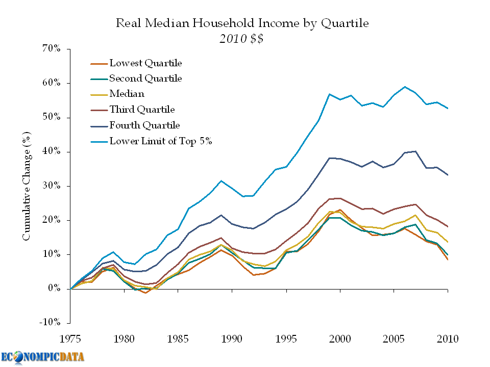
The income of the average American worker—long the envy of much of the world—has dropped for the third year in a row and is now roughly where it was in 1996, adjusted for inflation.

The U.S. poverty rate, meanwhile, has continued to rise. America's median household income—what the statistical middle of the pack earns in a year—fell 2.3% to $49,445, adjusted for inflation, according to the Census Bureau's annual snapshot of living standards. The figure has fallen each year since 2007 as high unemployment and a tougher job market has made it harder for working Americans to get bigger paychecks.

This downdraft is part of a longer trend that has wiped out the wage gains of the last decade. Inflation-adjusted household income is now down 7.1% from its peak in 1999, and 2010 is the first time since 1997 that American households made less than a median of $50,000.

As the chart below shows, even upper incomes have been affected by the sluggish economy.


A large factor driving the have / have nots has to do with education. In the past (i.e. a long time ago), an individual could use either their hands or their minds and make a "livable" salary. As EconomPic has detailed multiple times, education matters and labor intensive jobs are no longer a viable means for most.


The issue has been amplified because individuals didn't act as if incomes were stagnant. Back to the WSJ.
"The past decade was just a mirage," says Justin Wolfers, an economics professor now visiting at Princeton University. That's because wage gains earlier in the decade were never that robust, yet people were able to take advantage of surging housing values and easy credit to spend more than they earned.
Source: Census

All Eyes on Europe

The lack of posts have been two-fold:
  • I’ve been swamped
  • I have been trying to wrap my head around the European situation (i.e. the slow moving car wreck)
While I don’t pretend to be an expert on Europe (though it was obvious enough to be asking the question back in January 2009 whether it was possible that a country would leave the Eurozone), below are my super high level thoughts.

In my opinion (the fact that this is only my opinion is key), it seems more and more likely that the only way the situation in Europe can be successfully resolved, is if the end result is a European fiscal union (this is just another way of saying that Germany needs to bail out those within the broader European Monetary Union if we are to avoid another systemic crisis). If this is the case, the obvious question becomes... is Germany willing to bail out the broader European Union?

The pros / cons of such a bailout for Germany can be broken down into at least two areas; political and economic.


Political

Short-term: Politically, it seems that the easier choice is for Germany to say no, as German citizens are broadly opposed to a bailout. However this is countered by existing politicians who have their legacy tied to the European Union and will likely do anything it takes to maintain that legacy.

Long-term: If Germans are to take a longer term view, a fiscal union helps maintain peace within the region (which was the whole point of the economic union to begin with). That is unless the economic ramifications of a bailout cause political tensions between countries in a scale that exceeds those benefits.


Economic

I have no clue whether the systemic issues that Germany would inevitably feel resulting from sovereign defaults in Europe are greater than the cost of a bail out.

Positives of a bailout for Germany include allowing Germany to maintain an undervalued currency, bailing out Europe = bailing out European trading partners (which maintain demand for German exports), and most important (in my opinion) effectively bailing out the European banking system that owns all the European sovereign debt (including German banks).

Negatives of a bailout include the cost (unless you believe this is just one big liquidity crisis, it will be very expensive) and there is no historical precedent that these countries would get their house in order (i.e. will this just happen again?). More important (in my opinion) is what happens if the broader European solvency issue infects the last remaining healthy European balance sheet (i.e. is a German bail out similar to Bank of America purchasing Countrywide).

Sunday, September 11, 2011

Remembering...

As someone who lived and worked very close to the World Trade Center ten years ago on that horrible day, I have been greatly impacted by those day's events even though I was extremely lucky to have not known any of the victims at the time. I wish everyone the best that was directly impacted that day and I am amazed by the resiliency of so many and of the city itself. I just hope that ten years from now we are able to look back and see a lot more positive things that may still come from dealing with the tragedy, as well as resolved some of the hate that resulted from that day. Even though I have recently left NYC, I will always be a New Yorker and I know the city still has its best to come.

Friday, September 9, 2011

Unprecedented Times... Treasury Edition

Last August (2010), I outlined why I thought those claiming Treasuries were in a Bubble was Blasphemy, but even I didn't expect how much more room there was for Treasuries to run.

Reuters details:
Treasury debt prices rose on Friday, taking benchmark yields to the lowest in at least 60 years as investors looked for a safe haven on revived worries a European debt crisis could have a significant global impact.
Note the "at least" 60 years. The chart below shows the ten year Treasury yield over the last 110 years combining monthly data from Irrational Exuberance and daily data from the Federal Reserve once available.


The 1.91% reached today appears to possibly have been, a new all-time low (assuming there was no intra-month low pre-1962 lower than the end of month print).

Thursday, September 8, 2011

Students Heart Debt... Everyone Else Deleveraging

Bloomberg details:

Consumer borrowing in the U.S. rose by the most in more than three years in July, led by a gain in non-revolving credit that includes student loans.
Credit increased $12 billion after a revised $11.3 billion rise in June, the Federal Reserve said today in Washington. Economists projected a $6 billion gain, according to the median forecast in a Bloomberg News survey. The rise in non-revolving loans was the most since November 2001.
Revolving credit showed the biggest decrease in six months, indicating Americans may be cutting back on non-essential items as limited job and wage growth depresses consumer confidence. Employment and income gains may be required to help spark the household spending and the recovery.


Note that the chart above assumes all non-revolving consumer loans held by the federal government are student loans (and they mainly are).

Wednesday, September 7, 2011

Hedge Fund Performance Update

Hedge fund performance per Barclay Hedge (yellow are broader indices, compared to the S&P 500).


For more on my thoughts on hedge funds more broadly (some are good, some aren't), see my post What is an Investment in Hedge Funds?

Quits / Layoffs

Bloomberg details (the below was pieced together from a broader article):

The quits rate can serve as a measure of workers’ willingness or ability to change jobs. The number of quits (not seasonally adjusted) in July 2011 increased from 12 months earlier for total nonfarm, total private, and government. In the regions, the number of quits rose in the Midwest and West.

The layoffs and discharges level (not seasonally adjusted) declined over the 12 months ending in July for total nonfarm and government. The number of layoffs and discharges was little changed in all four regions over the year.
So, in theory an increase in the number of quits relative to layoffs should reflect an improving economy and an improving economy should be reflected in the equity market. I was surprised by how strong this was reflected in the data (maybe just luck).


If one were to believe in this relationship, then one would notice how equities seem to lead out of recessions, but the ratio would have given investors a heads up that things were not right back as early as late 2006. I'd also note that the ratio has come back since the market bottom, but not nearly as much as the equity markets have.

Source: BLS / Yahoo Finance

Friday, September 2, 2011

EconomPics of the Week... (Lack of) Labor Day Weekend Edition

Asset Classes
The Predictive Power of "Stocks as Bonds"
Generation Vexed... Housing Edition
The Month that Was...

Economics
Happy Labor Day Everyone!!!!
August Employment Shows No Job Recovery
Consumer Confidence Smack Down... Jobs Edition
On the Response to Irene...
Real GDP per Capita at March 2005 Levels
Manufacturing at Stall Speed... Production and New Orders Decline
Why a One Size Fits All Policy Doesn't Work
Where's the Investment?

And your quote of the week (don't expect this to be a regular occurence... I just really liked this quote):

Great minds discuss ideas; Average minds discuss events; Small minds discuss people.
-Eleanor Roosevelt

And your video of the week... The Decemberists with 'The Wanting Comes in Waves'


Happy Labor Day Everyone!!!!

Robert Reich (via PBS):

Labor Day is traditionally a time for picnics and parades. But this year is no picnic for American workers, and a protest march would be more appropriate than a parade.

Not only are 25 million unemployed or underemployed, but American companies continue to cut wages and benefits. The median wage is still dropping, adjusted for inflation. High unemployment has given employers extra bargaining leverage to wring out wage concessions.

All told, it’s been the worst decade for American workers in a century. According to Commerce Department data, private-sector wage gains over the last decade have even lagged behind wage gains during the decade of the Great Depression (4 percent over the last ten years, adjusted for inflation, versus 5 percent from 1929 to 1939).

He later notes:
The ratio of corporate profits to wages is now higher than at any time since just before the Great Depression.


Source: Politfact

August Employment Shows No Job Recovery

I'll keep my comments brief... any way you cut it, the employment report was extremely weak. Off to a long weekend...

Household Survey - unlike the establishment survey, this actually showed jobs being added (reversing last month's figure which showed a decline)... just not as fast as labor force growth)


Hours Worked per Person - once again turning negative


Source: BLS

Thursday, September 1, 2011

Real GDP per Capita at March 2005 Levels

First, what are we looking at...

  • Blue line: real GDP per capita (in 2005 dollars)
  • Red line: same 1951 starting point in real GDP terms, growing at the 2.15% annualized rate seen from 1951 through 2001 (hence the two lines intersect in June 2001)
  • Yellow line: the difference between the two

Highlights:

  • Real GDP per capita is currently at March 2005 (6+ years ago) levels
  • We are currently "below trend" (if you believe in trend) by $7000 per person (assuming all 300+ million people share the growth equally)
  • Real GDP per capita growth actually turned negative in Q1 2011 (flipped positive in Q2)
  • Despite the end the recession, the gap between real GDP per capita and trend is growing

Bulls would say "if you believe at all in mean reversion, then the U.S. economy is bound to bounce back". Bears would say "this time truly is different and the recession didn't wipe out excesses (i.e. debt, imbalances between classes, etc...), thus we still have a way to go".

Source: Population / Real GDP

Manufacturing at Stall Speed... Production and New Orders Decline

What respondents are saying:

  • "Earlier chemical price increases are beginning to soften." (Chemical Products)
  • "Business is soft, confidence is down, and we are cutting inventory and expenses." (Machinery)
  • "Exports continue to be strong — domestic weak." (Computer & Electronic Products)
  • "Domestic sales are showing small improvements. International sales are showing larger improvements." (Fabricated Metal Products)
  • "Demand remains constant and strong." (Paper Products)
  • "Current headwinds in the national and international economic environment have increased uncertainty, and are affecting our customers' willingness to commit to high-dollar equipment purchases." (Transportation Equipment)
  • "We continue to post solid numbers, but the situation seems tenuous." (Plastics & Rubber Products)
  • "Automotive business (represents 52 percent of our sales portfolio) continues to be strong. Core business has pulled back slightly." (Apparel, Leather & Allied Products)
  • "Sales continue to be sluggish." (Furniture & Related Products)


Source: ISM