Wednesday, November 30, 2011

The Importance of Small Business Hiring

The WSJ details the potential good news on the job front:

Private-sector jobs in the U.S. rose by 206,000, according to a national employment report published by payroll giant Automatic Data Processing Inc. and consultancy Macroeconomic Advisers.

Economists surveyed by Dow Jones Newswires expected ADP would report an increase of 130,000. The October data were revised to show a rise of 130,000 versus 110,000 reported earlier.
The chart below shows that the bounce has come almost entirely by small and medium sized businesses (i.e. those with payroll of less than 499 employees). I would note that hiring among companies with payroll of less than 50, saw the highest jump in hiring since November 2006. I personally wonder whether those that can't find jobs are creating their own or if there are opportunities out there that corporations aren't seeing as they have downsized and focused on reducing expenses.


Either way, this is part of a longer term trend in the job market. Corporate payroll now makes up less than 16% of overall payroll, according to ADP, down from almost 18.5% a decade ago. The issue of course is that small and medium size businesses haven't grown their share, but rather corporations have reduced their share through the outsourcing of jobs overseas.


Source: ADP

Tuesday, November 29, 2011

Are Home Prices Inexpensive Relative to History?

It depends on the time frame you are looking at. The below charts show real appreciation (after inflation), by city where available, going back 5, 10, and 15 years.

5 Years (Home Prices Appear VERY Cheap)


10 Years (Home Prices Appear Quite Cheap)


15 Years (Regions Impacted Most by the Recent Recession Appear Cheap... Others Quite Expensive)


Source: S&P

Consumer Confidence.... Things Are Looking Up as it Can't Get Much Worse Editition

BusinessWeek details:

Consumer confidence climbed in November by the most in more than eight years as Americans grew more upbeat about employment and income prospects.

The Conference Board’s index increased to 56 from a revised 40.9 reading in October, the biggest monthly gain since April 2003, figures from the New York-based private research group showed today. The gauge, at a four-month high, exceeded the most-optimistic forecast in a Bloomberg News survey of economists.
An improvement (a much stronger than anticipated one at that) is a good thing, but we are bouncing off of extreme lows.


Sunday, November 27, 2011

The European Impact on Financials and Risk Assets

I wrote back in early October that financials have been an important factor in risk asset performance for the better part of the past four years. The below chart shows that since June, financials are still an important sector to keep an eye on, but that the sector appears to be driven (remarkably well) by the situation in Europe.


Friday, November 25, 2011

Whipsaw

What was down (risk assets), was up, then down again. What was up (Treasuries), was down, then up again. Below is an assortment of sector ETFs sorted by three month performance (Long Treasuries are up the most, EM Equities down the most).

Wednesday, November 23, 2011

European Industrial New Orders Crumble

Industrial production within Europe for the month of September was ugly (see here), but nothing compared to new orders made during the same month (which leads to future production). The Economic Times details:
Euro zone industrial new orders slumped in September, the EU said on Wednesday, the deepest fall since December 2008 and far worse than economists had forecast, in the latest sign that Europe may be heading for a recession.

Orders in the 17 countries sharing the euro tumbled 6.4 percent in the month compared to August, well below expectations of a 2.5 percent fall, with Germany and France registering sharp contractions, the EU's Statistics Office Eurostat said.

"The scale of the deterioration is surprising," said Clemente de Lucia, an economist at BNP Paribas. "We are entering some kind of contraction in the last quarter of this year that will continue in the first quarter of next year," he said.
Interesting to note that the core of Europe appears to be doing much worse than the periphery (a reader noted that the core is where "stuff" is made").


Source: Eurostat

Corporate Profits vs. Personal Income

Stagnant wages and outsourced production (reduced expenses for corporations - higher unemployment / underemployment for individuals), combined with cheap financing (lower interest payments for corporations - lower income on savings for individuals) have fed record corporate profits, while personal income slowly rebounds (and remains below pre-crisis levels).


Another way to view the same data is to compare real corporate profits (still the red line) with the difference between real GDP growth and real personal income. What we see is that when real GDP grows faster than real personal income, more of national income makes its way into corporate bottom lines.


What this misses is that for corporate income to continue to grow either:
  • National income needs to grow
  • Corporations need to grab an even larger slice of national income from individuals
Both of which will be much tougher on a going forward basis (the former a good thing, the latter not so much).

Source: BEA

Tuesday, November 22, 2011

GDP Growth Revised Down Due to (Lack of) Inventory Rebuild

Bloomberg details:

The economy in the U.S. expanded less than previously estimated in the third quarter, reflecting a drop in inventories that points to a pickup in growth as 2011 comes to a close.
Gross domestic product climbed at a 2 percent annual rate from July through September, less than projected and down from a 2.5 percent prior estimate, revised Commerce Department figures showed today in Washington. The median forecast of 81 economists surveyed by Bloomberg News called for no revision. Excluding stockpiles, so-called final sales climbed 3.6 percent, the most since last year’s fourth quarter.
As can be seen below, the decline was almost entirely due to the negative impact from inventories (i.e. we consumed what we had previously stored and businesses didn't restock), offset in part by an increase in net exports.


As I mentioned following the most recent trade release:
Trade (imports) is down not because we are consuming goods made in the U.S., but rather because businesses paused on rebuilding inventories.

In other words, it seems we are simply consuming past imports, thus when inventories are rebuilt, the above "should" revert to negative territory unless aggregate demand collapses. Something else to keep an eye.
Source: BEA

Monday, November 21, 2011

Morality and Religion

Lots of interesting topics in the PEW Research Center's The American-Western European Values Gap. Here's one...


Note: bringing up religion among any group of individuals where everyone is not like-minded is the equivalent of playing with fire, so I will not be making any comments.

Source: PEW

Friday, November 18, 2011

EconomPics of the Week

U.S. (Pointing Up)
Leading Indicators... Full Steam Ahead
Retail Sales Ratchet Higher
Capacity Utilization vs. Inflation

Employment (Ugly / Stagnant)
Unemployment: Due to Lack of Domestic Expansion, Not Layoffs
R.I.P. Teen Workforce

Europe (Getting Uglier)
European Recession?
France is No Germany

Investing Isn't Easy
Bill Miller Stepping Down as CIO

And your video of the week... AWOLNATION with Sail

Leading Indicators... Full Steam Ahead

Whether or not the U.S. can truly break away from European concerns is still an open question, but recent economic data points to a decreased likelihood of a double dip.

Bloomberg details:
The index of U.S. leading indicators climbed more than forecast in October, signaling the world’s largest economy will keep growing in early 2012.
The Conference Board’s gauge of the outlook for the next three to six months rose 0.9 percent, the biggest jump since February, after a 0.1 percent September increase, the New York- based research group said today. The median forecast of 56 economists surveyed by Bloomberg News projected the gauge would advance 0.6 percent.


Thursday, November 17, 2011

Unemployment: Due to Lack of Domestic Expansion, Not Layoffs

The BLS released their latest Business Employment Dynamics report that breaks out positive change in employment (by expansions and new business openings) and negative change in employment (by contractions and business closings). The data lags a few quarters so it is not very good for looking at short-term trends, but the long-term trend is quite interesting.

The first chart outlines each component, which I then normalized by population to get an apples to apples comparison over the years. What may be surprising is that the negatives (contractions and closings) have actually come down as a percent of population over the past few decades (in fact there has been a huge "contraction in contractions" recently). The bad news is that the level of expansions and openings are down (by an even larger amount) over that time frame.


The next chart compares expansions vs contractions (i.e. existing business employment dynamics) and openings vs closings (i.e. new business employment dynamics). From the below chart we can see that the largest contributor to (the lack of) job growth has been existing business dynamics (though a long-term decline of new businesses have likely played a role in the lack of expansion hiring).


Taken together, we can summarize the charts as follows:
  • Layoffs via contractions and closing may be less of an issue (than at least I thought)
  • There has been a decline in new business employment over the past few decades
  • The lack of expansionary hiring (and negative expansionary "shocks" during the last two recessions) seems to be the the likely reason we are facing high unemployment
The issue we face is that the lack of expansionary hiring among businesses is structural in nature. As I've detailed before, the shift in hiring by existing businesses from the U.S. to overseas has played a huge role (the example of China is shown here). The good news is that policy may be able to fix some of this, either through incentives for new business development and/or shifting employment back to the U.S. (the latter of which I expect targeted policy at some point, regardless of the kicking and screaming by pro free-trade economists and corporations).

Source: BLS

Bill Miller Stepping Down as CIO

Update: the Yahoo Finance data for LMVTX that I had used appears to be wrong (no clue why and quite frankly concerning). The chart has been replaced by one from Morningstar.


Following the Legg Mason announcement that Bill Miller will step down as CIO after a 30 year run with the firm, Abnormal Returns details the difficulty of providing consistent above average equity returns:
Bill Miller co-manager of Legg Mason Capital Management Value Equity announced he was stepping down as CIO of LMCM effective April 2012. Like Woods Miller had a fifteen year period where he was seemingly unstoppable. His fund topped the performance of the S&P 500 every year over this time period.
Bill Miller has managed the Legg Mason Capital Management Value Equity fund (LMVTX) since 1982 and results of that data (relative to the S&P 500) is shown below. The data now shows the average performance pre-1991, the remarkable performance from 1991-2006, and the underperformance since due to the misplaced bets on financials.


Back to Abnormal Returns on the potential danger of allocating to outperforming managers:
In investing a fall from grace is a common occurrence. In 2011 we have seen both John Paulson who conducted the “The Greatest Trade Ever” and Bruce Berkowitz, Morningstar’s manager of the decade both stumble badly.
Source: Morningstar

Wednesday, November 16, 2011

Capacity Utilization vs. Inflation

Marketwatch details:

The output of the nation’s factories, mines and utilities rose 0.7% in October, the Federal Reserve said Wednesday in another sign the manufacturing industry is still expanding.

The October gain was the biggest since July and was stronger than the 0.4% increase expected by analysts.


Source: BLS / Federal Reserve

Tuesday, November 15, 2011

France is No Germany

FT Alphaville details:

The 30-year German bond yield is close to a record low, around 2.48 per cent at pixel time. France might be able to borrow for 30 years at just 4.4 per cent (i.e. hardly a distressed credit)… but the days of convergence are long gone.

Retail Sales Ratchet Higher

The WSJ details:

U.S. retail sales rose in October as Americans spent their dollars at electronics stores and on the Internet, a sign that consumers are willing to open their wallets ahead of the all-important holiday shopping season.

Separately, U.S. wholesale prices in October dropped at the fastest monthly pace since February 2010, a move that gives the Federal Reserve leeway to boost the economy and jobs with its monetary stimulus.

Retail and food services sales climbed 0.5% last month from September to an adjusted $397.67 billion, the Commerce Department said Tuesday. That came on top of a strong 1.1% gain in September retail sales.


Electronics saw a spike due to huge demand for the latest iPhone, but strong results across the board in the face of declining energy prices during the month.

Source: Census

Monday, November 14, 2011

R.I.P. Teen Workforce

Last Thursday, my friend GYSC had a post at his blog Economic Disconnect titled Odd Jobs Over the Years. He outlined the jobs he has had over the years, many of them during his pre-teen / teenage years.

Reading the post allowed for some self reflection on jobs I had before turning 20 (lawn mowing, snow shoveling, race track concession stand, snack bar at a swim club, waiter at a retirement community, waiter at a diner, painter, medical assembly line, data entry at a local college... to name a few). While some of these jobs were miserable and some quite enjoyable, I truly believe that in aggregate they helped me figure out what it was that I wanted to be (and what I didn't), the "rules" of work, as well as the importance of hard work.

Which is why the below chart is absolutely terrifying to me. It shows that for the next generation of teens (and now early 20-somethings) only 1 in 4 teens are employed, down from the 40-50% range from 1950 through the end of the century. A large portion of the next generation will be left behind.


I had the above post all ready to go, when I came across a similar post over at Rortybomb, but that post points to something perhaps more concerning:
To leave the United States for a minute, one way people are trying to understand the Arab Spring is through the lens of mass youth unemployment and inequality. Given how high unemployment has been in these MENA – Middle-East and North African – countries, what else could we expect besides revolution?
He then shows a series of charts (this one is telling) that shows unemployment among the youth in MENA countries is awfully similar to levels seen among 16-24 year olds in the U.S.

Source: BLS

European Recession?

Expect there to be a larger focus on European economic data in the coming months. With that in mind, Bloomberg details European industrial production for September:
European industrial production declined the most in 2 1/2 years in September, led by capital and consumer goods, as the sovereign-debt crisis pushed the economy toward a recession.

A few things to note in the above...
  • Germany appears to have been severely impacted by broader European austerity
  • Italy was crushed
  • Eastern Europe (an area that was initially impacted more by the crisis) saw positive growth in industrial production
Warning: While my guess is the above is more of a trend than a blip, the data is backward looking (over a month ago) and just one data point, thus it will be important to see how this progresses.

Source: Eurostat

Friday, November 11, 2011

EconomPic Recap: We're Not Gonna Take It Edition

Similar to the sentiment hopefully shared by all of you, I am appalled by the horrific events that have taken place over the course of the last 15 years by one sick individual and a lot of potential individuals that didn't report it (and allowed it to continue) at Penn State. What most readers don't know is that I happen to be an alum of the university, thus in addition to the disgust I had a huge sense of disappointment in the (lack of) leadership from the organization. That disappointment led to initial feelings of shame as I called Penn State home for four years of my life.

Fortunately for me, a fellow alum (and good friend) Jerry Needel, didn't allow that shame to linger as he (along with his wife and a few friends) put the control back into our own hands. The thought was if the leadership of the university was going to hide when needed most and the (minority of) students were going to provide the media an easy way to showcase the worst reactions, then we all needed to show what the Penn State community was really about.

Hence, the Proud to Be a Penn Stater movement, which outlines that we are:
  • A grassroots network of proud Penn State alumni, students, parents, and fans, who are embarrassed and shocked by the recent events at Penn State
  • Here to stand up for the victims of abuse and help Penn Staters get their pride back
  • Tired of feeling helpless in this situation and are compelled to do our part by mobilizing the Penn State fan base - alumni, students and college sports fans - to ensure something like this never happens again - anywhere
  • Partnered with RAINN.org, one of the largest anti-sexual violence organizations in the country, to launch a Penn State-specific donation campaign
  • Looking to raise over $500,000 - one dollar for each of the 557,000 Penn State alumni
And how's that going? Parabolic. As of this writing, "we" have raised over $130,000 (about $10,000 an hour) showing that we will not be defined by the acts of a few individuals. Regardless of whether you have a connection with Penn State, I encourage everyone to think about donating to a great cause. If interested, go to Proud PSU for RAINN.

Make your own comparisons to the Occupy Wall Street movement and the potential of that energy if it is focused on making actual change.

Now, to links from the past few weeks:

Income / Spending

Jobs

Economic
Breaking Down Trade

Assets
On the Seasonality of Equities

Breaking Down Trade

While the U.S. still imports MUCH more than we export ($43.1 billion more in September alone to be exact), the trend has shown positive signs. The below chart outlines the year-over-year change in the real (adjusted for inflation) level of imports and exports, broken out by petroleum and non-petroleum trade. Note that an increase in exports is shown as a positive contributor below, while an increase in imports is shown as a detractor.

What can be seen:
  • The pace of growth in non-petroleum imports is down significantly over the past year
  • The pace of growth in non-petroleum exports is relatively flat over that time
  • Petroleum imports are actually down in real terms (i.e. we are importing less)
  • The net change is actually positive (i.e. trade is a positive contributor to GDP)


The good news is that this net decline in trade balance has not been met with reduced consumption (i.e. it is not a reflection of reduced aggregate demand). Potential bad news is that petroleum trade is down (good for the long-term independence of the U.S., but a potential short-term signal of an issue - see Bonddad Blog for further detail) and that trade is down not because we are consuming goods made in the U.S., but rather because businesses paused on rebuilding inventories (see here).

In other words, it seems we are simply consuming past imports, thus when inventories are rebuilt, the above "should" revert to negative territory unless aggregate demand collapses. Something else to keep an eye.

Source: Census

Thursday, November 10, 2011

Job Opening and Labor Turnover Point to (Slow) Recovery

NPR reports:
U.S. employers advertised more jobs in September than at any other point in the past three years. The increase suggests hiring could pick up in the next few months. Competition for jobs is fierce. And many employers aren't rushing to fill some because they are worried about the strength of the economy. Still, most economists say the increase in openings is a reassuring sign. Nearly 3.4 million jobs were posted in September, the Labor Department said Tuesday. That's the most since August 2008, one month before the financial crisis intensified.
Digging into the data, we see that hiring, openings, and layoffs are moving in the right direction, but the levels of hiring and openings are still significantly below pre-crisis levels. Also note that while job openings are bouncing, we haven't seen the same improvement in actual hiring (perhaps this points to the difficulty in finding talent and/or we are due for a bounce in hiring).


Diving a bit deeper, the below chart shows the ratio of quits and hires to layoffs. In a nutshell, when people are confident enough to quit or are being hired at an increasing pace relative to layoffs, it means things are improving.


So we are bouncing off of lows (a good thing), but still need a lot of improvement.

Source: BLS

Tuesday, November 8, 2011

Deleveraging is Not a Myth

The New Yorker's The Develeraging Myth states (at a high level) that consumers are not deleveraging because they are still spending:

Americans certainly have lots of debt, but the evidence that it’s killing the recovery is surprisingly sketchy. For a start, American consumers are not actually keeping their wallets closed. Real consumer spending, after collapsing in 2009, has risen for nine straight quarters; this past quarter it was up at an annualized rate of 2.4 per cent. That looks anemic by the standard of past recoveries, but, with an unemployment rate near ten per cent and wages barely rising, that’s to be expected.
EconomPic has explained how spending has remained strong in the face of lower income and higher savings here. More curious is why an article on consumer credit focuses on spending, rather than consumer credit.

Looking at the actual consumer credit data, we see that consumers (with the exception of student loans) have reduced consumer credit dramatically. Both revolving (mainly credit card loans) and non-revolving (excluding student loans) credit levels are back to 2004 levels. As a percent of GDP, the reduction has been even greater.


Note that in the chart above, federal non-revolving loans are assumed to be 100% student loans. Likely close, but I can't find specific details.

Friday, November 4, 2011

Breaking Down Employment

BusinessWeek details:

U.S. employment climbed in October at the slowest pace in four months, illustrating the “frustratingly slow” progress cited by Federal Reserve Chairman Ben S. Bernanke this week.
The 80,000 increase in payrolls was less than forecast and followed gains in the prior two months that were revised up by 102,000, Labor Department figures showed today in Washington. The unemployment rate fell to a six-month low of 9 percent from 9.1 percent even as the labor force expanded.
The above 80,000 figure was non-farm payroll. Taking a deeper dive into the household data (the figure used for the unemployment rate and one that historical has better captured any upturn in employment), we see a slightly improved, but sluggish employment recovery.

Month over Month
  • 277,000 more employed individuals (better than the headline payroll figure of 80,000)
  • 95,000 less unemployed (the difference being population growth)
  • Only 17,000 individuals leaving the labor force


Long-Term

The sluggishness of the recovery can be seen below in both the longer term picture of unemployed (i.e. unemployment rate) and underemployed (i.e. broader total unemployment), which remains extremely elevated.


How About the Levels

Another way to view the magnitude of the downturn and lack of recovery is below. While the number of individuals employed is roughly 3% higher than seen 10 years ago, the number after normalization for population growth is down a whopping 8% and has not seen any improvement since the downturn (i.e. since the downturn in employment bottomed, the rate of employment growth has matched population growth).


Source: BLS

Wednesday, November 2, 2011

How's the Job Recovery?

While MF Global and the situation in Europe significantly reduce the importance of any economic release, I thought I would highlight today's ADP employment figure anyhow.


The chart below outlines the change in goods producing, service providing, and total employment figures going back ten years. Note that over this time there have been no jobs added, while the population has grown roughly 10% (i.e. it looks bad, but it's been even worse).


The good news: service providing jobs (the type that make up the majority of jobs these days) are rebounding
The bad news: goods producing jobs (the type that actually produce stuff) are down almost 25% (yes 25%) since 2001

Source: ADP

Monday, October 31, 2011

Spending, Transfer Payments, and Taxes

As the chart below shows, personal outlays (i.e. spending) has grown significantly faster than wages over the past decade. Even before the crisis, consumers spent more of what they earned.

Since the 2008 crisis, wages initially declined (and have since remained stagnant) and the level of savings has moved higher (both of which are negative for consumption on a stand-alone basis), but spending remains strong.

How is this possible?

Well, when one adds in transfer payments (i.e. money provided by the government) and subtracts less taxes from wages, we see a different story... growth that has actually outpaced consumption since the downturn.

The reduced tax burden is a result of lower incomes to tax, a lower tax rate via the progressive tax structure, and tax cuts enacted to stimulate demand.


Telling (to me) is that over the last 10 years, wages plus transfer payments less taxes have grown at pretty much the exact same rate as personal outlays, despite weak wage growth. Going forward, unless there is change in the austerity sentiment that has been the focus of both Republicans (less spending) and Democrats (higher taxes), expect the boosts we have seen, to soften.

If that happens, we'll likely need actual wage growth via an employment recovery in order for the consumption rebound to continue.

Source: BEA

Thursday, October 27, 2011

Economy Grows at 2.5%, Led by Spending and Investment

BusinessWeek details:
The U.S. economy grew in the third quarter at the fastest pace in a year as Americans reduced savings to boost purchases and companies stepped up investment in equipment and software.

Gross domestic product, the value of all goods and services produced, rose at a 2.5 percent annual rate, up from 1.3 percent in the prior three months, Commerce Department figures showed today in Washington. Household purchases, the biggest part of the economy, increased at a 2.4 percent pace, more than forecast by economists.
Looking at the chart below, another potential bright sign is the pickup in non-residential investment in the quarter showing that corporations may finally be using all that cash to reinvest in their businesses (though they also appear to have "paid" for this investment by delaying inventory purchases).


If the next step in this cycle is an inventory rebuild and (don't want to jinx it) hiring, we may be in business.

Source: BEA

Unsustainable... Transfer Payments

Transfer payments are defined simply as:
Money given by the government to its citizens.
As long-time readers know, I am all for government involvement / income distribution for projects / policies that attempt to provide:
  • Everyone (specifically youth) with the same chance
  • A needed shared service
  • A positive return on investment (education, security, infrastructure, etc...)
In addition, I do believe that a safety net (such as unemployment benefits) provides additional security that allows the broader system (in the case of unemployment benefits, the labor market) to work more efficiently.

BUT, many of these projects / policies have been extremely neglected (education, infrastructure are two easy examples) and/or are being threatened with further cuts, as a way to put off answering tough questions. Tough questions such as "should we be spending our national wealth on programs that will provide for the betterment of society in the future or should we use it to allow individuals to retire while they are still productive / to extend the life of a sick elder by another six months?".


As unfortunate as it may be... does anyone really think the chart above looks sustainable?

Source: BEA

Wednesday, October 26, 2011

The Rich Get "Slightly Less Baller"

Greg Mankiw points out that we've been forgetting about a demographic that has been hit extra hard by the economic downturn... the rich:
Here is a fact that you might not have heard from the Occupy Wall Street crowd: The incomes at the top of the income distribution have fallen substantially over the past few years.
That's right kids... in 2009, the top 1% of earners made only 13.2x more on average than the rest of the top 50% (i.e. by definition those that are themselves better off than the average), down from a peak of 16.3x in 2007. Ignore the fact that this is still almost twice the level seen in the early 1980's.


I should also point out that the title of his post is "The Rich Get Poorer", so before I sign off why don't we quickly take a look at the definition of poorer:
  1. Having little or no wealth and few or no possessions.
  2. Lacking in a specified resource or quality: an area poor in timber and coal.
  3. Not adequate in quality; inferior.
  4. Lacking in value; insufficient.
  5. Lacking fertility.
  6. Undernourished; lean.
  7. Humble.
  8. Eliciting or deserving pity; pitiable.
Way to show those Occupy Wall Streeters some perspective!

Tuesday, October 25, 2011

Monday, October 24, 2011

On the Seasonality of Equities

EconomPic has outlined the seasonal performance of the equity market (with a "secret sauce" twist) a number of times (most recently here).

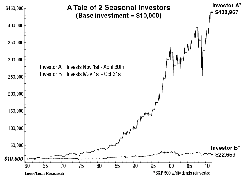
The Big Picture details equities seasonal phenomenon since 1959:
Here are the specifics of seasonality: Imagine we start with two $10,000 accounts, and use them to make investments in an S&P 500 Index fund. One account invests in one 6-month period, the other invests in the remaining 6-month period. Account A is invested from November 1st through April 30th each year, while Account B is invested from May 1st through October 31st.
Here are the numbers:

• Account A portfolio grew from $10,000 to over $438,967. That is a 42-fold increase.
• Account B portfolio barely doubled to $22,659.
A chart outlining the above phenomenon going back to 1959 can be found here, but I thought I'd take some alternative looks.... one that goes back further in time (all the way to 1871) to see when this seasonality started and one taking a look at the real return (i.e. after inflation) of each leg since 1959.

140 Year Rewind

Using S&P data from Professor Shiller's Irrational Exuberance site, I constructed the below chart going all the way back to 1871. The outperformance of the November - April time frame since 1959 can be seen, but interestingly enough before that date both periods had almost the exact same performance. Begging the question... what changed around 1959?


Real Seasonality (1959 - 2011)

You thought the original May - October figure looked bad in nominal terms? After inflation, total returns for that six month period over 52 years (312 months) were negative, while the November - April time frame posted annualized real returns ~10%.


Sunday, October 23, 2011

Below Trend Growth

The WSJ details:

It looks as if, despite everything, gross domestic product picked up in the third quarter, easing fears that the U.S. was on the cusp of another recession. But that doesn’t mean the economy is anywhere near where it needs to be.

Economists expect Thursday’s GDP report from the Commerce Department will show the economy grew at a 2.7% annual rate in the third quarter. That would still leave economic output 6.7% below what the Congressional Budget Office estimates its potential is. In other words, in a world where employment and economic activity were as high as they could be without the economy running into inflationary trouble, the U.S. would be producing about $900 billion more in goods and services a year than it is now.

Experts quibble about exactly where potential GDP is these days, and that’s especially true in light of all the damage the economy has suffered.
As the last portion of the article outlines, experts quibble where potential GDP is these days. I (a non-expert) will outline an alternative way to project potential GDP... past performance. While past performance does not guarantee future performance for investments, it also does not guarantee where the economy should be today. That said, it does represent a growth rate that Americans and American systems (tax levels, spending, debt accumulation) were used to dealing with / expected.

Below is a chart outlining just that... real GDP going back to mid-1971, along with what real GDP would look like today if it grew at the 3.1% pace of growth it saw on average between June 1971 and June 2007. In addition, the yellow line is the difference between the two.


In this case, the differences implies current GDP is 11% below potential.


Source: BEA

Friday, October 21, 2011

EconomPics of the Week

Investing


Economic Data

Other
RIP Steve Jobs

And your video of the week. Sublime with Badfish.

Explaining the Retail Sales / Confidence Dislocation

My buddy Sami Mesrour (from Blackrock) had a write up earlier this month titled Follow What I Do, Not What I Say; Consumer Spending and Consumer Confidence that outlines the surprise rebound in retail sales (bold mine):

The US consumer is feeling down. Several indicators of confidence collapsed over the summer with the declines beginning in May as job growth slowed, and the bulk of the drop in sentiment occurring during August. It is likely that the intense focus on the country’s deficit problem and the attendant prospects of lower government spending going forward were the main drivers in the decline of consumer expectations. Forecasters are concerned over this development because of what it implies for the growth of consumer spending—historically sentiment has been a good reflection of sales in the US.
This time, however, something strange is going on: consumers are apparently saying one thing, but doing another
Very timely analysis, as this was ahead of last Friday's report that showed retail sales surprised, significantly, to the upside (September was up a 1.1%, while June and July were revised higher as well).


The year over year figure is even more impressive, up more than 8%.

Sami outlined (in detail - go to his report for more) the following four drivers:
  1. Borrowed time (ability for the consumer to once again borrow to spend)
  2. Income distribution (the rich keep getting richer and are driving spending, while individuals struggling are driving the confidence surveys lower)
  3. Transfer payments (outlined at EconomPic here)
  4. Foreclosures (squatters and those moving home with their parents are effectively not paying rent, increasing their ability to spend on goods)
I broadly agree with these points, especially #2 and #3, and I'll lay out a fifth... inflation. While inflation may be the best (and only) politically viable option to reduce the level of nominal debt in the system, there are always interesting implications.

The below chart outlines the nominal year over year change in retail sales, along with my best effort in matching the applicable inflation figures for each category (by all means imperfect). The real retail sales change is simply the difference between the two.


Building this out further with data going back to the mid 1990's, the below chart outlines the year over year change in the following consumption measures:
  • Nominal goods (very closely aligned with retail sales)
  • Nominal consumption (includes the less inflationary services sector)
  • Real consumption (i.e. less inflation)
  • Real per capita consumption
In addition, the dotted lines show the average for each category from 1996 to 2008 (i.e. pre-crisis).


What we see is that while the "spike" in retail sales (via nominal goods consumption) is higher than pre-crisis, all other measures are below their historical levels of growth.

In other words, the growth in the amount that individuals are consuming is lower, but individuals are paying more for what they are consuming. For those individuals where food and energy are a higher percent of their consumption basket (i.e. those that earn less), this is an even bigger impact.

Makes a lot more sense why individuals would be unhappy.

Source: BEA / BLS / Census

Thursday, October 20, 2011

Leading Economic Indicators

Bloomberg details:

The index of U.S. leading economic indicators increased in September at a pace that suggests a slower rate of growth in the coming months.
The Conference Board’s gauge of the outlook for the next three to six months climbed 0.2 percent after a 0.3 percent gain in August, the New York-based research group said today. The September increase, the lowest since a decline in April, matched economists’ projections, according to the median forecast in a Bloomberg News survey.
A Federal Reserve survey published yesterday said the economy maintained its expansion last month even as more companies reported more doubt about the strength of the recovery. An acceleration in growth is needed to support the job gains that drive household spending, the biggest part of the U.S. economy.

Wednesday, October 19, 2011

Inflation


Source: PPI / CPI

Monday, October 17, 2011

Industrial Production "Inflection" to Lead Equities Higher?

The WSJ reports:

U.S. industrial production grew in September but the gain was small, underscoring the economy's lack of vigor.

Production rose by 0.2%, with a modest gain in manufacturing and a sharp drop in utilities caused by moderating weather. The Federal Reserve report on Monday showed overall production was flat in August, revised down from a previously estimated 0.2% increase.
Manufacturers in the U.S. have been feeling the weight of a lackluster economy, hamstrung by high unemployment. While it is still growing, the factory sector has, with the overall economy, slowed.
While the rebound in industrial production may be lacking the ideal punch, the index (which tends to have a positive relationship with the S&P 500) did turn positive this month on a three year rolling basis.


More interesting (to me) industrial production appears to have led the S&P 500 higher when rolling three year industrial production turned positive (i.e. the "inflection" point). The below chart strips out the S&P 500 rolling returns and replaces it with the three year forward (annualized) performance of the S&P 500 following the inflection point.


Tuesday, October 11, 2011

It's All About Financials

The chart below compares the absolute return of an investment in the S&P 500 vs. the excess return of an investment in the investment grade financial bond index (as compared to Treasuries) over rolling three-month periods going back 10 years. Note that pre-financial crisis there was a small relationship (even less so the prior decade) with the return streams below showing an r-square from 1988-June 2007 of less than 0.20. Since that time, an investment in the S&P 500 and financial bonds have been remarkably similar in terms of performance with an r-square of 0.56.


Source: Barclays Capital / S&P

Monday, October 10, 2011

Emerging Market Rotation Strategy

Along with taking a deeper look at macro trends / releases to try to figure out this whole economy thing (in these all-too-interesting times), I spend quite a bit of my time creating (long-term oriented) trading models. The goal? To better allocate my investments by taking away some of my emotion.


The following model I will walk through is a simple model (available for download here) based on my friend Meb Faber's (of World Beta blog and Cambria Investment Management) Timing Model.

What is it...

It is an Emerging Market "EM" timing model that allocates between two EM sectors... fixed income and equities. As a way of background, since 1999 (I could only pull data for both indices as of December 1998 - due to the methodology below, the start of the model is 10 months later), both EM fixed income and equities have had very similar returns, but have had VERY different ways of getting there (see chart below). At a high level, EM equity tends to outperform when both are trending higher, but EM fixed income outperforms when EM beta struggles.

With that in mind... what is the model? On an end-of-month basis:
  • If EM Equity Total Return index > 10-Month moving average, allocate to EM Equities
  • If EM Equity Total Return index < 10-Month moving average, allocate to EM Fixed Income

The result? Over this time frame, the rotation strategy has significantly outperformed both EM fixed income and equities with volatility and drawdown levels right between the two (note that a 50/50 blend had returns of around 10.7% with slightly less volatility than the rotation strategy).

If anyone can pull data for EM indices going back further in time, please send my way as I'd like to see how this performs over the longer term.

Source: MSCI, JP Morgan, World Beta
Model: Download here

Friday, October 7, 2011

Employment Reports Mixed

PBS details:

According to the "establishment survey" of places that hire, the economy added more jobs than predicted: just over 100,000. More significantly, the last two months' numbers were revised upward by another 100,000 or so.

Yet when we turn to the "household survey" of actual people, the headline unemployment rate remains unchanged at 9.1 percent. How come?

The numbers suggest that the working-age population (16 and over) grew by 200,000 last month, and another 200,000 people rejoined the workforce - that is, are back looking for work. The household survey also shows that 400,000 more Americans were employed this month than last. So it's a wash.

Disturbingly, our U-7 number actually went UP. How so? Because -- and here's the bad news in this month's numbers -- the total number of workers toiling part-time, but looking for FULL-time work, jumped by 400,000, about 5 percent. Since "part-time for economic reasons" are included in our U-7, the number rose from 18.26 percent to 18.41 percent, the third highest month since we inaugurated U-7 back in December.

Source: BLS

Thursday, October 6, 2011

More on Chinese Investment

Yesterday, I posted about China's Investment Conundrum (specifically, that China can't keep growing their investments at the torrid pace we've seen due to simple math). Below is a comparison of the composition of China's economy vs. that of the U.S., as well as growth in each component from 2001-2010.


To show this in a different way, below is just U.S. and Chinese investment. Combined, they have grown at a ~4.5% annualized clip, which not coincidentally is just about the pace of global GDP growth over that time frame. In other words, China has been taking production market share (a lot of it) from the U.S. (and developed world). At some point in time there isn't any more market share to take (or in theory the outsource trend could reverse), thus the entire consumption pie (including Chinese consumption) needs to grow at a faster pace in order for China to maintain the outpaced growth seen.


Source: BEA / Chinability