Friday, December 30, 2011

What a Year it Was!!!

So... what happened to asset classes in 2011?

Bonds crushed equities. Real assets were mixed.


More important (to me)... what happened to me in 2011?

1) I retired from blogging
2) I un-retired from blogging
3) I moved across the country
4) I found out my wife was pregnant (with our first child) the first night in our new place post-move
5) I quit my job (it involved commuting away from where I moved to each week... a kid [see point #4] made that a non-viable option for us)
6) I called everyone I knew who may have known someone in the city I moved to, met 100's (literally) of people for coffee, lunch, dinner, and drinks, then interviewed... then interviewed... then interviewed. Did I mention, I interviewed?
7) Had an amazing kid (though he is still in "blob" phase [i.e. he can't do much except eat, sleep, and sh@t, but he does them very well])
8) In the past month I have received three job offers! (I understand how lucky I am as, amazingly, two of them sound ideal. It will be a tough decision)

So a new job, a new city, and a new kid. I can only hope that 2012 is as great, but MUCH slower.

EconomPic in Review

There are now 2520 subscribers to EconomPic (wow!)

The Top 5 Most Read Posts of 2011 were...

1) Emerging Market Rotation Strategy
2) Unsustainable: Transfer Payments
3) Secret Sauce Continues to Grip It and Rip It
4) Gold Model Still Rocking
5) China Owns Lots of Paper

Not a surprise that 4 of 5 were asset class (rather than economic data point) related. Asset class posts tend to get linked to by financial blogs / forwarded more, which drives traffic whereas most of my readers that are interested in economic data view the blog via an RSS feed.

Videos of 2011

Reader GYSC says I have good taste in music, so that is all the encouragement I needed to list all the live performance music videos posted at EconomPic during 2011 (quite an eclectic mix I must say, which I hadn't realized started in January and ended in December with The Black Keys)

The Black Keys - Gold on the Ceiling


Fugazi - Waiting Room


AWOLNATION - Sail


Sublime - Badfish


Broken Bells - The Ghost Inside


The Decemberists - The Wanting Comes in Waves


Edward Sharpe and the Magnetic Zeros - Home


Jay-Z + Toto = Girlfriend in Africa


ThePETEBOX (cover of The Pixies) - Where is My Mind?

  • Iron and Wine (cover of the Postal Service) - Such Great Heights

  • The Strokes - Under the Cover of Darkness

    Passion Pit - Little Secrets


    The Black Keys - Tighten Up


    Happy New Year!!!!

    Something Positive for the New Year

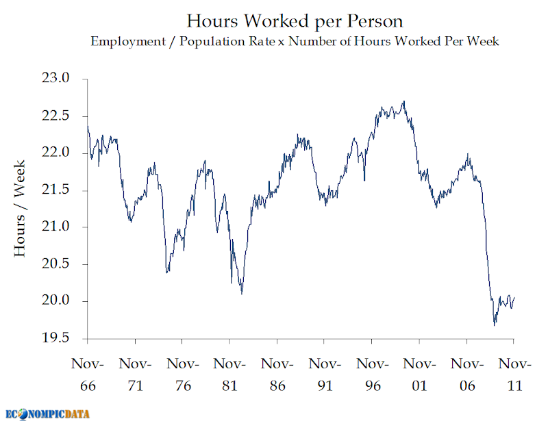
    An ugly (yet improving) chart shows the number of hours worked per person...


    Which, when combined with real GDP leads to a new high in GDP per "man hour".


    We have never been more productive with our labor in our history than now (because this is meant to be a positive for the New Year, I won't get into detail why this is also a result of outsourcing labor to emerging countries which has been a horrible policy move IMO).

    Source: BLS / BEA

    Tuesday, December 27, 2011

    Breaking Out the 0.1%

    Greg Mankiw outlines who earns the 0.1% of national income:

    Here is an interesting paper that answers the question. Some highlights from Table 3 about the top 0.1 percent:
    • 18 percent are financial professionals.
    • 42 percent are executives, managers, or supervisors in nonfinancial businesses. More than half of those are in closely-held (presumably often small) businesses.
    • 7 percent are lawyers.
    • 6 percent are in medicine.
    • 3 percent are in arts, media, or sports.
    • Less than 1 percent are professors or scientists.

    Note that this is only as of 2005 (my guess is financial professional income spiked as a percent of 0.1% of income from 2005 to 2008). It also doesn't show that the 0.1% earned 2.8% of all income in 1979, but 7.3% in 2005, or how much the above figures changed over the years. The latter is outlined below (i.e. the shift to finance was dramatic).

    Confidence Upswing Continues

    Bloomberg details:

    Confidence among U.S. consumers rose in December to the highest level in eight months as an improving job market helped regain all the ground lost following the mid- year government budget battle and credit-rating downgrade.

    The Conference Board’s index increased to 64.5, exceeding all estimates in a Bloomberg News survey and the highest since April, from a revised 55.2 reading in November, figures from the New York-based private research group showed today.

    Friday, December 23, 2011

    Consumers Don't Care About Savings Rates

    LA Times details the (lack of) savings:
    Consumer spending last month grew faster than people’s take-home incomes as households cut their savings rate a bit to support their purchases of cars and other goods and services.

    The government said Friday that the personal saving rate — the percentage of after-tax income that’s not spent — fell to 3.5% in November from 3.6% in October. As recently as June, the rate was 5% after being consistently at about that level or higher since late 2009.
    I'm not sure why it took me so long to realize the below relationship (I have been looking over this data for years now), but the savings rate broadly does not matter to consumers. In fact, over the past 50 years (as the chart below shows), it hasn't mattered at all.

    What has mattered for the average American is simply that a specific amount is saved, which has been around $100-$200 a month in real (after-inflation) terms, irrespective of the amount they have actually earned. So while real disposable income and consumption have roughly tripled over the past 50 years on a per capita basis, savings is up a less-than-whopping 13% (0.25% annualized growth).


    The other thing to notice in the above chart is the declining level of real per capita disposable income, something that will have to reverse to keep the concept that we can grow our way out of our debt alive.

    Source: BEA

    Thursday, December 22, 2011

    Leading Economic Indicators Rise in November

    BusinessWeek details:

    The index of U.S. leading indicators climbed more than forecast in November, a sign that the world’s largest economy will keep growing in early 2012.

    The Conference Board’s gauge of the outlook for the next three to six months rose 0.5 percent after a 0.9 percent October increase, the New York-based research group said today. The median forecast of 54 economists surveyed by Bloomberg News projected the gauge would advance 0.3 percent.


    Source: Conference Board

    GDP Revised Down to 1.8% on Weaker Consumption

    The WSJ details:

    The U.S. economy expanded less than thought during the third quarter as consumer spending fell short of an earlier estimate, though signs point to stronger growth in the final months of the year. Gross domestic product, the broadest measure of all the goods and services produced in an economy, grew at an inflation-adjusted annual rate of 1.8% in the July to September period.
    The revisions cause?
    The latest estimate showed personal consumption expenditure, which accounts for about two-thirds of spending in the economy, rose by 1.7% in the third quarter. That compares to a previous estimate of a 2.3% increase.


    Source: BEA

    Wednesday, December 21, 2011

    Even More Perspective on Housing

    In response to my post Some Perspective on Housing, reader Tom Lindmark commented:

    It would be interesting if you could take the time series back far enough to account for the rise of the Boomer generation. My guess is that if it were at all possible to normalize the data for their outsize impact we might see a far lower number of new home starts than what economists predict would occur in a "healthy market".
    The chart below normalizes housing starts by the 16+ year old population (not perfect as it does not account for family size... the smaller the family size, the more housing units needed). What we see is that the most recent spike in housing units during this bubble was not as outsized as I would have thought (at least relative to the baby boom when household formations spiked), while the drop off remains severe. For reference, 0.5% roughly equates to 1.2 million homes (i.e. the number of homes economists referenced in a healthy market).


    Source: Census / BLS

    Tuesday, December 20, 2011

    Some Perspective on Housing

    Washington Post puts some perspective on the new housing data:

    Builders broke ground on a seasonally adjusted annual rate of 685,000 homes in November, a 9.3 percent jump from October, the government said Tuesday. It’s the highest level since April 2010.

    Still, the rate is far below the 1.2 million homes that economists say would be built each year in a healthy housing market.

    Construction of single-family homes rose 2.3 percent in November to a seasonally adjusted annual rate of 447,000. Apartment construction jumped 32 percent to a rate of 238,000 units. Single-family homes account for about 70 percent of homebuilding.
    The chart below shows the increase in 5+ unit buildings (i.e. apartments) and the continued struggle in single family homes (November 2011 was actually below the level seen in November 2010).


    Source: Census

    Gingrich Sliding in Polls... Phew!

    I try to steer clear of politics for the most part here at EconomPic, but the thought of Gingrich in any position of power frightens me (here is one example as to why). So, Insider Advantage's most recent poll showing a complete 180 in terms of favorite for the Iowa Caucuses brings me some comfort.


    Source: RealClear Politics

    Friday, December 16, 2011

    EconomPics of the Week (12/16/11)

    Economic Data
    Breaking Down CPI

    Global
    China's Slowing Treasury Purchases

    Asset Classes
    European Expectations and the Price of Gold
    Why Do Large Cap Firm's Trade at a Discount to Market?

    And your video of the week... The Black Keys with 'Gold on the Ceiling' off their (AWESOME) new album El Camino.


    Breaking Down CPI

    SF Gate details:

    Overall consumer prices increased 3.4 percent in the 12 months ended November, the smallest year-over-year increase since April. The core CPI climbed 2.2 percent from November 2010, the most since October 2008.
    The Fed's preferred price gauge, the Commerce Department's measure that excludes food and fuel and is tied to consumer spending, rose 0.1 percent in October after no change the prior month. It was up 1.7 percent in the year ended in October, at the lower end of Fed policy makers' long-run projection of 1.7 percent to 2 percent.
    "Inflation has moderated since earlier in the year, and longer-term inflation expectations have remained stable," Fed policy makers said in a Dec. 13 statement after their most recent monetary policy meeting.
    The chart below breaks out the components of the 3.4% headline figure. As can be seen, the bulk of consumer inflation is embedded within transportation, specifically fuel which is up 20% year over year. As lower fuel prices from the first quarter of 2011 begin to roll off during the beginning of next year, expect headline CPI to move significantly lower unless gas prices rise again over the next few months (knock on wood). This roll-off can already be seen in the six month chart below.

    12-Month


    6-Month Annualized


    Source: BLS

    Thursday, December 15, 2011

    China's Slowing Treasury Purchases

    With almost each Treasury holdings release, the mainstream media claims China is selling Treasuries, when in reality purchases are just flowing through the United Kingdom (and are later revised to China... see here, here, and here for a few examples). So, not a surprise when I read this via the AP:

    China bought less U.S. Treasury debt in October and total foreign holdings dipped for the first time since July.
    Total foreign holdings of Treasury debt edged down 0.1 percent to $4.66 trillion, the Treasury Department reported Thursday.
    China, the largest foreign holder, bought 1.2 percent less to bring its total holdings to $1.13 trillion. China had increased its holdings 1 percent in September after a reduction of 3.1 percent in August.
    The small decline in overall holdings still left them at high levels that suggest foreign demand for U.S. debt remains strong.
    Details as to why the United Kingdom's holdings should be included can be found here.

    BUT, when I looked at the data, something caught my eye. While the month over month level of Treasury holdings actually declined this time when accounting for the United Kingdom, which could simply be noise, the longer term trend is clear. The pace of growth in Chinese purchases of Treasuries has declined rather dramatically (in percentage terms). This may prove to be a smaller issue for the U.S. in terms of Treasury demand (the smaller percent is off a larger base, so in $$ terms the growth is still significant), but it may reflect the difficulty China may have growing their export driven economy at the scale required to prevent social unrest, as global aggregate demand has waned.


    Source: Treasury

    Wednesday, December 14, 2011

    Will the US be Importing Deflation?

    Bloomberg details:

    The import-price index climbed 0.7 percent, the first increase in four months and followed a 0.5 percent drop in October, Labor Department figures showed today in Washington. Economists projected the gauge would increase 1 percent, according to the median forecast in a Bloomberg News survey. Prices excluding fuel decreased 0.2 percent for a second month, the first back-to-back drop in more than a year.
    Oil prices may have reached a plateau this month, indicating increases in the cost of imported goods may moderate as slowing growth from Europe to Asia and a strengthening dollar hold down prices. Federal Reserve policy makers yesterday said they expected inflation to slow and reiterated their pledge to hold the benchmark rate “exceptionally low” at least through mid-2013.
    The below chart outlines the longer term trend in imported inflation. Over the past three months, the price of imported goods (excluding petroleum) has declined for only the third time since 2005 (six month figure is now flat), while the twelve month change is turning lower (below 4%) after it peaked at over 5% as recently as September.


    Source: BLS

    Tuesday, December 13, 2011

    Real Retails Sales per Capita

    Following this morning's post on real monthly retail sales, a few readers asked to see the chart adjusted for population growth. I'm glad they did, as the results show why the recovery doesn't feel as strong as headline figures would otherwise indicate. To be more specific, retail sales excluding autos and gas are roughly where they were 12 years ago on a per capita basis.


    Source: Census / BLS / BEA

    Real Retail Sales Ex Autos and Gas Makes New High

    Bloomberg details the latest retail sales:

    U.S. retail sales rose in November at the slowest pace in five months, indicating faster job growth may be needed to spark the biggest part of the economy.
    The 0.2 percent gain in sales followed a 0.6 percent advance in October that was more than initially reported, Commerce Department figures showed today in Washington. Economists projected a 0.6 percent November increase, according to the median forecast in a Bloomberg News survey.
    It is important to remember that retail sales figures are nominal (i.e. they include inflation), thus any decline in the price of goods would make this figure appear lower. As a result, November likely understates retail sales as gasoline fell abruptly during the month (chart here). However, (sorry if this becomes confusing) if gasoline sales are understated... that means retail sales ex gasoline are overstated (all else equal).

    Longer term, we are still making slow progress, but we have passed an important milestone. By my calculation (backing out BLS inflation figures for each of the below components), we have now made a new high in terms of real (i.e. after inflation) retail sales less autos and gasoline.


    In other words, we're still purchasing a heck of a lot of stuff.

    Source: Census / BLS

    Monday, December 12, 2011

    European Expectations and the Price of Gold

    You never want to read too much into any short-term trend, but take a look today's market performance, as well as the "correction" we've seen across asset classes since spring / summer peaks and notice which assets have done well (high quality income producing bonds) and which have done poorly (equities, non-US currencies, commodities, AND gold). I highlight gold because over the past three years risk-asset sell-offs have broadly been met by strong bids for Treasuries and gold, but today's performance and the drawdowns indicate it may be losing that flight to quality bid.


    Daily Performance (December 12th, 2011)


    Drawdown from 52 Week High


    As Eddy Elfenbein's gold model outlined (further optimized by Willem Weytjens), gold has broadly done well in low (or negative) real interest rate environments. In fact, should inflation run at its historical levels the next two years, Willem's revised model calls for $4000+ per ounce gold in the next few years.

    Yet, gold is down about 12% from its recent peak. One possible reason is the concern over Europe. My own thinking... how unlikely is it that things get worse, impacting global aggregate demand and the financial system more broadly? In that case, how improbable is disinflation or deflation, which in turn would mean these low nominal rates may actually move a lot higher in real terms.

    Source: Yahoo

    Friday, December 9, 2011

    Trade Deficit Narrows

    Bloomberg details:

    The trade deficit narrowed in October to the lowest level of the year, reflecting a drop in imports that will help give the U.S. economy a lift.
    The gap shrank 1.6 percent to $43.5 billion, smaller than projected, from $44.2 billion in September, Commerce Department figures showed today in Washington. Purchases from overseas fell to the lowest level since April, due almost entirely to a plunge in demand for petroleum.
    Imports of capital goods, like computers and aircraft, and consumer goods climbed, showing spending by American companies and households is keeping the economy growing. Exports to China and South and Central America reached records, indicating demand from developing nations that is benefiting companies like Dow Chemical Co. (DOW) may cushion the U.S. from any slowdown in Europe.
    The below chart outlines the 12-month change in real net exports by category (as well as the breakdown between the change in real imports and exports). As can be seen, the trade deficit is improving, due to improved industrial supplies and consumer goods trade balances.


    Source: Census

    Thursday, December 8, 2011

    Why Do Large Cap Firm's Trade at a Discount to Market?

    Aleph Blog outlines why he believes "behemoth" companies (i.e. firms with a market value greater than $100 billion) trade at relatively compressed price to earnings ratios:

    For Behemoth companies to achieve large earnings growth, they have to find monster-sized innovations to do so. Those don’t come along too regularly. Even for a company as creative as Apple (or Google), it becomes progressively more difficult to create products that will raise earnings by a high percentage quarter after quarter.

    As a result it should not be a surprise that Behemoth stocks trade at discounts to the market when global growth prospects are poor. They have more assets and free cash flow to put to work than is useful in a bad environment. Not every environment offers large opportunities.
    The below chart outlines, by sector, the market cap of the current 39 behemoths using data from a follow up post at Aleph Blog (he adds even more granularity in his post).


    I would also add that I believe these behemoths trade at an aggregate discount due in part by their composition. Financials (and to a lesser extent energy firms) trade at a large discount due to the damage they inflicted upon themselves and the threat of future regulatory restrictions that may impede profitability, both of which may force them to dilute shareholders as they raise / write-down capital. Technology firms on the other hand are constantly threatened by innovation and becoming irrelevant by the next generation of firms (i.e. what happened to Yahoo via Google), thus earnings become difficult to project past even a few years.

    Public Sector Balance Sheets Leveraged to Offset Private Sector Deleveraging

    From table D.3. of the Fed's Flow of Funds, we see that as the private sector deleverages, the public sector has added even more debt, which (in my opinion) has (thus far) prevented a debt deflation cycle.


    Wednesday, December 7, 2011

    Consumer Credit (Excluding Student Loans) Now Below 50 Year Average

    Bloomberg outlines:

    U.S. consumer borrowing rose in October to the highest level in two years, propelled by gains in non-revolving debt like auto and student loans.

    Credit increased by $7.65 billion to $2.46 trillion, the most since October 2009, Federal Reserve figures showed today in Washington. The advance was in line with the median forecast of economists surveyed by Bloomberg News that projected a $7 billion gain.
    While overall consumer credit rose, consumer credit excluding student loans continued to decline as a percent of personal income from 15.74% in September to 15.71% in October. Of note, total consumer credit (revolving and non-revolving) is now below the 50 year average when viewed relative to personal income, with the big caveat that this excludes student loans*, a category that is now more than 3% of personal income (up from less than 0.5% on average the past 50 years).


    * this assumes all Federal student loans are student loans.

    Friday, December 2, 2011

    EconomPics of the Week (12/2/11)


    Asset Classes
    The European Impact on Financials and Risk Assets
    Whipsaw
    Auto Recovery in Perspective

    Random
    Morality and Religion

    And your song of the week... one of the more popular songs to cover in punk rock history, Fugazi's Waiting Room. For Fugazi fans, they just posted more than 1000 of their live concerts online here.

    Not the best quality video, but the energy in that room (way back in 1988) appears to have been rather epic.


    Enjoy the weekend!

    Traction on the Jobs Front... Headline vs. Actual

    First the (very strong) "headline", then the details.


    The WSJ with the headline:
    The U.S. labor market strengthened in November as private employers continued to add jobs at a healthy pace, while the unemployment rate fell to its lowest level since March 2009.

    Nonfarm payrolls rose by 120,000 last month, the U.S. Labor Department reported Friday in its monthly survey of employers. Private companies added 140,000 jobs, while the public sector—federal, state and local governments—lost 20,000 jobs.
    The unemployment rate, obtained by a separate survey of U.S. households, fell to 8.6% in November from 9.0% the previous month. The rate hadn't been below 9% since March, when it was 8.8%. The rate is now lower than at any point since March 2009, when it was 8.6% as well.
    In another positive development, October's figure for nonfarm payrolls was revised upward to show a gain of 100,000 from a previously reported 80,000, while September was revised up to a 210,000 gain from 158,000.
    The chart below shows the good news... an improving job market with declining unemployment and underemployment.


    Now the details...

    A improvement in the sense that jobs are being added, but a bifurcation between the "haves" (those getting jobs) and "have nots" (those so disgruntled they are leaving the workforce completely). Notice the huge spike in the number not in the labor force. In other words, the unemployment rate dropped not only due to an increase in the number of individuals employed, but also due to the number no longer counted as unemployed because they have dropped out of the labor force. Also notice the huge split between men (getting jobs) and women (losing jobs and leaving the job market). No clue what is going on there...


    A better picture emerges when viewed as a percent of the total population of individuals qualified to work. The chart below shows the number in the labor force as a percent of that broader population, as well as the number employed. The good news is we continue to see stability in the employment to population ratio (i.e. jobs are growing at the rate of population), the bad news is that rate has been stagnant and remains near a 30 year low. The other concern is that the number of people participating in the job market continues to decline, so unemployment could present a long term issue even if the economy bounces back (those that left the workforce may find themselves unqualified to return).


    If the above trend continues, expect the unemployment rate to continue to decline regardless of whether the job market improves. The good news is that this will result in a positive headline each month. It will be interesting to see if that headline helps with confidence, which makes a the recovery self fulfilling.

    Source: BLS

    Thursday, December 1, 2011

    Auto Recovery in Perspective

    SF Gate details:

    Four of the six largest automakers by U.S. sales beat expectations, boosting industry sales to a 13.6 million seasonally adjusted annualized rate, according to Autodata Corp. The pace exceeded the 13.4 million average estimate of 14 analysts surveyed by Bloomberg and is the best month since sales were helped by "cash for clunkers" in August 2009.

    "Consumers have been waiting for this," Jessica Caldwell, an analyst for the researcher Edmunds.com, said today in a phone interview. "Cars are getting old, and people are getting to the point where they need to replace them. There's recession fatigue and people want to buy. We're getting tired of being in this saving pattern."
    While any recovery is good news, we are still at very low levels relative to recent history. The chart below outlines historical auto sales normalized by population (i.e. "people per car"). What we see is that year-to-date auto sales are in the neighborhood of 1 auto sold per 24 people, down from 29 in 2009, but up from the 17 average seen from 1971 - 2007.


    Source: Wards Auto

    Construction Decline Bottoming

    The AP reports:

    U.S. builders spent more in October on homes, offices and shopping centers, pushing construction spending up for a third straight month. Despite the gains, construction spending remained depressed.
    Construction spending rose 0.8 percent in October to a seasonally adjusted annual rate of $798.5 billion, the Commerce Department said Thursday. While an improvement, that's barely half the $1.5 trillion that economists consider healthy. And through the first 10 months of this year, construction spending is 2.9 percent below the dismal levels from 2010.
    While things do remain well below normal levels, but not nearly the "half" quoted above. Even during the boom times earlier last decade, the US never approached the $1.5 trillion "healthy" figure (though I would note the below is in nominal terms, thus in real terms would look worse).


    Source: Census

    ISM Manufacturing Moves Higher

    ISM Reports:

    WHAT RESPONDENTS ARE SAYING ...
    • "Business still holding its own. Some growth in margin now that some of the raw materials prices have abated. Oil is pushing $100 so that has not been favorable." (Chemical Products)
    • "Orders for the remaining two months have increased after an extended 'summer dip' in sales overall. We expect to finish the year approximately 10 percent above 2010." (Electrical Equipment, Appliances & Components)
    • "Seeing a slight slowdown in orders; could be related to the holidays." (Primary Metals)
    • "Material lead times are getting longer. Seems like no one is hiring. Trying to do twice the output with the same amount of people." (Food, Beverage & Tobacco Products)
    • "Japanese auto production has returned to 100 percent, and domestic manufacturing continues to increase." (Fabricated Metal Products)
    • "Oil exploration seems to be really picking up. Government is permitting again, so business is the busiest we've ever seen." (Computer & Electronic Products)
    • "The EPS ruling about higher fees for coal-generated electricity can have a huge, negative impact on our business if implemented in January 2012. We are at the peak of our seasonal demand push." (Plastics & Rubber Products)
    • "Thailand flood impacting our business. Honda and Toyota cut production forecasts, and we are chasing some components made in Thailand." (Transportation Equipment)

    Source: ISM

    Wednesday, November 30, 2011

    The Importance of Small Business Hiring

    The WSJ details the potential good news on the job front:

    Private-sector jobs in the U.S. rose by 206,000, according to a national employment report published by payroll giant Automatic Data Processing Inc. and consultancy Macroeconomic Advisers.

    Economists surveyed by Dow Jones Newswires expected ADP would report an increase of 130,000. The October data were revised to show a rise of 130,000 versus 110,000 reported earlier.
    The chart below shows that the bounce has come almost entirely by small and medium sized businesses (i.e. those with payroll of less than 499 employees). I would note that hiring among companies with payroll of less than 50, saw the highest jump in hiring since November 2006. I personally wonder whether those that can't find jobs are creating their own or if there are opportunities out there that corporations aren't seeing as they have downsized and focused on reducing expenses.


    Either way, this is part of a longer term trend in the job market. Corporate payroll now makes up less than 16% of overall payroll, according to ADP, down from almost 18.5% a decade ago. The issue of course is that small and medium size businesses haven't grown their share, but rather corporations have reduced their share through the outsourcing of jobs overseas.


    Source: ADP

    Tuesday, November 29, 2011

    Are Home Prices Inexpensive Relative to History?

    It depends on the time frame you are looking at. The below charts show real appreciation (after inflation), by city where available, going back 5, 10, and 15 years.

    5 Years (Home Prices Appear VERY Cheap)


    10 Years (Home Prices Appear Quite Cheap)


    15 Years (Regions Impacted Most by the Recent Recession Appear Cheap... Others Quite Expensive)


    Source: S&P

    Consumer Confidence.... Things Are Looking Up as it Can't Get Much Worse Editition

    BusinessWeek details:

    Consumer confidence climbed in November by the most in more than eight years as Americans grew more upbeat about employment and income prospects.

    The Conference Board’s index increased to 56 from a revised 40.9 reading in October, the biggest monthly gain since April 2003, figures from the New York-based private research group showed today. The gauge, at a four-month high, exceeded the most-optimistic forecast in a Bloomberg News survey of economists.
    An improvement (a much stronger than anticipated one at that) is a good thing, but we are bouncing off of extreme lows.


    Sunday, November 27, 2011

    The European Impact on Financials and Risk Assets

    I wrote back in early October that financials have been an important factor in risk asset performance for the better part of the past four years. The below chart shows that since June, financials are still an important sector to keep an eye on, but that the sector appears to be driven (remarkably well) by the situation in Europe.


    Friday, November 25, 2011

    Whipsaw

    What was down (risk assets), was up, then down again. What was up (Treasuries), was down, then up again. Below is an assortment of sector ETFs sorted by three month performance (Long Treasuries are up the most, EM Equities down the most).

    Wednesday, November 23, 2011

    European Industrial New Orders Crumble

    Industrial production within Europe for the month of September was ugly (see here), but nothing compared to new orders made during the same month (which leads to future production). The Economic Times details:
    Euro zone industrial new orders slumped in September, the EU said on Wednesday, the deepest fall since December 2008 and far worse than economists had forecast, in the latest sign that Europe may be heading for a recession.

    Orders in the 17 countries sharing the euro tumbled 6.4 percent in the month compared to August, well below expectations of a 2.5 percent fall, with Germany and France registering sharp contractions, the EU's Statistics Office Eurostat said.

    "The scale of the deterioration is surprising," said Clemente de Lucia, an economist at BNP Paribas. "We are entering some kind of contraction in the last quarter of this year that will continue in the first quarter of next year," he said.
    Interesting to note that the core of Europe appears to be doing much worse than the periphery (a reader noted that the core is where "stuff" is made").


    Source: Eurostat

    Corporate Profits vs. Personal Income

    Stagnant wages and outsourced production (reduced expenses for corporations - higher unemployment / underemployment for individuals), combined with cheap financing (lower interest payments for corporations - lower income on savings for individuals) have fed record corporate profits, while personal income slowly rebounds (and remains below pre-crisis levels).


    Another way to view the same data is to compare real corporate profits (still the red line) with the difference between real GDP growth and real personal income. What we see is that when real GDP grows faster than real personal income, more of national income makes its way into corporate bottom lines.


    What this misses is that for corporate income to continue to grow either:
    • National income needs to grow
    • Corporations need to grab an even larger slice of national income from individuals
    Both of which will be much tougher on a going forward basis (the former a good thing, the latter not so much).

    Source: BEA

    Tuesday, November 22, 2011

    GDP Growth Revised Down Due to (Lack of) Inventory Rebuild

    Bloomberg details:

    The economy in the U.S. expanded less than previously estimated in the third quarter, reflecting a drop in inventories that points to a pickup in growth as 2011 comes to a close.
    Gross domestic product climbed at a 2 percent annual rate from July through September, less than projected and down from a 2.5 percent prior estimate, revised Commerce Department figures showed today in Washington. The median forecast of 81 economists surveyed by Bloomberg News called for no revision. Excluding stockpiles, so-called final sales climbed 3.6 percent, the most since last year’s fourth quarter.
    As can be seen below, the decline was almost entirely due to the negative impact from inventories (i.e. we consumed what we had previously stored and businesses didn't restock), offset in part by an increase in net exports.


    As I mentioned following the most recent trade release:
    Trade (imports) is down not because we are consuming goods made in the U.S., but rather because businesses paused on rebuilding inventories.

    In other words, it seems we are simply consuming past imports, thus when inventories are rebuilt, the above "should" revert to negative territory unless aggregate demand collapses. Something else to keep an eye.
    Source: BEA

    Monday, November 21, 2011

    Morality and Religion

    Lots of interesting topics in the PEW Research Center's The American-Western European Values Gap. Here's one...


    Note: bringing up religion among any group of individuals where everyone is not like-minded is the equivalent of playing with fire, so I will not be making any comments.

    Source: PEW

    Friday, November 18, 2011

    EconomPics of the Week

    U.S. (Pointing Up)
    Leading Indicators... Full Steam Ahead
    Retail Sales Ratchet Higher
    Capacity Utilization vs. Inflation

    Employment (Ugly / Stagnant)
    Unemployment: Due to Lack of Domestic Expansion, Not Layoffs
    R.I.P. Teen Workforce

    Europe (Getting Uglier)
    European Recession?
    France is No Germany

    Investing Isn't Easy
    Bill Miller Stepping Down as CIO

    And your video of the week... AWOLNATION with Sail

    Leading Indicators... Full Steam Ahead

    Whether or not the U.S. can truly break away from European concerns is still an open question, but recent economic data points to a decreased likelihood of a double dip.

    Bloomberg details:
    The index of U.S. leading indicators climbed more than forecast in October, signaling the world’s largest economy will keep growing in early 2012.
    The Conference Board’s gauge of the outlook for the next three to six months rose 0.9 percent, the biggest jump since February, after a 0.1 percent September increase, the New York- based research group said today. The median forecast of 56 economists surveyed by Bloomberg News projected the gauge would advance 0.6 percent.


    Thursday, November 17, 2011

    Unemployment: Due to Lack of Domestic Expansion, Not Layoffs

    The BLS released their latest Business Employment Dynamics report that breaks out positive change in employment (by expansions and new business openings) and negative change in employment (by contractions and business closings). The data lags a few quarters so it is not very good for looking at short-term trends, but the long-term trend is quite interesting.

    The first chart outlines each component, which I then normalized by population to get an apples to apples comparison over the years. What may be surprising is that the negatives (contractions and closings) have actually come down as a percent of population over the past few decades (in fact there has been a huge "contraction in contractions" recently). The bad news is that the level of expansions and openings are down (by an even larger amount) over that time frame.


    The next chart compares expansions vs contractions (i.e. existing business employment dynamics) and openings vs closings (i.e. new business employment dynamics). From the below chart we can see that the largest contributor to (the lack of) job growth has been existing business dynamics (though a long-term decline of new businesses have likely played a role in the lack of expansion hiring).


    Taken together, we can summarize the charts as follows:
    • Layoffs via contractions and closing may be less of an issue (than at least I thought)
    • There has been a decline in new business employment over the past few decades
    • The lack of expansionary hiring (and negative expansionary "shocks" during the last two recessions) seems to be the the likely reason we are facing high unemployment
    The issue we face is that the lack of expansionary hiring among businesses is structural in nature. As I've detailed before, the shift in hiring by existing businesses from the U.S. to overseas has played a huge role (the example of China is shown here). The good news is that policy may be able to fix some of this, either through incentives for new business development and/or shifting employment back to the U.S. (the latter of which I expect targeted policy at some point, regardless of the kicking and screaming by pro free-trade economists and corporations).

    Source: BLS

    Bill Miller Stepping Down as CIO

    Update: the Yahoo Finance data for LMVTX that I had used appears to be wrong (no clue why and quite frankly concerning). The chart has been replaced by one from Morningstar.


    Following the Legg Mason announcement that Bill Miller will step down as CIO after a 30 year run with the firm, Abnormal Returns details the difficulty of providing consistent above average equity returns:
    Bill Miller co-manager of Legg Mason Capital Management Value Equity announced he was stepping down as CIO of LMCM effective April 2012. Like Woods Miller had a fifteen year period where he was seemingly unstoppable. His fund topped the performance of the S&P 500 every year over this time period.
    Bill Miller has managed the Legg Mason Capital Management Value Equity fund (LMVTX) since 1982 and results of that data (relative to the S&P 500) is shown below. The data now shows the average performance pre-1991, the remarkable performance from 1991-2006, and the underperformance since due to the misplaced bets on financials.


    Back to Abnormal Returns on the potential danger of allocating to outperforming managers:
    In investing a fall from grace is a common occurrence. In 2011 we have seen both John Paulson who conducted the “The Greatest Trade Ever” and Bruce Berkowitz, Morningstar’s manager of the decade both stumble badly.
    Source: Morningstar

    Wednesday, November 16, 2011

    Capacity Utilization vs. Inflation

    Marketwatch details:

    The output of the nation’s factories, mines and utilities rose 0.7% in October, the Federal Reserve said Wednesday in another sign the manufacturing industry is still expanding.

    The October gain was the biggest since July and was stronger than the 0.4% increase expected by analysts.


    Source: BLS / Federal Reserve

    Tuesday, November 15, 2011

    France is No Germany

    FT Alphaville details:

    The 30-year German bond yield is close to a record low, around 2.48 per cent at pixel time. France might be able to borrow for 30 years at just 4.4 per cent (i.e. hardly a distressed credit)… but the days of convergence are long gone.