Thursday, March 29, 2012

Final Q4 GDP Unchanged at 3%


Source: BEA

Friday, March 23, 2012

Baseball Valuations Soar

Let's pretend for the time being that Forbes doesn't just stick their finger in the air and make up these valuations (an M&A professor of mine in business school shared that teams have a lot of influence in the Forbes' valuations, hence it shouldn't be a surprise that the Dodgers valuation is a whopping 75% higher than last year when the owner would have preferred a lower valuation while going through a divorce and higher valuation this year when selling the team).


To Forbes:
The average Major League Baseball team rose 16% in value during the past year, to an all-time high of $605 million. In 2011, revenue (net of payments to cover stadium debt) for the league’s 30 teams climbed to an average of $212 million, a 3.4% gain over the previous season. But operating income (in the sense of earnings before non-cash charges and interest expenses) fell 13%, to an average of $14 million in part due to a 5.1% increase in player costs (including benefits and signing bonuses for amateurs), to $3.5 billion in 2011.


But that's not where the money is. It's all in the regional sports networks "RSN's":
The Rolls-Royce of the RSN model is the New York Yankees, who own 34% of the YES Network. The Bronx Bombers are the most valuable team in baseball, worth $1.85 billion, tying them with the National Football League’s Dallas Cowboys for the top spot among American sports teams and placing them second in the world to Manchester United, the English soccer team worth $1.9 billion. YES generated a staggering $224 million in operating income and paid the Yankees a $90 million rights fee in 2011.
So... teams earn an average $14 million each from baseball operations, while the Yankees earn $90 million just from their TV network. Which explains how the Evil Empire (i.e. the Yankees) can blow a seemingly unlimited amount of money on players, while the Mets (one of two teams that actually lost value in 2011) shed payroll because their owner got ripped off by Mr. Bernie Madoff (full disclosure if not already obvious... I am a bitter Mets fan).

Source: Forbes

Thursday, March 22, 2012

Leading Economic Indicators Show Strength in February

Ken Goldstein, economist at The Conference Board details:

“Recent data reflect an economy that improved this winter. To be sure, an unseasonably mild winter has contributed to many of the recent positive economic reports. But the consistent signal for the leading series suggests that progress on jobs, output, and incomes may continue through the summer months, if not beyond.”


Wednesday, March 21, 2012

Not All Bonds are the Same

The (overrated) bond sell-off took a breather today, perhaps rallying on news that iron ore demand from China was waning.

Regardless of the whether or not the sell-off is just noise (my guess until proven otherwise) or the reversing of what has been a 30 year trend, it's important to remember that not all bonds are the same.

In the face of the "huge" 2.1% Treasury sell-off (kidding) since the Treasury index hit its all-time high on January 31st (yes, all this news of a Treasury sell-off is when the index is 2.1% off its all-time high), we can see that quite a few sectors actually have positive performance over that time.


Source: Barclays Capital

Monday, March 19, 2012

State Taxes

The Rockefeller Institute details the continued, yet slower paced, growth in state tax collection in the fourth quarter:

Preliminary data for the October-December quarter of 2011 show further growth in state tax collections, with gains now coming for every quarter over two full years. However, such growth softened considerably in the second half of 2011. We will provide a full report on the October-December period after Census Bureau data for the quarter are available.
The Rockefeller Institute's compilation of preliminary data from all 50 states shows collections from major tax sources increased by 2.7 percent in nominal terms in the fourth quarter of 2011 compared to the same quarter of 2010. This is a noticeable slowdown from the 11.1 and 6.1 percent year-over-year growth reported in the second and third quarters of 2011 respectively.
The growth was dampened by a 3.8% decline in corporate taxes in Q4 2011 as compared to Q4 2010 (anyone's guess as to why Q4 2011 taxable earnings were lower considering "reported" earnings were higher is better than mine).

Over the longer term, we see that while state tax revenues have increased in nominal terms, they have declined over the past decade or so relative to nominal GDP. The chart below shows state tax revenues (by component) normalized to GDP, indexed at 1 as of December 1998 (the furthest back I could pull data). What we see is volatile, yet declining corporate taxes and a consistent decline in personal, sales, and overall taxes.


Why the decline?

Some initial thoughts.... the aggregate "state tax revenue pie" may be declining as states fight for tax dollars in a battle where nobody wins except corporations or perhaps economic growth is becoming less "taxable" as service sectors move underground (services seem to be harder to track than products) and products become less taxable as corporations outmaneuver states' ability to adapt to new technology.

Wednesday, March 14, 2012

About that Treasury Blood Bath

Pundits, bloggers, experts, etc... have been calling for a Treasury sell-off going on 3-4 years now (here is a post of mine from January 2009 on that exact subject.... and one from October 2010...and one from January 2012) so it is no surprise that the recent sell-off has brought the bears back out.


Global Macro Monitor even says we may be starting what it refers to as the Bond Market Arab Spring.

Wow... that's bold. Let's see the beginning stage of the massive sell-off they are referring to.


Yeah... I don't see it (yet) either.

While any sell-off has the potential to become the large sell-off EVERYONE has been waiting for (economic data is improving, yields are very low, inflation is ticking higher), I am not yet convinced it's the sure thing these "experts" want you to believe.

But, I guess if you keep making the same prediction, eventually it will come true.

Monday, March 12, 2012

What's Another Trillion?

Statesman details:

The U.S. federal deficit was slightly smaller through the first five months of this fiscal year than the previous year. Still, the deficit is on pace to exceed $1 trillion for the fourth straight year, which could be an issue in this year's presidential election.

The Treasury Department said Monday that the deficit grew by $232 billion in February. That increased the imbalance through the first five months of the current budget year to $581 billion, or 9 percent less than the same period in fiscal 2011.

The Obama administration expects the deficit will reach $1.3 trillion when the fiscal year ends Sept. 30. The government ran a record deficit of $1.41 trillion in 2009 and a $1.29 trillion deficit in 2010.
While the scale of deficits has been alarming, it should come as no surprise given the huge incentives for politicians to push revenues lower and spending higher, as well as the strong dependence for improvement (of both the revenue and spending side) on a weak underlying economy.

Politicians like to be elected. On the spending side of the equation, the easiest way (it seems) to be elected in the U.S. is to spend during prosperous times, as voters (not surprisingly) like to feel prosperous during these prosperous times (hence the limited number of times the below chart turns negative). One issue is that spending moves even higher during downturns due to all the social safety nets that kick in, pushing the deficit higher and higher each business cycle.


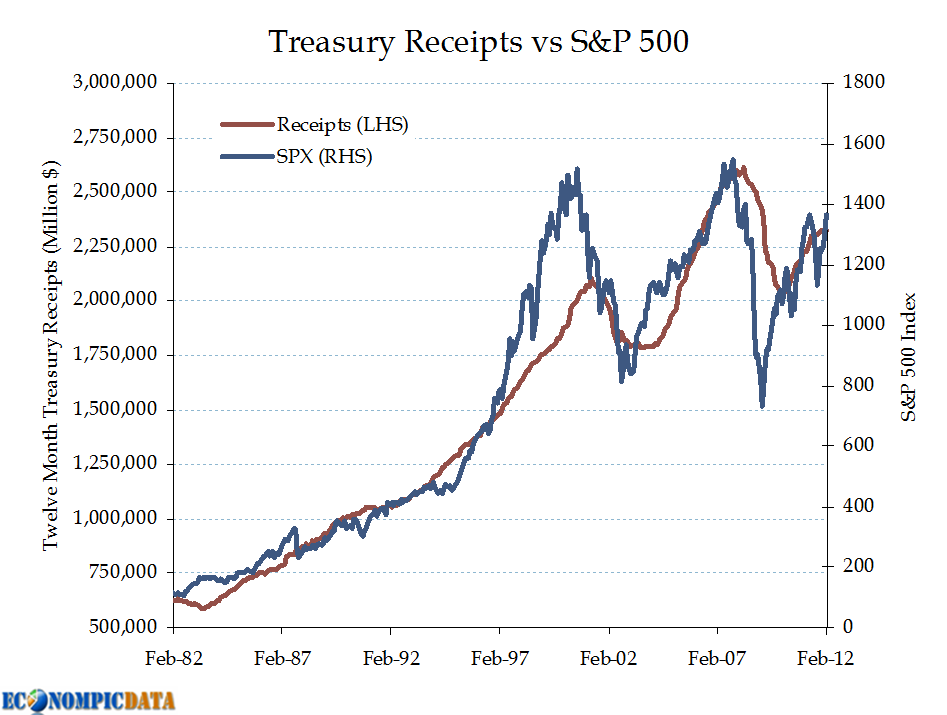
Similarly, tax revenues depend on these same politicians that want to be elected (during good times, why not cut taxes?) and shows a similarly strong relationship with the same underlying economy. In fact, revenues are similar to the S&P 500 in that they grow at roughly the same rate as nominal GDP over the long run, yet exhibit larger swings at turning points.


So... for the average voter of this great land, taxes are always too high and spending too low (hence deficits tend to remain even during prosperous times) and when downturns hit, the US finds itself long equity beta on the revenue side and short put options (social safety nets) / inflation (cost of spending) on the spending side.

Is it any wonder we're in this
situation?

Source: Treasury

Sunday, March 11, 2012

Quantifying March Madness

BostonSportsHub provides a breakdown of how the NCAA bracket has performed by seed going back to 1997:

The first step in filling out your bracket is to understand the importance of seeding. Unless you are a complete novice to the religion that is March Madness, you know that in general the better the seed, the better the team. There are of course exceptions to this rule. At times the committee loses its mind, but in general the seeding is a fairly accurate representation of the quality of the teams. Here is how the seeds have performed on a round by round basis since 1997.
The results...


Round One: Winning Percentages by Seed

Until you get to the 5 seed, upsets are rare.


Round Two (To the Sweet 16): Winning Percentages by Seed

One seeds rarely lose, but upsets are pretty common two seeds and out


Round Three (To the Elite Eight): Percent that Get Through by Seed

One seeds keep rocking, while a four seed is almost as unlikely as an eight seed to get through.


Round Four (To the Final Four): Percent that Make Up the Final Four

Taking the unlikely "flyer" this far yields minimal results.


So, everyone should just take the #1 seed right? If the goal was to get the least number wrong... sure. BUT, the goal is to outperform everyone else. Which is why your co-worker's eight year old is sure to win your office pool.

Lots of other cool stats over at BostonSportsHub


Update:

For those that really want to geek out, here is a table of all seed matchups going back the last 27 years pulled from mcubed.net.


Friday, March 9, 2012

EconomPics of the last month (or so)

Been a while... here are posts since the last EconomPics of the Week...

Pat on the Back
I don't care if you don't care... really I don't... okay maybe a little. Four years is crazy though. It means I've been doing this for a longer period of time than I spent being a hungover undergrad at Penn State. What's four years? Four years ago I wasn't married, didn't have a kid, didn't live in California... wow.

Asset Classes

Economic Data

Other

And your video of the week.... James Mercer, front man of The Shins (one of my favorite bands from the early 00's) with an acoustic version of a new song off their album dropping later this month... Simple Song


Enjoy the weekend!

Employment Breakdown... Are We There Yet Edition?

The Washington Post details:

U.S. employers added 227,000 jobs in February to complete three of the best months of hiring since the recession began. The unemployment rate was unchanged, largely because more people streamed into the work force. The Labor Department said Friday that the unemployment rate stayed at 8.3 percent last month, the lowest in three years.

 And hiring in January and December was better than first thought. The government revised those figures to show 61,000 an additional jobs.
The headline unemployment rate was unchanged (below we show why this figure is largely irrelevant), but the broader measure showed improvement.


The household survey shows the large increase in people returning to the workforce. Note that this survey does not feed into the headline figure, but the rationale for why the headline number stayed flat is the same. Basically, the BLS wants us to believe certain individuals no longer wanted jobs and now (with improved prospects of finding a job), they do. Whatever.... the details are quite strong, especially for women.


And a measure I've been following for some time. The number of actual hours worked per person shows continued improvement (albeit off a very low figure).


Ladies and gentlemen.... we may FINALLY be at a tipping point.

Source: BLS

Thursday, March 8, 2012

Wealth, Debt, and the Fed

The Federal Reserve released their quarterly Flow of Funds report today, which for a data nerd like me is just about as good as it gets. Unfortunately, not too much to report in terms of change, but I will highlight a few things that I've touched on in the past.


I've shown the data within the first chart a few times. The data is pulled from table D.3. of the report and it shows the cumulative change in outstanding debt by a few private sectors, as well as the federal government. As the private sector deleverages, the public sector has leveraged up in an almost perfect mirror image. The fact that the public sector has leveraged up, has (in my opinion) prevented a debt deflation cycle. My thought is we won't be out of the bag until the private sector is able to leverage back up (like it or not). The good news is we're close.


The next chart from table B.100.e outlines where the average U.S. citizen sits in terms of wealth, shown below in real per capita terms (which puts some perspective on Andrew Schiffs complaint that he can't live a middle class lifestyle on $350,000 / year when the average person is worth about half that). The obvious issue is that we're still only slightly above 2001 wealth levels, having suffered a decline in 2011, despite the unprecedented help by the Fed that has pushed up (or at a minimum supported) asset levels. Also interesting to note that the overall level of real assets per person is only slightly above 2008 levels, while wealth is a bit higher due to the deleveraging done by the average consumer. I would note the other issue of wealth disparity being at or near all time highs likely means that median real per capita wealth is substantially lower.


Source: Federal Reserve

Wednesday, March 7, 2012

Consumer Credit: The Good and the Bad

Marketwatch details:

Credit has risen for 5 straight months and fifteen out of the last sixteen months.

But analysts noted that all of the gain in January came from non-revolving debt, such as auto loans, personal loans and student loans.

These three categories combined for a $20.7 billion jump in January, the biggest gain since November 2001.
While all three categories (auto loans, personal loans, and student loans) combined for $20.7 billion seasonally adjusted, the bulk was in student loans. In fact, more than 100% of the total consumer credit increase was student loans ($27.9 billion increase).

But, as the chart below shows.... we are almost there in terms of consumer credit ex-student loans expansion, after more than 3 years of decline.


The unfortunate aspect of the above chart is, of course, all the student loans. While it is logical that a lot of individuals chose to pursue further education during the downturn, if there aren't jobs waiting for them at the other side (high paying jobs at that), these students become bogged down by debt and/or unable to pay it back. To BusinessWeek with some ugly numbers as to what an adjusted (for the fact that students don't have to pay back loans immediately) delinquency rate looks like:
Once researchers exclude those loans to more accurately reflect the pool of borrowers who can actually be late, the delinquency rate more than doubled. In the end, 27 percent of the remaining borrowers were late on their payments, totaling about 21 percent of the aggregate loan balance.

VIX Fun Fact

Eddy Elfenbein tweeted this fun fact:

Take whatever today's $VIX is. Divide it by 3.46. That's the market's view of the 1 stand dev range +/- for the next 30 days. $$
For those keeping track at home, 3.46 = 12^(1/2)

And here are the results... blue is the +/- expected range based on the VIX and the red is how well the S&P 500 performed over the following month (i.e. one month returns, one month forward).


For more detail on how well the VIX predicts equity returns, see past posts:

Monday, March 5, 2012

Germany Needs to Consume

Bloomberg details:

European retail sales unexpectedly rebounded from four months of declines in January, as growth in France helped to offset a drop in Germany.

Sales rose 0.3 percent from December, when they fell a revised 0.5 percent, the European Union’s statistics office in Luxembourg said today.
Not as much good news in Germany:
In Germany, Europe’s largest economy, retail sales fell 1.6 percent from December, when they advanced 0.1 percent, today’s report showed.
Which means everything in Germany is apparently "normal" and rebalancing across European countries is still nowhere near happening.

Over the past 10 years, German retail sales neither rose nor fell more than 5% from January 2002 levels (see below) in real terms. On the other hand, we can see the extreme rise and fall of Greece retail sales, the surprising (recent) resilience of Irish retail sales after an even sharper rise, and the battle between Spain, Greece, and Portugal for furthest overall decline from 2002 levels (Spain data is missing over the past two months).


While I was well aware of the relative lack of personal consumption in Germany relative to investment and exports, it is still amazing to see how little retail sales have grown. No wonder the average German citizen doesn't want to pay for the rest of the European peripheral's "sins". On the other hand, those sins largely benefited German corporations that exported these goods.

The issue that you regularly hear about is the need for Europe to rebalance. Without the Euro, this would entail a rise in German currency which would make German exports more expensive and goods more affordable for the average German citizen (perhaps even leading to German imports from the periphery, though not sure what they really make that Germans would want). Without that flexibility, rather than a rise in sales in Germany, we may just see a continued decline in sales elsewhere.

Source: Eurostat

Sunday, March 4, 2012

Taking a Look into Disposable Personal Income

Marketwatch provides detail on a trend that will be important to keep an eye on:

Consumer spending is rising at tortoise’s pace for a very good reason: Incomes aren’t rising very much, especially after you adjust for higher prices.

Despite the good news on the jobs front over the past few months, personal incomes are barely keeping pace with inflation. Over the past six months, real disposable incomes are up just 0.6%, according to data released Thursday by the Commerce Department.

That’s slower than the population’s growth. On a per capita basis, inflation-adjusted, after-tax incomes are down 0.1% in the past year to $32,675 (measured in constant 2005 dollars).
The decline in disposable personal income is in large part due to the reversal of a few counter cyclical components that helped prop up the consumer during the 2008-09 downturn (outlined previously here). The issue is that these components that had benefited the consumer are now reversing and will slow any economic recovery.

The chart below outlines two of these components, personal transfer payments (social security, medicare, medicaid, unemployment insurance, etc...) and taxes. The average person now receives more than $7500 / year in these government transfers, while doling out less than $5000 / year in taxes.


The next chart puts these figures in relative terms. Personal transfers now account for just under 18% of all personal income, up from a 12-14% range the previous 26 years, while taxes paid are at just 11% of personal income.


As you can see above, these two components are now reversing as a percent of personal income. While this reversal is necessary, this impact on disposable personal income will directly impact the consumer's ability to spend and dampen any economic recovery.

Source: BEA

EconomPic Turns Four

Back on March 4th, 2008 EconomPic came to be with this sorry looking chart of CPI (seriously look at it... it's a joke). The point of the blog was simply to store charts that I regularly created to get a better sense of what was going on in this crazy world (timing couldn't have been better for material as the global economy was just about to blow up).

The blog has since evolved from a source for almost all relevant economic data (not sure how I found the time to post so often) to one that attempts to help digest the major economic data points and to share my 10,000 foot view on asset class valuation. So while my 15-20 post weeks will never return, the blog still hopefully provides readers with a better sense of what is going on in the world, while I more regularly post links and random thoughts over at Twitter.

I am incredibly thankful for the "in" that this blog has provided me to such a remarkable community of other bloggers and an audience of wonderful, thoughtful readers that make traditional media seem flat and out of touch. The fact that EconomPic just passed 2600 RSS subscribers is mind boggling. Giving back to this community is what provides me with the motivation to keep the blog going, despite the limited time a 3 month old son provides (for those that don't recall, I unsuccessfully "retired" last year... I simply couldn't stay away).

So thank you to everyone who has read or contributed, enabling EconomPic to be something more than a storage space for tacky charts.


Wednesday, February 29, 2012

YTD Performance

The WSJ details:

Treasury and gold investors were rocked out of their recent torpor on Wednesday as a series of large trades in the futures markets sent prices tumbling.

At the Chicago Mercantile Exchange, an unusually big sale of more than 100,000 futures on U.S. government debt cascaded across traders' screens shortly after 10 a.m.

The selling spread to the cash markets where 10-year Treasury yields, which rise as prices fall, spiked to 1.99% from 1.93% in minutes.

The trades came just after the release of congressional testimony from Federal Reserve Chairman Ben Bernanke. Some traders said Mr. Bernanke appeared less focused on the prospect for a third round of asset purchases, known as QE3, than the market expected.
Not a good day for gold bugs.


Despite the huge sell-off in gold shown above (the largest in 3 years), gold (and other asset classes) are doing just fine. The only asset down year to date that EconomPic regularly reports on is long Treasuries (which were up more than 30% in 2011).


GDP Revised Up Slightly on Services Spend

CNN Money details:

Economic growth was stronger than originally thought at the end of 2011 as consumers increased their spending and businesses stocked up their inventories. Gross domestic product, the broadest measure of the nation's economy, grew at a 3% annual rate in the fourth quarter of 2011, the Commerce Department said Wednesday. The government had initially said the economy grew at a 2.8% rate. The Commerce Department estimates the GDP figures three times, and Wednesday's report was its second estimate.


Source: BEA

Tuesday, February 28, 2012

What Goes Up...


Source: S&P

Durable Goods Miss in January

Bloomberg details:

Orders for U.S. durable goods fell in January by the most in three years, led by a slowdown in demand for commercial aircraft and business equipment. Bookings for goods meant to last at least three years slumped 4 percent, more than forecast, after a revised 3.2 percent gain the prior month, data from the Commerce Department showed today in Washington.

The expiration at the end of 2011 of a tax incentive allowing full depreciation on equipment purchases may have prompted a slowdown in investment at the start of this year.
Caution always must be taken when analyzing monthly data in that it may just be noise (after all, December's figure and 2011 were strong), but this report was ugly none-the-less.


Source: Census

Monday, February 27, 2012

Revisting The Equity Side of Ugly Bond Math

A few weeks back I outlined the Ugly Bond Math that an aggregate bond index with a 2% yield to maturity means for investors:

It means that investors should not expect more than 2% annualized from your bond allocation over the next five years, UNLESS you are willing to reach for yield via lower quality credit, non-US exposure, or increased duration.
And what it means for an investor with an 8% overall expected return and a 60% equity / 40% bond mix.
It also means that if you have a 60% equity / 40% bond allocation, to reach an 8% all-in annualized return your equity allocation needs to return roughly 12% / year over the next 5 years.
Below we'll analyze if that 12% figure seems reasonable based on history and current valuations... it doesn't.

The first chart takes the yield to maturity of the aggregate bond index (shown in that previous post here) and backs into the required return on equities over the next five years to get an 8% all-in portfolio return. The current 12% figure is VERY high by recent historical standards.


The next chart details where equity valuations currently stand based on earnings yield. The historical earnings yield of the S&P 500 (data pulled from Irrational Exuberance) is simply the inverse of the price / earnings ratio (a price / earnings ratio of 20 equals an earnings yield of 1/20 = 5%). The cyclically adjusted figure takes a 10 year average of earnings to smooth extended earnings during cyclical peaks (and depressed earnings during troughs). By this measure, things are much improved relative to the rich levels seen early last decade, but nowhere near the 12% figure. Past analysis showing the relationship between earnings yield and forward returns can be found here.


The final chart outlines the difference between the earnings yield and equity returns required to reach the 8% return (i.e. the difference between the top two charts). It also shows how much growth is required for current earnings to get to that 12% return. By this measure earnings are 5.14% short and 7.33% short cyclically adjusted on an annualized basis. Possible? Yes, but it means an investor needs either earnings, the P/E ratio, or a combination of the two to increase by those levels each of the next five years (and remember that earnings are already near 3+ standard deviation relative to national income).


This means an investor likely needs to look outside a traditional stock / bond allocation to reach their investment goal... better yet, if possible, revisit the 8% target outright.

Note: for simplicity, the above analysis excluded the potential for accruing a rebalancing premium should equities and bonds continue to be negatively correlated. It also excludes fees associated with allocating to either asset class. I'll call that a wash for the average investor....

Source: Barclays / Irrational Exuberance

Thursday, February 23, 2012

Mean Reversion


Source: Yahoo Finance

Relative Strength Update... Easy Money Edition

Below is an update of a relative strength chart I presented last August, a point which turned out to be right near the bottom of the summer's equity sell-off. At the time I noted that the chart:

Puts the dollar sell-off (commodities and gold are ripping) and risk-off (financials are sliding, Treasuries are rocking) in perspective.
This time around we've seen a remarka
ble recovery in risk assets, especially REITs (from 4th to the bottom to the top) and Financials (from the bottom to 4th from the top). Note also the continued strength in long treasuries (remaining third strongest).


The reason of course has been the Fed's easy money / quantitative easing that has pushed up asset values despite a lackluster recovery (especially helpful for bank balance sheets). Interesting to note that despite the response (or perhaps because of), the two weakest asset classes above are the Euro and EM currencies, showing that perhaps the massive response was not only helpful, but (a case can be made) required given the slowing economy and gridlock on the fiscal side in Washington.

Year to date the strong performance outlined above is even more clear, as can be seen below. Basically, if you haven't made money in 2012 you're doing something wrong. All of the asset classes are up with the exception of Treasuries (and up by a lot, with minimal volatility, and with hardly a draw down across asset classes).


Hopefully six months from now I won't be posting an update outlining that this marked a near top.

Monday, February 20, 2012

Why I Hate Politics

The Mercury News details:

Rising gasoline prices, trumpeted in foot-tall numbers on street corners across the country, are causing concern among advisers to President Barack Obama that a budding sense of economic optimism could be undermined just as he heads into the general election.
White House officials are preparing for Republicans to use consumer angst about the cost of oil and gas to condemn his energy programs and buttress their argument that his economic policies are not working.
In a closed-door meeting last week, Speaker John A. Boehner instructed fellow Republicans to embrace the gas-pump anger they find among their constituents when they return to their districts for the Presidents Day recess.
The above article coincides with recent points I've heard conservative friends make regarding the connection between Obama and the price of gas (i.e. that Obama is solely to blame) and recent talking points from Santorum. One of my favorite (i.e. meaningless) points they've made is that gas was $1.67 / gallon when Bush left office 3+ years ago showing that this obviously is a result of Obama's policies.

As the chart below shows, while the $1.67 claim may be factually true it leaves out the following (important) fact...

When Bush left office the financial system was melting down and the global economy was at a standstill, one result of which was that commodity markets (and the price of oil and gas) were plunging. Thus, the $1.67 / gallon price was down from the more than $4 a gallon (i.e. the highest in history) from June of that same year.


So... rather than Democrats and Republicans working together to perhaps change energy policy or to determine the tradeoffs associated with going to war (economic or actual combat) with Iran, higher gas prices simply becomes a talking point for reelection / election.

Another reason why I hate politics.

Note that this does not in any way exempt Democrats from similar worthless talking points.

Source: EIA

Friday, February 17, 2012

Leading Economic Indicators "May" Have Risen 0.4%

The reason "may" is in the title is because by my calculations, leading economic indicators grew by 0.55% in aggregate, not the 0.4% listed by the Conference Board (if you want to see for yourself, the components that add up to 0.55% are listed in Table 2). Perhaps the 0.4% is what the leading indicators would have shown under the old methodology (the methodology changed just last month... see here for details).

Assuming the components are actually correct, the below chart shows that the "headline" (i.e. reported) LEI index continues to improve at a decent clip off of summer / fall lows, while "core" (i.e. those components not affected by the Fed) also continue to show expansion, albeit at a slower pace.


Consumer Prices Continue to Cool-Off


Source: BLS

Thursday, February 16, 2012

We're #1

Ahead of tomorrow's leading economic indicator release, let's take a look at economic indicators for the G-7 countries over the last twelve months.


A severe downturn for those without monetary control (correlation does not necessarily equal causation) and surprising strength in Japan (though it is important to note that indicators do not equal actual growth).

Source: OECD

Wednesday, February 15, 2012

China Now Owns Slightly Less than a Ton of Treasuries

The FT details:
China was a large seller of US Treasuries in December but sought higher-yielding mortgage securities amid expectations of more policy easing by the Federal Reserve.

Treasury flows were dominated by China selling $32bn in bonds, dropping its overall holdings to $1.1tn and extending a steady decline from July’s peak of $1.173tn, according to official data released on Wednesday.

The UK, a financial centre seen as a proxy for Chinese flows, experienced a drop in Treasury holdings to $415bn from $426bn. Hong Kong’s appetite for Treasuries rose to $112bn from $105bn.

China’s selling of Treasuries was accompanied by the purchase of $9.5bn in US mortgage debt, a sign that analysts said reflected expectations that the Fed would undertake another round of quantitative easing in coming months.
A $9.5 billion addition in mortgages, less $32 billion (decline associated with China) less $11 billion (decline associated with the UK) equals a $33.5 billion decline month over month according to the data. While this could be noise, the chart below shows what appears to be a decline over the past 3-4 months. Note the chart combines Treasury holdings for both China and the UK, which together more accurately reflect China's holdings (as the FT article details, China purchases through the UK and these flows are only later revised to show they are held by China).

While it will be important to see if the downturn the data has shown in China's holdings in recent months continues, my takeaway from the chart is the amazing speed at which Treasuries were accumulated.


From less than $100 billion a bit more than a decade ago, to more than $1.5 trillion today. While continued growth in $$ terms is certainly possible, as I mentioned last year (in that case I was referring to China's reserves) growth in percent terms will be mathematically impossible to continue at some point in the near future (to adjust the relative figures below to the amount of Treasuries China owns rather than reserves at that time, cut the numbers in half):
This level of growth will be mathematically impossible to continue at some point (in my view sooner than later). The current $2.85 trillion is a whopping 20% of US GDP and 5% of World GDP, but if growth were to continue at this pace it would grow to 50% of US GDP by 2015 and 125% by 2020 (assuming the US grows at a 5% / year nominal pace).
Source: Treasury

Tuesday, February 14, 2012

Some More (Ugly) Bond Math

I've come across a number of forecasts for US Bond returns in the 4.5% - 6% range for the next 5 or so years.


Unfortunately, that is very wishful thinking.

The chart below shows that yield to maturity is awfully accurate in predicting five year forward returns for the aggregate bond index (this is because 5 years is roughly the universe of US bonds' duration). The unfortunate part is the current yield to maturity is a measly 2.06% as of today's close.


What does this mean?

It means that investors should not expect more than 2% annualized from your bond allocation over the next five years, UNLESS you are willing to reach for yield via lower quality credit, non-US exposure, or increased duration. It also means that if you have a 60% equity / 40% bond allocation, to reach an 8% all-in annualized return your equity allocation needs to return roughly 12% / year over the next 5 years. In addition, it likely means that correlation between bonds and equities are likely to increase over this time frame during times of turmoil, as bonds don't have room to appreciate in a flight to quality (more on that here).

In other words... don't expect much help from bonds (all that said, 2% still seems compelling relative to my 0% checking account).

Source: Barclays Capital

What Happened to the Great Consumer Recovery?

The Sun Times details:

Americans rebounded from a weak holiday season and stepped up spending on retail goods in January. The latest government report on retail sales pointed to a slowly improving economy.

Retail sales rose at a seasonally adjusted 0.4 percent last month, the Commerce Department said Tuesday.

Consumers spent more on electronics, home and garden supplies, sporting goods, at department and general merchandise stores and at restaurants and bars. They also paid higher prices for gas.
The last sentence is key... that 0.4% figure is in nominal terms (we'll find out what the real level is Friday when the consumer price index is released). The below charts convert retail sales from nominal to real (I am being conservative with a flat inflation rate for January, whereas a 0.1% increase is forecast).

What we see is a rebound from 2009 crisis lows in both real and nominal terms, but a recovery that has yet to make a new high in real terms.


On a year-over-year basis, it looks like the consumer recovery is slowing down in nominal and, even more so, in real terms.


Source: Census / BLS

Friday, February 10, 2012

EconomPics (and Links) of the Past Few Weeks

A quiet few weeks (unfortunately, get used to it) as I started a new gig in San Francisco (it only took two years to get here!) and I have a two month old that takes up a bunch of my non-work hours (zero complaining, just mentioning that fact).

What I did do this past week was consolidate some articles, posts, and charts that I found interesting and/or may want to revisit. Not sure if they would be of interest to you all, but I thought I would share (found below following my links since the last recap).

Asset Classes

Economic Data


Interesting (non-EconomPic) links....

Economic Data

The Housing Bottom is Here: New home sales forming bottom and nominal prices likely to follow (though real prices may have a few years left to decline)


Investing

JP Morgan Guide to the Markets: Pretty awesome presentation outlining returns by asset class for 2011 and Q4

Credit Suisse: Investment Returns Yearbook 2012: In depth review of global markets, containing returns, relationships across asset classes, and articles examining returns in various regimes (i.e. the ability of a variety of asset classes to hedge inflation)

• Equal Weight = Small Cap
• Dividend Weight = Value Stocks
• Revenue Weight = Low Margin, High Debt
• RAFI Weight = Value Stocks

Chart

Buy and Hold vs. Dollar-Weighted Returns: i.e. investors suck at investing


And your video of the week... Less than Jake (one of my favorite bands circa 1997) with Never Going Back to New Jersey