Wednesday, October 28, 2015

What Exactly Does the VIX Tell Us?

Most investors know of the VIX Index, but not as many understand what information the VIX provides an investor. Here is my attempt to provide an initial outline of what it is and why the information embedded within the figure is so powerful.

VIX Defined

The CBOE has a white paper that provides a ton of detail into the VIX calculation, but the origin of the index describes what it is at a high level well enough:

In 1993, the Chicago Board Options Exchange® (CBOE®) introduced the CBOE Volatility Index® (VIX® Index), which was originally designed to measure the market’s expectation of 30-day volatility implied by at-the-money S&P 100® Index (OEX® Index) option prices. The VIX Index soon became the premier benchmark for U.S. stock market volatility.
Ten years later in 2003, CBOE together with Goldman Sachs, updated the VIX to reflect a new way to measure expected volatility, one that continues to be widely used by financial theorists, risk managers and volatility traders alike. The new VIX is based on the S&P 500® Index (SPXSM), the core index for U.S. equities, and estimates expected volatility by averaging the weighted prices of SPX puts and calls over a wide range of strike prices.
In summary... the VIX is a reflection of the market's expectation of future market volatility.


The Math Behind What the VIX Level Means

As Eddy Elfenbein of the great Crossing Wall Street blog outlined back in 2012, you can take the current market's expectation of future market volatility (i.e. the VIX), to determine the expected range of future stock market returns.
The 3.46 denominator is simply the square root of 12, which takes the VIX from an annualized figure to a monthly figure given there are 12 months in a year.


You can also vary the blue "confidence bands" in the chart above (in the chart above, the one standard deviation bands "should" capture 68% of outcomes). For example, from statistics we know that 1.96 is the z value of a 95% confidence interval. We can convert this 1.96 level to a monthly value as follows:
1.96 / (square root of 12) = 0.57
We can then take that 0.57 value and multiply it by the VIX to determine the bands that (in theory) contain that 95% percent of outcomes. For example, with a VIX of 20, the equation is:
20 x 0.57 = 11.3 or 95% of all outcomes over the next month should be within a +/- 11.3% return
In reality, the VIX typically overstates the level of market risk and understates the results within the band. As the chart shows below, the confidence bands described by the VIX understate the "capture rate" of the bands, especially at higher confidence levels. In the chart above, one standard deviation bands should capture 68% of outcomes, but instead have captured 85% of outcomes.


Conclusions

Neither of the following conclusions should surprise readers of the blog, but they are:
As a result, while an investor can utilize the VIX to scale equity weights to smooth out returns, an investor should rarely be buying volatility protection.


Wednesday, October 21, 2015

Utilizing the Value of Value to Make Value / Growth Tilts

Back in August I outlined why I thought the plain-vanilla value premium had been compressed to the point growth had and was likely to continue to outperform in my post Death of (Plain Vanilla) Value - Long Live GARP. This post is meant as a follow up and suggests a few frameworks as to how an investor might allocate based on the given "value of value".


Backdrop: Value of Value Matters

Value historically outperforms growth when stocks making up the value indices are beaten down relative to growth. Thus, it should be no surprise that value materially outperformed following the Internet bubble as value stocks were massively cheap relative to growth stocks (see below). The issue over the last decade plus is that many investors have piled into value ignoring the driver of value's historical outperformance, resulting in a "value discount" that is historically narrow.


The next chart outlines in more detail why the discount matters, with the starting "value discount" on the x-axis and the subsequent 7-year excess return on the y-axis. You can see the linear relationship between the "value of value" and future value excess return to growth. When the discount is high, outperformance of value vs growth is likely. When the discount is low (which happens to be where we currently sit), underperformance of value vs. growth is likely.


Putting the Insight into Action

While there are a multitude of ways this insight can be put to use, below are a few simplistic ways that only require making a reallocation at most quarterly and has been more likely to require a reallocation once every 3-5 years. Note this analysis does have a huge data mining issue as we know in advance that a 25% and 30% value discount are thresholds where growth and value have diverged in the past - though less of an issue today as we are near all-time tight levels. As an aside, as the charts below show it wasn't until the late 1990's that the performance of the Russell 3000 Value and Growth indices diverged. It was only when investors initially flocked to growth (and later value) that we have seen distinct differences in the "value discount" and in subsequent performance.


Model 1: Long-Only

Rules (reallocate the portfolio quarterly - ignores transaction costs):
  • If the value discount is narrower than -25% (i.e. growth is cheap), allocate to the Russell 3000 Growth Index
  • If the value discount is between -30% and -25%, allocate to the Russell 3000 Index (i.e. don't tilt growth or value)
  • If the value discount is wider than -30% (i.e. growth is expensive), allocate to the Russell 3000 Value Index


Model 2: Long-Short

Rules (reallocate the portfolio quarterly - ignores transaction costs):
  • If the value discount is narrower than -25% (i.e. growth is cheap), long position in the Russell 3000 Growth Index / short position in the Russell 3000 Value index overlayed on the Russell 3000 Index (i.e. generate alpha on top of the Russell 3000 Index through the long/short)
  • If the value discount is between -30% and -25%, allocate to the Russell 3000 Index (i.e. don't tilt growth or value)
  • If the value discount is wider than -30% (i.e. growth is expensive), long position in the Russell 3000 Value Index / short position in the Russell 3000 Growth index overlayed on the Russell 3000 Index

Monday, October 19, 2015

The Relationship Between High Yields and High Yield / Stock Performance

I've previously posted my broader thoughts on high yield (that there is typically limited to no benefit vs. a stock / bond allocation), but the below chart provides some additional context I thought worth sharing.


Starting Yield: Anchor and Cap for High Yield Returns

The left hand chart breaks out five year forward returns vs. various starting yield-to-worst "YTW" buckets of the Barclays High Yield index (along with what the average starting yield was for the index within that bucket over the time frame). It should be no surprise that the average starting yield anchors what the return will be (when yields are low, returns are low), while the right hand chart outlines the average underperformance vs. the starting yield has been roughly 2.0-2.5% / year, irrespective of the starting yield (high yield isn't called junk for nothing).


Stocks vs High Yield Performance at Various Yields

Both charts show that equity market performance is highly correlated with the credit premium; when the YTW of high yield bonds is high, it is highly likely that the equity premium is high too - leading to higher equity returns. On the other hand, when yields are low and the credit premium (as well as equity premium) is low, stock and high yield returns are more muted. However, the unlimited potential of stocks vs the capped upside of high yield at low rates has lead to consistent equity outperformance when yields are low, while high yield has performed exceptionally after yields were completely blown out (post the 2008/09 financial crisis).


At the current yield to worst of 7.6% and a spread of almost 6% to treasuries, we should expect returns to be no more than 4.5-5.5% over the next five years. Nothing special for the potential risk, but much better than the sub 5% yield we saw a bit more than a year ago.

Friday, October 2, 2015

Using "Normal" Drawdowns as a Timing Signal

The below analysis was purely an accident. I was actually looking into periods the U.S. stock market "suffered" a 10% drawdown for the absolute opposite reason; to show that a buy and hold investor should likely ignore these regularly occurring events. How regular?

The always interesting Ryan Detrick points out:

I looked at every calendar year since 1960 and looked at various correction levels. Turns out 94% of all calendar years see at least a 5% correction, while 53% of all years see a 10% correction. Maybe this recent 12% correction isn’t so alarming?
So... what if an investor were to sell-out of their U.S. stock allocation and shift it into bonds whenever one of these standard 10% drawdowns occurred and were only willing to go back into stocks when they once again were within 10% of its all-time high?

Rules:
  • At month-end if the drawdown from its previous peak was less than -10%, bonds (US Agg)
  • Otherwise, stocks (S&P 500)


Well going back to 1976 (the inception of the Barclays U.S. Agg bond index), the results were surprising. Almost 100% of the return, about 20% less volatility, and less than half of the drawdown. As interesting is how well it kept up with the stock market in all periods except those that followed severe drawdowns. This is largely due to the rarity of which 10% drawdowns become 30, 40, or even 50% drawdowns, so the strategy was at most times fully invested.

Monday, September 28, 2015

Using the VIX Futures Term Structure to Reduce Equity Exposure

The WSJ blog had a recent article The VIX Market Suggests It’s Not Yet Time to Buy the Dips outlining:

Typically, longer-dated VIX futures are more expensive than VIX futures expiring in the current month, as there’s a greater chance of stock swings over a longer time period. That makes for an upward sloping futures curve.
In times of stress, when investors are very fearful about the stock market over the next few weeks, they bid up the prices of short-dated futures more than the prices of the longer-dated futures. That phenomenon is known as “backwardation,” meaning a downward sloping futures curve. 
The article itself pointed to the relatively flat term structure (as of Friday), stating that an elevated VIX for the foreseeable future is a potential outcome. I've written in multiple iterations (here and here are two examples), that the VIX does a great job of predicting future levels of volatility AND risk-adjusted returns. What I'll take a look at now is whether the term structure adds additional insight (sneak peak... it just might).


The VIX Term Structure

I went into greater detail in a recent post about the VIX term structure (that was specific to trading VIX futures), where I introduced the VIX/VXV ratio (i.e. the Implied Volatility Term Structure or "IVTS"):
One way to make an allocation is to simply allocate to a long VIX futures position only when they have a tailwind vs. headwind. Simply calculate the term premium (a simple way is to use the VIX/VXV ratio - details of what that is by the great Bill Luby here) to determine contango or backwardation (in this case when the VIX/VXV is less than or greater than 100) and only allocate to UVXY when it's above 100. To put some numbers behind that statement, the average modeled daily performance of UVXY is -1.1% when the ratio is < 100 (2500 trading days) and 5.0% when the ratio > 100 (378 trading days) since 2004.
So... in addition to simply looking at the level of the VIX (in this case whether the VIX is greater than 20), we also look at the levels of the IVTS (in this case if it's greater than 100).

The table below outlines the results of next day S&P 500 returns given the level and term structure of the VIX.


Some highlights... the geometric returns are broadly the same whether the VIX is above or below 20, but the volatility is MUCH lower at low levels of VIX (resulting in higher levels of risk-adjusted returns at low levels of the VIX). However, the addition of the IVTS signal shows a lot of interesting promise. 

When both signs are in disagreement, returns are by far the best, with returns of  11.9% when the VIX > 20, but the IVTS < 100 and a whopping 105% when the VIX < 20 and the IVTS > 100. When both signals are telling investors to tread carefully (i.e. VIX > 20 and IVTS > 100),  returns have been abysmal, with returns of -8.6% and volatility north of 40%.


Data Mined Model

Using the above insight to create a model that is absolutely data mined (yet may be interesting to look at going forward), we use the following rules:
  • If VIX > 20 and IVTS > 100, go to aggregate bonds
  • Otherwise, S&P 500

Something to keep an eye on as the warning signs are both currently flashing red.

Monday, September 21, 2015

Momentum Applied to Mutual Funds

Back in May, I posted A Guide to Creating Your Own Hedge Fund outlining how the application of momentum to the two worst performing funds within the Morningstar Multialternative category over the previous ten years would have provided an investor with better risk-adjusted returns than the Barclays Hedge Fund index and a lower correlation to equity markets.

Now, I'll share how a similar strategy going back a further ten years would have performed using randomly selected funds from the Morningstar Moderate Allocation / World stock universes. As an aside... this isn't too far removed from how I manage my own retirement money.


Narrowing the Universe for a Few Examples
  • Use the oldest share class within the Morningstar Moderate Allocation or World stock universe (oldest share classes typically have a relatively high fee structure - so I'll deem this conservative)
  • Only funds with a track record going back 20 years, the result of which is 69 funds in the Moderate Allocation universe and 44 funds in the World stock universe (this unfortunately adds to the survivorship bias, which makes the below figures a bit less conservative)
  • Randomly narrow the universe down to five funds; I used Excel's rand function for each iteration (this makes the results much more conservative in my view)

Allocation Rules

Random Momentum
  • If the 9-month return of the fund is > 0, allocate next month to the fund, otherwise to aggregate bonds
  • 20% weight to each fund's "path"
Dual Momentum (Top 3)
  • Pick five funds at random (as done with 'random momentum')
  • Take the best 3 performing funds over the previous 9-months and if > 0, allocate next month to the fund, otherwise to aggregate bonds
  • 1/3rd weight to top 3 at the previous month-end

Results

Moderate Allocation

The below are my first 5 results (random iterations of the 69 funds) vs. an equal weight of all 69 funds with a 20 year track record and the S&P 500.


And the same rules applied to the Morningstar World stock fund universe


The challenge (and likely reason why it works) are the extended periods of underperformance an investor using momentum must deal with relative to a long only stock portfolio (these strategies have all materially underperformed during strong bull markets). I''ll save what I view as a potential fix to that for another day. For now, buyer beware... as of 8/31/15, less than 10% of funds within the Moderate Allocation and World categories had positive returns over the previous 9-months.

Wednesday, September 9, 2015

The Case for Put Writing / Further Improving PutWrite Performance

What is Put Writing?

The CBOE has some great resources on what exactly put writing is here, but in a nutshell:

The CBOE S&P 500® PutWrite Index is a benchmark that measures the performance of a hypothetical portfolio that sells S&P 500® Index put options against collateralized cash reserves held in a money market account. 
What this means is that the index sells puts at a 100% notional value (i.e. there is no leverage). For those more familiar with covered call writing (i.e. writing calls on the stocks you own, which gives up a less certain upside for a more certain option premium), the chart below highlights that covered calls and put writing result in the exact same economic exposure (the green on the left and orange on the right are identical), which is downside risk commensurate to the stock's decline with upside capped at the premium collected (the below chart comparing the two ignores that premium).


The historical benefit of put writing has been a long run return close to that of the S&P 500 index, with slight underperformance during bull markets and outperformance during bear markets. The PutWrite index can be thought of as an alternative means of capturing the same equity premium; through premium collection in the case of put writing (i.e. collecting the insurance that others are willing to pay to protect their portfolio) vs. the upside of the equity market.

Of note is the PutWrite index has historically achieved this similar performance with a lower risk profile than the S&P 500 (as defined by both standard deviation and drawdown), the reason being that an investor has the same downside risk (the market), but a PutWrite investor collects a higher level of income (the option premium) vs the lower dividend distributions and the option premium increases as market risk increases (while dividends can decrease), helping cushion losses further.


Improving Upon the Strategy Further - Switching Between Put Writing and the S&P 500

The great Philosophical Economics blog wrote a treatise outlining an improved way to manage put writing given that put writing generally underperforms the S&P 500 during bull markets and outperforms during bear market in part due to cushion the higher option premium provides put writing when market volatility picks up (i.e. insuring against a market downturn is more costly when investors view an increased probability of needing that insurance). As a result, an investor may be able to increase returns by allocating to PutWriting at month-end when the VIX is elevated (above 20) and to the S&P 500 at month-end when the VIX is more “normal” (less than 20).

The above rule does improve upon the strategy's absolute return (see "$PUT Switching" in the below chart). YET, that higher return comes at the cost of reduced risk-adjusted returns (higher standard deviation, higher drawdown, and a lower sharpe than the $PUT index itself).  


Another Alternative Utilizing a Surprising Characteristic of PutWrite Performance 

While I do think the above is an interesting solution, I think it misses one of the surprising characteristics of put writing... its risk-adjusted returns are actually higher when the VIX is lower. As the table outlines below, the absolute returns have indeed been lower when the VIX < 20 (9.2% vs. the 10.6% returns for the S&P 500), the sharpe ratio of the PutWrite index is a whopping 1.20 during these periods (a huge number for a 25 year time frame as any investor can attest). The reason being the level of VIX (or the amount of option premium received) matters less than the premium collected compared to the puts realized payout (i.e. what the insurance is actually paying out). In other words, it is more profitable to insure a good driver at a low insurance premium than a bad driver at a high premium.


As a result, rather than moving from put writing to the S&P 500 when the VIX is below 20 (a move that has resulted in higher returns, but lower risk-adjusted returns), simply increase your notional allocation to put writing when the volatility is low and decrease it when it is high. In the analysis below, my rules are as follows:

If the monthly close of the volatility index (VIX) is above 20, then for the next month invest in the put-write strategy at 67% notional (a 50% reduction) with the balance in 3-month t-bills. If the monthly close of the volatility index is below 20, then for the next month invest in the put-write strategy at 150% notional (a 50% increase) financed at the 3-month t-bill rate. 


The end result? Improved absolute return and material improvement in both standard deviation, drawdown, and sharpe ratio.

As an aside... put writing provides a ton of flexibility for an investor. Unlike covered calls, which requires collateral (the stocks you are writing calls against), put writing simply assumes you are holding 100% cash (t-bills). For those that are willing to be creative, there are a lot of interesting things you can do that can provide returns in excess of cash to further improve returns with limited increase in total risk.

Tuesday, September 1, 2015

Utilizing the Money Sucking $UVXY to Improve Risk-Adjusted Returns

Horrific Performance
An initial investment of more than $450,000 to the ProShares Ultra VIX Short-Term Futures ETN (UVXY) at the open of its October 4th, 2011 inception date (the split adjusted opening price) would be worth just $87 at today's close (this after a more than 28% gain today and more than 300% gain over the past few weeks). Modeling what the performance would have been going back to the inception of VIX futures in March 2004, a $100 million initial investment would be worth a bit less than $5 today (you read that correctly).


Investors Haven't Fared Better
Given the above performance figures, it should be no surprise that UVXY has eaten a tremendous amount of the capital investors have sunk into it. Since its launch, the ETN has seen net flows in excess of $1.7 billion, while current AUM stood at less than $400 million as of yesterday's close (simple math tells you investors have lost more than $1.3 billion in the strategy since inception). This figure may improve short-term, but I all-but-guarantee it will get worse over the longer term. As an aside... how in the world is UVXY accessible by mom and pop investors who have zero clue how it works.

What is It / Explaining the Underperformance
The ETNs description:
The Ultra Fund seeks daily results that match (before fees and expenses) two times (2x) the daily performance of the S&P 500 VIX Short-Term Futures Index. The index seeks to offer exposure to market volatility through publicly traded futures markets and is designed to measure the return from a rolling long position in the first and second month VIX futures contracts.
To summarize, the ETN provides exposure to a long position in the front two VIX futures contracts at 200% notional (i.e. it is a 2x levered position). If VIX futures simply followed the VIX, UVXY returns would be extremely mean-reverting as the VIX is one of them most mean-reverting figures in all of finance as it cannot go to zero or infinity. But, while VIX futures do typically move in sync with the VIX index over very short periods (i.e. the exposure most investors in UVXY believe they are getting), it does not over long periods of time.

The issue with VIX futures is the term structure, which during calm markets is typically in contango (i.e. VIX futures are priced higher than spot), while during distressed markets is typically in backwardation (i.e. VIX futures are priced lower than spot). UVXY benefits immensely from backwardation because the upward slope of VIX futures owned provides a tailwind to the futures contracts as they approach maturity (while UVXY faces a severe headwind during contango... which is present much more often).

Examples of VIX futures in contango (bad for UVXY) and backwardation (good for UVXY) is shown in the two below charts using data / charting from the especially helpful VIX Central (follow Eli on Twitter).

Example of VIX in Contango (6/23/15)


Example of VIX in Backwardation (9/1/15)


Using UVXY
All that said, there is absolutely a case for going long VIX futures / VIX ETNs. As the last few weeks have shown, there are very few financial instruments that have a correlation near -1.0 to stocks during periods of market distress.

One way to make an allocation is to simply allocate to a long VIX futures position only when they have a tailwind vs. headwind. Simply calculate the term premium (a simple way is to use the VIX/VXV ratio - details of what that is by the great Bill Luby here) to determine contango or backwardation (in this case when the VIX/VXV is less than or greater than 100) and only allocate to UVXY when it's above 100. To put some numbers behind that statement, the average modeled daily performance of UVXY is -1.1% when the ratio is < 100 (2500 trading days) and 5.0% when the ratio > 100 (378 trading days) since 2004.

As an example of putting this to work within a portfolio, below is an allocation to the S&P 500 compared against an allocation to the S&P 500 when the term structure is in contango (bad for UVXY), or a 83% allocation to the S&P 500 / 17% allocation to UVXY (UVXY is ~5-6x more volatile than the S&P 500 over the long-term) when the term structure is in backwardation (i.e. favorable to UVXY).


The above breaks down to annualized returns of 6.9% for the S&P 500 and 12.4% for the hedged version, while standard deviation moves from 19.6% for the S&P 500 down to 15.5% for the hedged version. In addition, max drawdowns moves from 55% down to 29%.

So, while I certainly feel the average retail investor should not be allowed access to something as volatile as UVXY without proof they have a good understanding of the mechanics that drive performance, I do think there is a benefit in using such vehicles for those that understand how they might tame them.

Monday, August 10, 2015

Death of (Plain Vanilla) Value - Long Live GARP

Warren Buffett made news this morning, not just for making the largest acquisition of his career, but for making it at a relatively lofty 22x earnings multiple.

Reuters reports:

Warren Buffett is paying a hefty price for the biggest acquisition of his career, now that his Berkshire Hathaway Inc has agreed to buy Precision Castparts Corp in a merger valuing the maker of aerospace and other parts at $32.3 billion. 
As for that valuation...
Buffett, known for buying undervalued and often unloved companies, acknowledged the high price. "In terms of price-earnings multiple going in, this is right there at the top," he told CNBC television. 

The Death of the (Plain Vanilla) Value Premium

Which brings me back to a chart from my March post outlining The Disappearing Value Premium since the seminal Fama French white paper.


More recent data outlining the relative performance of value vs. growth is even more striking, as growth has outperformed value across market caps (small through large) materially over five and ten years.


How Can Something Be Hated, Yet Receive the Bulk of Flows?

Value traditionally outperformed growth in large part because it was composed of the most hated, beaten down stocks. But over the last 15+ years flows have increasingly piled into "value stocks". How can something be hated, yet receive the bulk of flows? To put some numbers to this, $200 billion more has gone to large value vs. large growth in the last ten years alone. 


Growth at a Reasonable Price Matters

As Investopedia outlines, GARP is:
An equity investment strategy that seeks to combine tenets of both growth investing and value investing to find individual stocks. GARP investors look for companies that are showing consistent earnings growth above broad market levels (a tenet of growth investing) while excluding companies that have very high valuations (value investing). 
In other words, while value is by definition "cheaper" if you simply look at price multiples (such as price to book or price to earnings), it isn't necessarily cheaper once accounting for the underlying fundamentals of a business. Growth stocks should trade at a premium to value due to the underlying growth, the only question is by how much. 

Without getting into the "by how much question" at this time, there has been a material shift in relative valuations between value and growth since those flows have piled in, resulting in a dramatic decline in the growth premium (or the value discount if you want to think in those terms). In June 2000 (around the peak of the Internet bubble), the forward P/E of the Russell 1000 Growth (large growth) index was a whopping 118% higher than that of the Russell 1000 Value (large value) index, but by June 2005 it was down to 45%, and by June 2010 it was down to 19% (right about where it currently resides).

As the next chart highlights, the relative size of the growth premium matters; the starting level of growth premium and seven year excess returns have an r-squared of 0.67. When the forward premium has been less than 40% growth has outperformed value by almost 2% / year over the next seven years, when it has been between 40-60% value has outperformed growth by ~1.5% / year over the next seven years, and when the premium has been greater than 60% value has outperformed by a whopping ~8% / year over the next seven years (again... it currently sits at ~20%).


Going back to Buffett's acquisition of Precision Castparts Corp; a multiple of 22x certainly isn't cheap, but it may be reasonable for the underlying fundamentals of the business. If the company can continue to grow top and bottom line figures by double digits, it will certainly look a lot cheaper than the average company in the Russell 1000 Value index trading at 16x that has seen a decline year-over-year in earnings.

Wednesday, July 15, 2015

From Momentum to Mean Reversion: What the Heck Happened in 2000?

After reading about John Orford's Simplest Mean Reversion Strategy and Simplest Momentum Strategy, I decided to take a look at how the S&P composite would react going back to 1950 (as far back as I could pull daily index returns... note these exclude dividends, thus are not total returns).

The rules are simple
  • Daily Mean Reversion: if the previous day was positive, go short; if the previous day was negative, go long
  • Daily Momentum: if the previous day was negative, go short; if the previous day was positive, go long

Performance Results (excluding any transaction costs / ignoring dividends)
  • From 1950 - 2000 (50 years is a HUGE sample size), daily momentum compounded at a 22% annual rate, while daily mean reversion went straight to 0, losing nearly -20% per year.
  • Since 2000, daily momentum has lost -18% per year, while daily mean reversion has compounded at a 17% clip.


Source: S&P

Monday, July 13, 2015

Investing with Not-So-Perfect Economic Foresight

Following up on my previous post Is there a Relationship Between the Economy and Stock Market?, which outlined the relative performance of the U.S. stock market and underlying U.S. economy over time and market performance during economic expansions / contractions, the below provides further detail into performance of the stock market during periods of improving / declining underlying economic conditions.


GDP Growth and Stock Performance (real-time)
If you had perfect insight into whether underlying U.S. economic growth was improving or declining in real-time (or more realistically a view), then the first chart is interesting. It shows U.S. stocks have historically outperformed when economic growth was picking up (note this is not a measure of expansion vs. contraction, but rather a second derivative outlining whether the growth rate is improving / declining).


GDP Growth and Stock Performance (lagged)
Even without perfect foresight, if you had an opinion about the previous quarter's growth AFTER the quarter ended, the information remains valuable. The chart below outlines stock market performance against one quarter lagged economic growth (for example, if you knew on July 1st that the second quarter had improved from the poor first quarter). Note that the BEA releases quarterly real GDP stats about a month into the following quarter (and that information is revised for years), thus no perfect way to gather this information. Interesting none-the-less if you did have some insight...

GDP Growth and Stock Performance (lagged two quarters)
Economic improvement lagged two quarters actually has an inverse relationship with market performance (i.e. the stock market has underperformed after an improving quarter - two quarters lagged). My guess as to why is two-fold:
  1. Mean-reversion: following the outperformance during the "real-time" and "lagged" periods, markets takes a relative break
  2. Public knowledge: at this point the improving economy is well-known, thus individuals have likely over-reacted to it

GDP Growth and Stock Performance (linked quarters)
Knowing how the economy has performed in the past / in multiple periods also provides a potential opportunity for investors. The following 2x2 matrix outlines the possibilities:


The resulting performance is outlined below and highlights that if the previous quarter of economic growth was improving, you are relatively cushioned no matter how the underlying economy performs this quarter (a subsequent weakening economy has meant decent returns, an economy that continues to improve has meant monster returns), while a weakening economy in the previous quarter without a bounce back, has meant trouble for equity markets.


Source: BEA, Russell

Monday, July 6, 2015

Adding a VIX Signal to Momentum

Michael Batnick, Director of Research at Ritholtz Wealth Management, and blogger of the always interesting Irrelevant Investor, recently shared the historical performance of U.S. stocks when they fall below their 200-day moving average, something that occurred early last week (bold mine, quotes Michael's).

Increased odds at a material sell-off 
When bad things have happened, they tended to do so below the 200-day. Since 1960, 22 of the 25 worst days have occurred below the 200-day moving average. Of the 100 worst single days over the last 55 years, 83 of them happened while stocks were below the 200-day.  
Lower returns 
The average 30-day return going back to 1960 is 0.88%. The average 30-day return when stocks are below the 200-day is -2.60%. 
Higher risk
That’s 13.8% annualized for all periods and 18.4% for periods below the 200-day. 

While there is nothing magical about the 200-day moving average, I am a huge fan of momentum because it tends to result in improved risk-adjusted returns using any number of rolling periods (i.e. 100-day, 200-day, 300-day) and due to momentum's ability to cushion my own behavioral issues (I have a very difficult time doing nothing... something that can cause a material impact on my investment performance if not controlled). For me, momentum provides a systematic approach to protect my portfolio from myself. To keep myself busy (again... I have a very difficult time doing nothing), I have done quite a bit of work on momentum, specifically thinking about ways that may further enhance its outcomes. In this post I'll discuss one area I've looked into, which (in U.S. equity markets) happens to be sending a conflicting signal relative to the 200-day moving average.


Combining Momentum and Volatility Managed Portfolios

In a recent post, I outline the relationship between market volatility, the VIX, and future returns (see The Case for a Steady Volatility-State Managed Portfolio for high level details). The takeaway is there is valuable information contained within the VIX, specifically that it does a pretty good job of predicting future levels of volatility (due to the relationship between historical volatility and future volatility), which in itself has a strong relationship with future risk-adjusted returns (when volatility is high, risk-adjusted returns tend to be lower).

In this example, going back to January 19, 1993 (the first in-sample date of CBOE VIX index), I took forward S&P 500 returns and split them into the following four buckets:
  • When VIX > 20 and the S&P 500 TR Index > 200 Day Moving Average
  • When VIX > 20 and the S&P 500 TR Index < 200 Day Moving Average
  • When VIX < 20 and the S&P 500 TR Index > 200 Day Moving Average
  • When VIX < 20 and the S&P 500 TR Index < 200 Day Moving Average

As the chart outlines below, there is a strong relationship between momentum and implied market volatility; when momentum is strong (i.e. stocks are above their 200-day moving average), the VIX is below 20 seventy percent of the time and when momentum is weak (i.e. stocks are below their 200-day moving average), the VIX is greater than 20 eighty percent of the time. Of note (and what we'll focus on below), is when the market is below its 200-day while the VIX is less than 20 (a rarity at only 6% of the time).


Similar to what Michael pointed out in his analysis going back to the 1960's, when stocks are below their 200-day moving average, market risk is materially higher (28.4% annualized standard deviation vs. 18.9% for all days since 1993) and the Sharpe ratio is lower. BUT, in those 6% of days that stocks were below their 200-day moving average, while the VIX was below 20, not only was market volatility lower (13.6% standard deviation vs. the 18.9% for all days), excess returns to t-bills were materially higher (18.2% annualized vs. 6.4% for all periods), resulting in a Sharpe ratio 4x higher than the entire period.

Which brings us to the current period... despite all the noise currently in the market (China, Greece, my own personal nightmare of having my rent recently doubled), as I write this post the VIX is sitting below 17.5, well below the 20 threshold outlined above. Perhaps the VIX is providing investors with a signal that the market will bounce (mean reversion) vs. providing verification that the market is in a continued downtrend (momentum). In other words, a market that has recently underperformed, yet remains "calm", may in fact be a good buying opportunity.

Tuesday, June 23, 2015

Fad Investments (the Case of Good Harbor)

Investment News outlines an arbitration request by an investor seeking damages for being placed in two funds; one to F-Squared (an outright fraud) and another to Good Harbor's U.S. Tactical Core Fund (GHUIX).

The adviser placed approximately $900,000 of the investor's savings, which his lawyer said was the vast majority, in products managed by two so-called ETF strategists. More than half went into an F-Squared's AlphaSector Allocator Select, and the remainder went into Good Harbor Financial's U.S. Tactical Core product.
A quick look at the insanely good returns of the black box Good Harbor strategy prior to their fund launch (this was for Good Harbor's non-wrap and wrap accounts).


BACKGROUND
At roughly that time, a salesman at my former firm would rave about the returns of the strategy / drool at the commissions their quickly expanding distribution team was capturing (see fund flows below). I remember him sharing that flows were in the billion plus per quarter range (I can't verify that figure, but given the fund is only a fraction of firm's AUM that seems plausible).


To no surprise of anyone that knows me, I tried to figure out what they were actually doing, using the following Good Harbor objectives as my starting point.
  • Long-only stock exposure with reduced beta
  • Seeks to outperform the Standard & Poor's 500 Total Return Index by allocating investments tactically across various asset classes
  • Designed to align with US stocks during sustained bull markets
  • Designed to move defensively to US Treasuries during sustained bear markets
  • Use of leverage

Through a bit of trial and error, I backed into results that looked awfully similar using the following simplistic rules:
  • 3 and 6 month rolling returns (i.e. 2 paths)
  • If S&P 500 > Long Treasuries, allocate to the S&P 500
  • If S&P 500 < Long Treasuries, allocate to the Long Treasuries
  • 1.2x leverage

I hadn't thought about the above model (or Good Harbor for that measure) in more than 2 years, but when I came across the article I thought it would be interesting to dust off the model and compare the results of Good Harbor's strategy vs. my own (in the below, returns past January 2013 are the institutional fund). 

The results are pretty brutal; either their model's signal(s) were tied to momentum and that relationship broke down or... well, they simply changed how they followed the model (perhaps behavioral issues tied to managing billions vs millions). Either way, returns since January 2013 were 65% for the EconomPic replication model, 55% for the S&P 500, and -3% for the Good Harbor strategy.


As for the investors that piled in billions of dollars, this is seemingly yet another example of performance chasing. In this specific case by an advisor who should have known better than to chase returns with the majority of a client's portfolio (concentration that should not be done irrespective of past performance or future performance expectations). 

What's interesting to me is that performance chasing is especially prevalent for investments that are too good to be true, either with the potential of a new technology (biopharma comes to mind), the superiority of an investment manager (the case of Marketfield comes to mind), or (in this case) in the form of a black box that always beats the market (hedge funds also come to mind). 

In this specific case, you add in the 5.75% load of the A-share and this may be a situation where past performance is not the only issue:
The claim said that Wells Fargo earned about $19,000 in fees for recommending the products, eroding potential capital gains. According to a copy of the claim reviewed by InvestmentNews that created "a conflict in recommending such high commission investments.”
Source: S&P, Barclays

Monday, June 15, 2015

The Case for a Steady Volatility-State Managed Portfolio

The always interesting quant aggregator Quantocracy linked to an interesting post by John Orford (follow John on Twitter at @mmport80) outlining a 'Steady Volatility Strategy' that targets a constant volatility target based on the most recent VIX index as follows:

Stock weight = Target volatility / VIX 
For example, if an investor is targeting a portfolio volatility of 10% and the current VIX is 20, then the investor would weight stocks at x = 10 / 20 = 50% weight.
I've actually been working on something similar (actually... almost exactly the same thing), thus I thought it might be helpful to share some thoughts on why this strategy likely leads to a portfolio with an improved Sharpe ratio over time relative to the S&P 500.


Market Volatility is Sticky

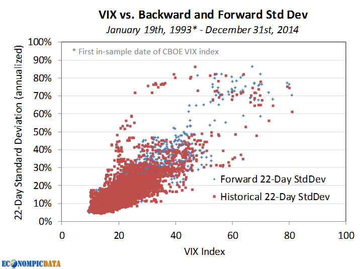
High levels of market volatility tend to lead to continued high levels of market volatility (at least over short periods of time before mean-reversion does its magic). As the chart below highlights, higher levels of the VIX have largely been the result of high market volatility over the previous month, while high levels of VIX tend to lead to higher levels of market volatility over the next month. Putting the old A = B and B = C, so A = C thought process to work, we get to high levels of historical market volatility leading to high levels of future market volatility.


Sharpe Ratios are Higher During Low Volatility Environments

While returns have in fact been a bit higher when volatility is elevated, the relationship has been much weaker than the relationship between historical and forward volatility. As a result, the S&P 500 has had a Sharpe ratio almost 2x higher when the VIX was less than 20 than when it was above 20. As a reminder, Sharpe ratio is excess performance to cash over standard deviation. The lower denominator when volatility is low more than offsets the impact of slightly lower returns on the Sharpe ratio calculation.


Allocating More to Equities when the Sharpe Ratio is Higher = Improved Return Profile

As a result of a higher Sharpe ratio when the VIX is less than 20, an investor could produce higher risk-adjusted returns by allocating more to stocks when the VIX is less than 20 and less when the VIX is above 20. In the example below, stock weights were increased 50% to 150% when the VIX was less than 20 and decreased 50% to 67% when the VIX was above 20 (financed by 3-month t-bills when levered / allocated to 3-month t-bills when unlevered).


While the introduction of leverage brings in a whole assortment of other risks I'll ignore here, the result of the steady volatility allocation over the above time frame is a portfolio with:
  • More consistent year-to-year performance: 12-month standard deviation ranged from 11% to 31% for steady volatility vs. 8% to 45% for the S&P 500
  • Lower drawdown: -47% for steady volatility vs. -55% for the S&P 500
  • Lower overall volatility and higher returns: see above


Source: CBOE, S&P, Federal Reserve

Wednesday, June 10, 2015

The Relationship Between TIPS, Treasuries, and Inflation

TIPS "treasury inflation protected securities" currently provide very little upside (return), but that exact statement can be made about just about any area of the fixed income market. Where they do present a potential opportunity is in relative terms against traditional Treasury bonds. Regardless, this post is less about the opportunity within TIPS and more about the return profile they provide. For a deeper dive into how TIPS function, I recommend this Vanguard piece.


What are TIPS?

TIPS provide an investor with real (i.e. after inflation) returns guaranteed by the U.S. government. You buy TIPS at a real rate, which is lower than traditional Treasuries by a 'break-even' inflation rate determined by the marketplace. For example, in the below post I will assume the nominal rate on a Treasury bond of 2.5% and a break-even inflation rate of 2.0%, resulting in a TIPS real yield of 0.50% (all relatively close to current levels for bonds with a 10 year maturity).


Return Profile of Treasuries vs. TIPS

The below chart is without a doubt an oversimplification, but the most important aspect is that nominal bonds (i.e. Treasuries) provide a nominal return (over a time frame equal to their duration) that is extraordinarily close to their yield to maturity. For this exercise we will ignore the path of returns (i.e. how they got there... which is important), so that we can focus solely on the relationship between inflation and returns (nominal and real).


Treasury Bonds

At the current yield of 2.5% and an 8-year duration, a 10-year maturity Treasury bond WILL provide an investor a nominal return very close to 2.5% over the next 8 years regardless of inflation. As Treasuries do not adjust for inflation, assuming an inflation rate at a constant level over the life of the Treasury bond, the real return of a Treasury bond is simply the nominal rate less the inflation rate. For example, if inflation is 3% and the Treasury bonds only return 2.5%, then real returns are negative -0.5%. On the other hand, if there is deflation, then the real return moves higher. For example, if deflation is -1% and the nominal yield is 2.5%, then the real return is 3.5%.


TIPS

Inflationary Environment
At a real yield of 0.5%, TIPS provide an investor with a real return equal to 0.5% if there is inflation, while the nominal return will increase by the rate of inflation. For example, if the inflation rate is a constant 2%, then TIPS provide the same nominal return as Treasuries (the fact they are the same, means the break-even is 2%). If inflation is above 2%, then TIPS provide a greater nominal return than Treasuries... if less, they provide a smaller nominal return than Treasuries. 

Deflationary Environment
A TIPS investor is guaranteed to receive PAR at maturity, thus is given an embedded "deflation floor" option. As outlined in this Vanguard piece:
TIPS also provide some deflation protection to the principal (but not to the coupon payments). At maturity, if consumer prices have fallen so much that the inflation-adjusted principal would be below par, the Treasury will repay the principal at par value. In this manner, TIPS provide a “deflation floor.”
As a result, while nominal bond real returns move in a linear fashion to changes in inflation rates, TIPS cannot move negative (unless the real yield at purchase was negative) in nominal terms, thus the real return also increases in a deflationary environment (a ~0% nominal return when deflation is 3% = to a 3% real return). 


Conclusion

In normal market environments when inflation is relatively stable, long-term returns tend to be similar for both Treasuries and TIPS. However, TIPS materially outperform in an inflationary environment, while Treasury outperformance is capped by a rate roughly equal to the break-even inflation rate in a deflationary environment. Thus, assuming a view that an inflationary and deflationary scenario are equally likely, the unlimited potential outperformance of TIPS vs. Treasuries in an inflationary environment and limited upside of Treasuries vs. TIPS in a deflation environment would sway an investor towards TIPS.

Wednesday, June 3, 2015

An Improved High Yield Alternative

I really don't like the high yield asset class. Not just in the current environment with near-low historical yields and the potential for material liquidity issues, but in general. As an asset class, I think high yield:

  1. Often caters to unsophisticated investors that only look at the yield
  2. Is riskier than its returns suggest due to an opaque credit market that doesn't as regularly reprice bonds (as they do within equities)
  3. Has unfavorable tax consequences relative to stocks as coupons are taxed at a much higher rate than the capital appreciation of stocks

Historical Performance Comparison to Stocks

One draw of high yield is the view that its performance is from a known yield (vs. the less guaranteed market appreciation of equities). In addition, the Sharpe ratio of the asset class has historically been superior to stocks (i.e. more return per unit of risk). The counter points to that argument is that the Sharpe ratio is overstated as volatility of high yield is under-reported (see point 2 above), as well as the fact that high yield returns are the result of two factors (credit and rates) that can be replicated with an allocation to stocks and bonds (thus a high yield vs. stocks comparison is apples to oranges). Case in point being that a 54% S&P 500 / 46% treasury portfolio since the Barclays High Yield 1983 inception has the same standard deviation and higher returns vs high yield... thus a higher Sharpe ratio. 


Decomposing High Yield Returns

Before getting into details of a high yield alternative, let's decompose historical high yield returns to get a better sense of what an investment in high yield actually provides. 

High yield benefits from the return of two main factors, credit and rates (actually as we'll see it mainly benefits from rates). As the chart outlines below, the credit (spread) component of high yield and the rates component are often well balanced, making high yield a "risk-parity" like allocation between the two factors. As a result, comparing high yield to a blended stock/bond allocation rather than a stand-alone stock or bond allocation makes sense. Or as we'll outline below, there may be an opportunity to replace one of the factors with a more efficient / more liquid component. The below charts break down the returns into these two factors over the past 25 years (as far back as Barclays reports them separately).

Despite a higher contribution to portfolio level risk from the credit (spread) component...

Credit (spread) has provided a materially smaller contribution to the long-term performance of high yield

Swapping in Credit Risk via Equities vs. Bonds

If high yield is a sub-optimal way to access credit risk an investor utilizing leverage can replicate high yield via treasuries for the rate factor and the S&P 500 for the credit / spread factor.

The below chart shows the equity curve of two such options going back to 1983...
  • High Yield Alternative A: scale stocks to provide similar return as high yield: 100% treasuries, 24% S&P 500 financed at 3-month t-bills 
  • High Yield Alternative B: scale stocks to provide similar risk as high yield: 100% treasuries, 46% S&P 500 financed at 3-month t-bills


The Results

Historical results are certainly promising on an absolute and relative basis. Not only were Sharpe ratios improved, drawdowns were materially reduced. In addition, a portfolio consisting of treasuries and the S&P 500 will likely be MUCH more liquid than high yield during periods of turmoil.


Sources: S&P, Barclays, Federal Reserve