Wednesday, March 31, 2010

Does the U.S. Pay Too Little in Taxes?

Before I dive into the post, let me just say that when I discovered the actual amount I owe the Federal government in ~2 weeks, I almost threw up in my mouth. Lets begin...

Greg Mankiw questions measuring the level of taxes solely by the tax rate:
Some pundits, reflecting on the looming U.S. budget deficits, claim that Americans are vastly undertaxed compared with other major nations. I was wondering, to what extent is that true?

The most common metric for answering this question is taxes as a percentage of GDP. However, high tax rates tend to depress GDP. Looking at taxes as a percentage of GDP may mislead us into thinking we can increase tax revenue more than we actually can. For some purposes, a better statistic may be taxes per person, which we can compute using this piece of advanced mathematics (Taxes/GDP x GDP/Person = Taxes/Person):
The below is a chart of the table he references above ordered by each country's tax rate. In this case, the United States is in fact taxed at a very low rate, but is in the "middle of the pack" in per capita terms


Greg's conclusion:
The bottom line: The United States is indeed a low-tax country as judged by taxes as a percentage of GDP, but as judged by taxes per person, the United States is in the middle of the pack.
I feel like an (extremely) exaggerated, but equivalent argument as this is saying a $4000 donation made by a billionaire is similar to a $4500 donation made by someone worth $100,000 (i.e. it may be in theory, but that billionaire is one cheap bastard).

It also matters what the money is used for. In other words, is it going to social services, such as education / training / health care, that promote equality or is it going to...


Before I get called a pacifist... I do understand the importance of our military, but by simple math taxes 'ex Military Spend' equals less tax revenue available for, well, everything else (unless you assume the military allows the United States to take advantage of the global political economy and increase our ability to consume... which we'll ignore for now). Remove this annual military spend from the first chart and it turns out the United States pays less taxes per person excluding military expenses than all but Spain and Japan in the initial chart. In fact, the United States is taxed ~10% less than the next (fourth least) taxed per capita country in the list, Italy (which is 37% smaller in GDP per capita terms).


Greg Mankiw's post was interesting to me in that it brought up a huge point of division between the right and left. On one hand taxes are only justified if they preserve order in society, while on the other the inequality we face has increased the appetite to "make right" all those that have been left behind.

Source: Population / Military Spend

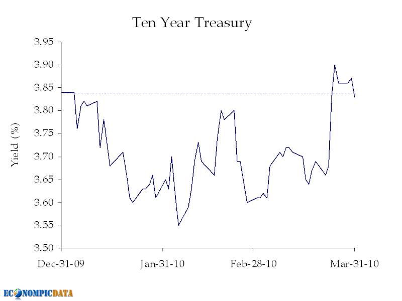
For All the Recent Concern About the Treasury Sell-Off

Volatile? Yes. But, the yield of the ten year treasury bond is only 2 bps above below the level seen at the end of the year.


Source: Bloomberg

Chicago PMI Shows Expansion, but at Slower Pace

Marketwatch details:

Investors were also disappointed Wednesday by a survey of Chicago-area purchasing managers that showed U.S. business activity continued to expand in March, but at a slower pace than the previous month. The Institute for Supply Management-Chicago said its business barometer slipped to 58.8 in March, from a nearly five-year high of 62.6 in February. Economists expected a reading of 60.8.

Still, Croft noted that a reading above 50 still reflects expansion. "We think the economy is marching forward here, but not at an extremely fast pace," he said.


Source: Briefing

ADP Employment... Not Yet "Back in Black"

Peter Boockvar (via The Big Picture) reported pre-release:

While many are waiting for Friday’s Payroll figure to tell them the state of the US labor market, I’m going to rely on today’s ADP report as a better gauge. That is because it is private sector based and thus won’t be distorted by the likely 100k+ adds of government census workers and the “methodology used to construct it” takes out most of the impact of the Feb snow storms and March snapback. Thus, a cleaner number will result and expectations are +40k, the first positive reading since Jan ‘08.

It turns out that 40,000 was a bit optimistic as ADP showed a contraction of another 23,000 jobs. If these figures are to be believed (we will see "official figures" Friday), then we may have to wait for April for the private sector to stop contracting.


Source: ADP

European Unemployment to 11 1/2 Year High

Business and Finance reports:

Euro zone inflation was much higher than expected in March and the unemployment
rate reached 10 percent in February, data showed on Wednesday, highlighting the fragility of economic recovery.

Inflation in the 16-country area was 1.5 percent year-on-year, the highest since December 2008, after 0.9 percent in February, the European Union's statistics office said.

The March figure was lower than the European Central Bank's target of just below 2.0 percent inflation. Analysts believe the bank will leave its interest rates unchanged until late 2010 or 2011.

The euro zone's 10 percent jobless rate in February was the highest since August 1998 and in line with market expectations. A month earlier unemployment was at 9.9 percent.


Source: Eurostat

Tuesday, March 30, 2010

Housing Prices Flat Year-over-Year

And to get here all it took was subsidized financing (i.e. $1.25 Trillion in mortgage purchases by the Fed), the bailout of Fannie / Freddie / banking system, 0% fed funds, tax credits, and new home supply at 50 year lows.


But as I've asked before, what happens going forward? At some point the market must reflect supply / demand at a "natural" clearing price. And that clearing price will depend on how sustainable the recovery truly is.

Source: S&P

UK Housing: The Benefit of a Weaker Currency

While a weak currency isn't ideal in all situations, it seems that a weaker sterling is helping to reinflate the U.K. housing market. Ed over at Credit Writedowns provides details of the rebound:

The Nationwide, the UK’s largest building society, released data this morning showing that UK house prices rebounded in March from February’s dip. The average UK home now costs £164,519, up 9% from year ago levels. Much of the increase has been driven by supply-demand imbalances with a dearth of properties coming to market in the poor economic climate of 2009.
A weak sterling has caused the housing market to be awfully attractive to investors outside the U.K. An example can be seen below, comparing the change in the price index in both local currency (sterling), as well as the dollar.


Source: Nationwide / Yahoo Finance

Confidence Rebounds... Remains Low

Bloomberg details:

Confidence among U.S. consumers climbed in March as Americans perceived employment was starting to improve.

The Conference Board’s confidence index rose to 52.5, exceeding the median forecast of economists surveyed by Bloomberg News, from 46.4 in February, the private research group’s report showed today. Another report showed home prices rose in January.

“With signs of improvement in the labor market, confidence is more likely to be up than down in the next few months,” said James O’Sullivan, chief economist at MF Global Ltd. in New York, who forecast sentiment would pick up. “It’s still a low level of confidence.”


Source: Conference-Board

Monday, March 29, 2010

Japanese Production Takes a Breather

Bloomberg details:

Japan’s industrial production retreated in February, snapping an 11-month winning streak that helped to secure a recovery from the country’s worst postwar recession.

Factory output declined 0.9 percent from January, when it rose 2.7 percent, the most in eight months, the Trade Ministry said today in Tokyo. The median estimate of 24 economists surveyed by Bloomberg News was for a 0.5 percent drop.

The slide is unlikely to last as Asian demand for the country’s electronics and machinery continues to fuel exports, Junko Nishioka, chief economist at RBS Securities Japan Ltd. in Tokyo, said before the report was published. Factory output and exports have yet to return to their peak set two years ago, and the recovery remains plagued by deflation.
While today's 0.9% slide wasn't a surprise to the upside like yesterday's consumption release, it also wasn't that unexpected considering the huge jump we saw in January (industrial production is still up considerably from December's figure).


Putting it all together...

The good news is production is up considerably from lows. The bad news is how far things fell (i.e. can businesses operate profitably at these new levels). Relying on the United States for recovery is a concern, but the benefit of being situated near a red-hot China allows room for optimism.

Source: METI.Go

Are Americans Already Back to Their Old Ways?

Financial-Planning reports:

While 63% of Americans said they were concerned about the overall state of financial markets in 2009, just 45% said they were concerned in 2010.

Nervousness and fear about retirement dropped from 55% who were nervous or afraid last year to just 40% this year. American's concern about having enough money to retire has fallen from 56% in 2009 to 51% this year, the same as in early 2008, the study found.

“Americans appear more relaxed about retirement and are far less worried about their finances overall,” said Craig Hogan, Scottrade’s director of customer intelligence. “The number of people who reported being concerned about issues such as day-to-day expenses, education costs, paying off credit cards, and saving for big ticket purchases didn’t just decline – each category hit a four-year low.”

Which leads us to this morning's personal consumption and expenditure report. To the NY Times:

U.S. consumer spending rose as expected in February for a fifth straight month, while stagnant incomes pushed savings to their lowest level since October 2008, a government report showed on Monday.

The Commerce Department said spending increased 0.3 percent after rising by a slightly downwardly revised 0.4 percent in January. Consumer spending in January was previously reported to have increased 0.5 percent.


Source: BEA

Sunday, March 28, 2010

Japanese Consumer Showing Signs of Life

Bloomberg details:

Japan’s retail sales gained at the fastest pace in more than a decade in February as the economic recovery spread to households.

Sales rose 4.2 percent from a year earlier, the Trade Ministry said today in Tokyo. That was the biggest monthly jump since March 1997, when they advanced 12.4 percent, according to Bloomberg data. The median estimate of 12 economists surveyed was for a 1.6 percent climb.

An export-fueled recovery and government stimulus spending are beginning to create jobs and support wages, improving prospects for companies including Dydo Drinco Inc. A turnaround in employment will continue to support consumer spending, according to economist Julian Jessop.

From a month earlier, retail sales unexpectedly climbed 0.9 percent, the second consecutive gain. None of the eight economists surveyed by Bloomberg News predicted an increase, and their median estimate was for a 1.2 percent drop.

Consumer confidence advanced for a second month in February, led by sentiment about employment, a sign households may boost outlays in coming months as fears of being fired recede. Japan’s economy added the most jobs in more than three decades in January, unexpectedly sending the unemployment rate to a 10- month low of 4.9 percent. Workers’ pay declined at the slowest pace in 19 months.
While the 4.2% year over year jump is against a collapsed low, the fact that the Japanese consumer has come back to near pre-crisis spending levels is encouraging for any lasting recovery.


Source: Meti.GO

Thursday, March 25, 2010

The Social Security Tipping Point?

The NY Times reports:

The bursting of the real estate bubble and the ensuing recession have hurt jobs, home prices and now Social Security.

This year, the system will pay out more in benefits than it receives in payroll taxes, an important threshold it was not expected to cross until at least 2016, according to the Congressional Budget Office.

and
The problem, he said, is that payments have risen more than expected during the downturn, because jobs disappeared and people applied for benefits sooner than they had planned. At the same time, the program’s revenue has fallen sharply, because there are fewer paychecks to tax.
It is important to note that there is still an overall surplus due to the interest received on the fund, thus the overall balance continues to grow, but we are getting closer and closer to the tipping point unless growth surprises to the upside or changes are made to the current structure.


Source: CBO

On the Housing "Gap"

I got the idea from Calculated Risk to directly compare new with existing home sales. A huge "gap" exists between the two which was explained by CR as:

The initial gap was caused by the flood of distressed sales. This kept existing home sales elevated, and depressed new home sales since builders couldn't compete with the low prices of all the foreclosed properties.

The spike in existing home sales last year was due primarily to the first time homebuyer tax credit.

I took it one step further and broke out new and existing home sales by region to see where the phenomenon above had a greater impact.

The first chart shows the "gap" (i.e. the huge collapse in new home sales vs. existing).


The second is the ratio for each region over the past 10 years of new-to-existing home sales. Here we can see that each region (not surprising) was not affected the same. The areas impacted most (by far) were the west and south; the two areas hurt most by the run-up and subsequent collapse of their housing markets.


Source: Realtor / Census

Wednesday, March 24, 2010

Treasuries Sell-Off on Soverign Concern

Bloomberg reports:

The yield on the 10-year Treasury note rose to 3.85 percent, the highest since Jan. 8. The euro weakened against 12 of its 16 most-traded peers at 2:15 p.m. in New York and fell to a 10-month low against the dollar. The MSCI World Index of stocks in 23 developed nations slid 0.8 percent and the Standard & Poor’s 500 Index fell 0.5 percent, retreating from an 18-month high. The Reuters/Jefferies CRB Index of commodities dropped to a five-week low as oil slid 1.5 percent, copper lost 1.4 percent and lead tumbled 4 percent.

A record-tying $42 billion sale of five-year debt drew a higher-than-forecast yield and lowest demand since July from a group of investors that includes foreign central banks. France and Germany are nearing agreement on International Monetary Fund involvement in any aid package for Greece, according to a finance ministry official in Berlin, spurring concern the European Union won’t rescue the nation itself. The Portugal downgrade heightened concern that more European nations will struggle to fund swelling deficits.


Source: Yahoo

Durable Goods Jump on Continued Strength in Aircraft

The AP details:

Orders for big-ticket manufactured goods rose for a third consecutive month in February, bolstered by strong demand for commercial aircraft and machinery. The
hope is that continued strength in manufacturing will help sustain the economic recovery.

The Commerce Department said Wednesday that orders for durable goods advanced 0.5 percent last month, slightly lower than the 0.7 percent gain that economists had expected.

The increase was led by the second huge jump in demand for commercial aircraft, an increase of 32.7 percent which followed a 134.9 percent rise in this volatile category in January.

Below is the monthly gains by category:


As detailed above, the increase was driven by commercial aircraft (durable goods ex commercial aircraft was down 0.9% for the month) now up 211% since December!


Source: Census

Tuesday, March 23, 2010

Japanese Trade Shows Mixed Balance

Bloomberg report:

Japan’s export growth accelerated to 45.3 percent in February, led by Asian demand that increased the likelihood the economic recovery will be sustained.

The year-on-year increase was faster than January’s 40.8 percent, the Finance Ministry said today in Tokyo. The median estimate of 17 economists surveyed by Bloomberg News was for a 45.7 percent gain.

Imports climbed 29.5 percent in February from a year earlier, resulting in a trade surplus of 651 billion yen ($7.2 billion). The median estimate of 22 analysts surveyed was for 560.6 billion yen.
The strong export growth was driven by a large jump in exports to the United States (as well as the above mentioned Asian demand), but unlike Asian (including China below), trade did not flow both ways with the United States. The below chart shows the collapse in trade (imports and exports) between the United States and Japan during the crisis and the lack of a full rebound in exports to the United States and absolutely no budge in imports from the United States.


Source: Customs.GO

Americans... Hate... Everything

Bloomberg details:

The majority of poll participants -- 56 percent -- say big financial companies are more interested in enriching themselves at the expense of ordinary people, while 40 percent say such firms play a vital role in enabling the economy to grow.

At the same time, Americans are divided over the scope of government regulation. More than 40 percent of Americans say the government has gone too far in measures to fix the financial industry; 37 percent say it hasn’t done enough. Almost six out of 10 people say Wall Street hasn’t gone far enough on its own to protect against future emergencies.
And...


Source: Selzer & Co

Update:

Nelson did not appreciate the post:

Americans don't hate everything. They know they have been ripped off by the "FIRE economy, and the bought for congress. It is disingenous of you to label Americans as "hatas" when the whole financial economy is Lehman like, or are you too blinded by cutesy picturesque pie graphs and columns to see the graft from the graph? Either you help denounce the thieves, or you contribute to the cover up.

Disgusted@econompic

My response:

disgusted@econompic = another thing americans hate... econompic! (it was sarcastic people [nelson- you obviously do not read this blog regularly which is fine, but i hope i have done at least my share of "denouncing the thieves"]).

that is all besides the point. the main point and what i find interesting is not that everyone is fed up with the financial system (that makes sense), but how divided everyone is on... well, everything.

~half of americans hate the health care reform / ~half really like it.
~half say the gov't hasn't done enough / ~half say they've done too much

while the cutesy picturesque charts above shows americans view on business, the financial system, and government... we can add religion in schools (either side of the debate), abortion, war in the middle east, etc... and we'll still get close to 50% of people who do not approve.

that was my point... you cannot make americans happy doing anything, so leadership should simply just try to do what is right.

Risk Assets vs. Money Market Flows...

I must say the below chart is interesting, but as we all know "correlation does not imply causation"...


So did the fear that caused the sell-off in risk assets ALSO cause the flight to money markets (and the subsequent ease of fear that caused the reversal to occur) OR did the flows from money markets itself cause the rally?

Source: BarCap / ICI

Monday, March 22, 2010

Commercial Real Estate Bottoming?

Commercial real estate prices rose for the third straight month, bouncing from an epic collapse, on lower volume (less transactions), but higher dollar volume.

Before we jump into the details, as Calculated Risk notes:

Beware of the "Real" in the title - this index is not inflation adjusted. Moody's CRE price index is a repeat sales index like Case-Shiller - but there are far fewer commercial sales - and that can impact prices.
The below two charts (index level and year over year change), both show what appears to be a bottoming in the commercial real estate market.


Year over Year Change


So have we hit a bottom? For the time being... possibly. But longer term, I am not so sure in nominal terms and even less confident in real terms.

Lets put the current price level in perspective. We have come a LONG way (down 44% from peak to current trough), but price levels are now just slightly below the level seen in January 2001 (in real terms). What's different now than then?
  • Less demand (3,000,000 less people employed and office vacancy rates at 18% [up from 8%] in 2001)
  • Significantly more supply (anyone have a source for square footage?)
  • Less credit available for purchases
Source: MIT

Chicago Fed National Activity Declines in February

Reuters details what the index shows:

Zero values in the index indicate a national economy expanding at historical trends, while negative values indicate below-trend growth and positive values signal growth above trend, the Chicago Fed said. The 85 economic indicators that comprise the Chicago Fed's index are drawn from four categories: production and income; employment, unemployment and hours; personal consumption and housing; and sales, orders and inventories. The three-month moving average provides a more consistent picture of national economic growth compared to the more volatile monthly index.
And the three month average fell to -0.64 in February from -0.04 in January (i.e. below trend growth).


Source: Chicago Fed

Global Productivity and Unemployment

The Economist details:

Producing more by working less is the key to rising living standards, but in the short term there is a tension between efficiency and jobs. America and Europe have managed this trade-off rather differently.

America has gone on a diet: it has squeezed extra output from a smaller workforce and suffered a big rise in unemployment as a consequence. Europe, meanwhile, is hoping to burn off the calories in the future. It has opted to contain job losses at the cost of lower productivity. That probably means America’s recovery will be swifter. Further out, productivity trends in both continents are likely to be uniformly sluggish.
Below is a chart showing just how varied the economic results have been between the U.S. and the fifteen member EU-15 have been.


Longer term, the chart below shows just how much more the United States has been able to squeeze out from its workers over the previous few decades (and I threw in Brazil to show just how sizable the growth potential is for emerging market countries simply to "catch-up" to the developed world).


The interesting thing is related to timing of the chart. Just a few years ago when unemployment was much lower and average hours worked per week was much higher, the chart would have looked much different. It was at that point in time that the European countries were more productive with their workforce as they tended to work much less.

Now the question becomes how much more will we really be able to squeeze out of those workers left? At some point that answer is "not much" and companies will be forced to hire.

Source: Conference Board / The Economist

Sunday, March 21, 2010

Movie Business Still Golden

Box Office Guru details another strong weekend, in a year that is handily beating the record year that was 2009:

The Red Queen ruled once again as Disney's Alice in Wonderland remained at number one for the third consecutive frame beating out another pack of new releases. Fox's tween comedy Diary of a Wimpy Kid beat expectations to open in second place while Sony's Jennifer Aniston-Gerard Butler vehicle The Bounty Hunter enjoyed a solid debut of its own close behind in third. But Universal's new action entry Repo Men flopped in fourth with a miserable showing. The overall box office was up over 2009 for the fourth straight weekend.
YTD box office results are now a whopping 33% higher than just 4 years ago.


Source: Box Office Mojo

Friday, March 19, 2010

EconomPics of the Week: Go Pitt Edition

I didn't go to Pitt, but I grew up with them and I hope they can help the Big East rebound from the opening day fiasco.

Investing
Quality Spread Rotation
High Yield vs. Investment Grade Corporates
China "Officially" Largest Treasury Holder
Housing Starts Stagnant

Economics
Leading Economic Indicators Point to Slowing Recovery
CPI Shows Lack of Inflationary Pressure
PPI Stabilizing
Industrial Production Grows Despite Weather
NY Manufacturing Index Shown Strength

Random
March Madness Bracket Help

In honor of the NCAA tournament (and the time it has taken away from blogging), here is a highlight of the best buzzer beaters in NCAA tourney history.

Leading Economic Indicators Point to Slowing Recovery

Missed this yesterday as my mind was elsewhere (think hoops). Businessweek detailed:

The index of U.S. leading indicators rose 0.1 percent in February, the smallest gain in almost a year, pointing to an economy that may expand at a slower pace in the second half of 2010.

A pickup in manufacturing in the last half of 2009 that helped spearhead the recovery has prompted companies to slow the pace of job cuts. Stronger economic growth hinges on employment gains that have yet to occur, one reason Federal Reserve policy makers this week kept interest rates near zero.

“We don’t expect this to be an especially strong recovery,” said Scott Brown, chief economist at Raymond James & Associates Inc. in St. Petersburg, Florida, who accurately forecast the LEI increase. At the same time, “growth is still positive,” he said, and the index “is still consistent with a gradual economic recovery.”


Thursday, March 18, 2010

CPI Shows Lack of Inflationary Pressure

Marketwatch reports:

U.S. consumer prices were unchanged on a seasonally adjusted basis in February, with falling energy prices offsetting increases in prices of cars, medical care and food, the Labor Department reported Thursday.

In the past year, the CPI has risen 2.1%. The core rate is up 1.3% in the past year, the smallest year-over-year increase in six years.
As can be seen below, the headline has been all transportation costs (i.e. price of gas) flowing through to the consumer.


Source: Federal Reserve / BLS

Wednesday, March 17, 2010

Quality Spread Rotation...

Earlier this week EconomPic took a look at the relative returns of high yield vs. investment grade corporate bonds given the spread between the yield levels of the two. In a nutshell, when spreads between high yield and investment grade are 600+ bps, high yield has significantly outperformed. Otherwise, performance has been mixed (see chart).

Below, equities are thrown into the mix. The chart uses the same x-axis as yesterday's analysis (the spread between high yield and investment grade corporate bonds), while the y-axis shows one year forward excess return of both the S&P 500 (including dividend reinvestment) and high yield.


Unlike the strong correlation between changes in high yield spread and the performance of the S&P 500 that we've seen in the past, the performance of each is very different when spreads are low or when spreads are high*.

Which leads to the next chart detailing returns of investment grade, high yield, and the S&P 500 using the same "spread" metric, but showing the average annual performance of each in absolute terms across three "spread buckets" since 1994.


Now the fun begins.... assigning a 'best performer' to each bucket (S&P 500 when spreads are narrow, investment grade credit when spreads are "mid", and high yield when spreads are wide) and allocating monthly to the 'best performer' based upon the month-end spread differential between high yield and investment grade, we get the 'rotation' returns generated below.


While investment grade, high yield, and equities (i.e. the S&P 500) have all provided remarkably similar returns since 1994 (which is as far back as I was able to pull high yield spread data), the 'rotation' returns have significantly outperformed, up more than 11% per year with a similar level of volatility (compared to 7.3% annualized returns for the S&P 500 with more than 15% volatility).

It will be interesting to re-run the analysis as I dig up high yield data going back further, but in the meantime we need an official name for this type of rotation as "Quality Spread Rotation" isn't cutting it.

Any ideas?


Source: Barclays Capital


* Low:

When spreads between high yield and investment grade are low it likely:

  • Means that more investors are risk seeking on the margin
  • Reflects a decent economic environment
  • Equates to cheap fixed income financing for corporations (low spreads on borrowing costs)
All of which feed into higher earnings (all else equal) and earnings flow through to equity investors. Throw in the potential P/E multiple expansion when spreads are tighter and you get a great environment for equities.

High:

When spreads are high, those higher coupon payments are made to the high yield investor and everything detailed above is reversed. At the same time, high yield investors have a more secure spot in the capital structure than owners of equity, thus first rights to a corporation's assets if there are defaults (i.e. they have recovery value, whereas equity investors do not).

PPI Stabilizing...

Marketwatch reports:

Wholesale prices fell a larger-than-expected 0.6% in February after seasonable adjustments, with energy prices falling 2.9%, the Labor Department reported Wednesday. This is the largest decline since last July. The producer price index has risen 4.4% in the past year, the government said.

The core PPI - which excludes food and energy prices - rose 0.1% in February, more than expected. Core prices are up 1.0% in the past year. Economists surveyed by MarketWatch expected a 0.3% fall in the headline PPI and a 0.1% decline in the core rate. The PPI had risen 1.4% in January, while the core rate was up 0.3%.

Of all the information portrayed in the chart below, the most telling is the relatively low year over year headline PPI figure when compared to the spike in energy and materials.


It shows just how powerful the relationship is between the cost of labor and finished goods.

Source: BLS

Tuesday, March 16, 2010

Housing Starts Stagnant

Business Week details:

Housing starts in the U.S. fell in February as record snowfall in parts of the country hampered construction, while fewer building permits signaled demand is stagnating.

Builders broke ground on 575,000 homes at an annual rate last month, down 5.9 percent from January’s revised 611,000 pace that was higher than initially estimated, Commerce Department figures showed today in Washington. Building permits, a sign of future construction, decreased for a second month.

The overall drop has been nothing short of epic...


Source: Census

March Madness Bracket Help

A repost from last year just in time for opening tip off (note the chart does not include games from 2009)...


Source: Bleacher Report

Monday, March 15, 2010

High Yield vs. Investment Grade Corporates

As of the end of February, the spread on the investment grade corporate bond index was ~170 bps and the high yield index ~650 bps (up from the 1994-2010 average of 140 bps and 510 bps respectively). Below is a chart of the variance between the two since 1994 (as far back as I was able to pull data).


Below is the relationship between this variance and the subsequent 12 month out/under performance of high yield relative to investment grade corporate bonds. As can be seen, there appears to be a weak relationship between spread variance and performance when spreads are "tight" (in this case less than 600 bps [in blue], where correlation is -0.31), but when spreads were north of 600 bps [in red], correlation spiked to 0.75 (though it is important to note that spreads have only been this wide in two periods and 19 months since 1994 [i.e. small sample set]).


Below is a chart of the above data in a different form broken out by spread "bucket" rather than as a scatter plot. Again, except when spreads were at "world is ending" levels (and the world didn't end), high yield has tended to underperform.


The important point I will make is that any investment in high yield is by definition... risky. Especially at relative "tight" levels coming out of the worst credit crisis since the Great Depression.

Source: Barclays Capital

Industrial Production Grows Despite Weather

WSJ reports:

U.S. industries reduced manufacturing output in February because of severe weather, while overall production totals inched ahead slightly. Industrial production last month increased by 0.1%, the Federal Reserve said Monday. That falls in line with the expectations of economists surveyed by Dow Jones Newswires. January output remained unchanged at 0.9%.

The biggest gain in the report showed output in the mining industry rose 2.0% after climbing 1.1% in January. Mining capacity use rose to 88.2% from 86.4%. Still, manufacturing production in February decreased 0.2% from the previous month's 0.9% increase, the report said. Car and parts output showed a steep dip of 4.4%. excluding autos, production in all other industry remained stagnant.


China "Officially" Largest Treasury Holder

Last month Bloomberg reported:

China’s ownership of U.S. government debt fell in December by the most since 2000, allowing Japan to regain the position as the largest foreign holder of Treasury securities. Japan’s holdings rose 1.5 percent in December to $768.8 billion while China’s dropped 4.3 percent to $755.4 billion, Treasury Department figures today showed. China allowed its short-term Treasury bills to mature and replaced them with a smaller amount of longer-term notes and bonds, the data showed.
As I countered last month:

So (most of / some of?) these purchases by the United Kingdom were likely on behalf of China.
It looks like a portion of the figures were revised in the latest release.


China's total holdings of Treasuries is now listed at $889 billion, compared to $765 billion for the Japanese.

So China is still THE major player... BUT if they decided to reduce this dominance, Paul Krugman makes the case that it would not be a bad thing given the current situation.

The US private sector has gone from being a huge net borrower to being a net lender; meanwhile, government borrowing has surged, but not enough to offset the private plunge. As a nation, our dependence on foreign loans is way down; the surging deficit is, in effect, being domestically financed.

The bottom line in all this is that we don’t need the Chinese to keep interest rates down. If they decide to pull back, what they’re basically doing is selling dollars and buying other currencies — and that’s actually an expansionary policy for the United States, just as selling shekels and buying other currencies was an expansionary policy for Israel (it doesn’t matter who does it!).

Source: Treasury

NY Manufacturing Index Shown Strength

Marketwatch details:

Manufacturing activity in the New York region continued at a solid pace in March, the New York Federal Reserve Bank said Monday. The bank's Empire State Manufacturing index slipped to 22.9 in March from 24.9 in February. The index had plunged in December but has since recovered. The details of the report were strong. The new orders index shot up 17 points to 25.4. Shipments also moved higher. Inventories climbed above zero for the first time since August 2008.

The index for the number of employees rose to its highest level in more than two years. The Empire State index is of interest to investors and economists primarily because it is seen as an early indicator of what the Institute for Supply Management's March national factory survey due out in two weeks may show. In February, the ISM manufacturing index inched lower to 56.5 but continued to point to solid growth in the factory sector.


Source: NY Fed

Friday, March 12, 2010

Consumer = Unhappy, but Spending

Confidence Falls

Per Marketwatch:

U.S. consumer sentiment dipped in early March, according to media reports on Friday of the Reuters/University of Michigan index.

Amid signs that the labor market is approaching a trough but remains frail, the consumer sentiment index declined to 72.5 in March from 73.6 in February. Economists surveyed by MarketWatch had been expecting the sentiment index to hit 74 in March.

Yet, Still Shopping


Retail sales showed strength in February. Per the AP:.
For February, sales rose 0.3 percent, the Commerce Department said Friday. That surpassed expectations that sales would decline 0.2 percent.

The overall gain was held back by a 2 percent decline in auto sales, reflecting in part the recall problems at Toyota. Excluding autos, sales rose 0.8 percent. That was far better than the 0.1 percent increase excluding autos that economists had forecast.


If you're going to stay home (unemployed), perhaps that is cause for the new flat panel TV or laptop?

Calculated Risk does point out that while the trend is improved, the overall level is actual less than what was reported just one month ago:
January was revised down sharply. Jan was originally reported at $355.8 billion, an increase of 0.5% from December.

February was reported at $355.5 billion - a decline without the revision to January.
In other words, reports got ahead of themselves (no surprise), but the actual trend remains moving in an upward trajectory even though things quite frankly suck for the average consumer.

Source: Census

Thursday, March 11, 2010

The Changing Face of American Debt

The Federal Reserve released their latest Flow of Funds report, which contains TONS of great info. Below is a look at the change in debt outstanding by sector (as a percent of GDP) over a variety of periods since 1979.


1979 - 1989:

The "decade of debt" was led by the Federal government (Federal debt to GDP jumped from 26% to 41%) thanks to huge tax cuts, but businesses weren't far behind due to the leveraged buyout craze that saw over 2000 leveraged buyouts between 1979 and 1989 (and business debt to GDP from 53% to 66%).

1989 - 1999:

This decade saw continued growth in housing related debt (home mortgages grew from 33% in 1979 to 41% in 1989 to 47% in 1999). On the other hand, businesses and all three segments of the government delevered as there was a Federal budget surplus (seems impossible).

1999 - 2007:

In the next 8 years, the housing bubble was king. Home mortgages grew to 75% of GDP (2.3x the level of 1979) and helped keep consumer debt in check (have credit card debt? Simply take out a home equity loan to pay it down). Businesses once again levered up with cheap financing and a wave of private equity buyouts (business debt grew from 65% of GDP to 76%). The Federal government did continue to delever, as the economy outpaced the growth in the Federal government's debt (though the majority of this was due to a 5% decline in the Federal debt level from 1999 to 2000 (from 39% to 34%).

2007 - 2009:

The financial crisis wiped out a significant share of these debt levels, with home mortgages declining 2.5% and consumer credit a bit less than 1%, though as discussed earlier this was due to default vs. paydowns. The big story of course has been the change in outstanding debt issued by the Federal government (from 36% of GDP to 55% in 2 years!).

Source: Federal Reserve

Update: Changed the title of this post based on a title given to it when linked to by Real Clear Markets... credit, where credit is due

On the Price Stickiness of Imported Oil

In brief... there doesn't appear to be much...

(NOTE: the axis on the right hand side is REVERSED )


Source: EIA / Census

U.S. Trade Back to "Normal"

Marketwatch details the latest release:

After widening dramatically for two months, the U.S. trade deficit reversed course and narrowed unexpectedly in January, government data indicated, suggesting that the economic recovery remains tentative.

The trade deficit shrank a seasonally adjusted 6.6% to $37.29 billion from $39.90 billion in December, the Commerce Department said Thursday.

The one-month improvement in the deficit marked the biggest since last September.
The trade gap had jumped by 9.7% in November and by 10.5% in December -- reports that economists said had a strong-economy feel about them as the appetite for imported goods was robust.

The chart below details the longer term trend for imports and exports. For imports, an increase is a negative (a drag on GDP) whereas an increase in exports is positive (a plus on GDP). It shows that things have "normalized" after a huge reversal in post-crisis.


Source: Census

Was Consumer Delevering Part II

On Monday I asked if the consumer was relevering and showed the below chart (makes special note of the revolving debt).


Felix Salmon with some interesting analysis that shows perhaps they never really were:
It turns out that while total debt outstanding dropped by $93 billion, charge-offs added up to $83 billion — which means that only 10% of the decrease in credit card debt — less than $10 billion — was due to people actually paying down their balances.


Source: Cardhub

Wednesday, March 10, 2010

Explaining Inventory Rebuild

I received a comment asking for better clarity as to why this morning's Wholesale Sales / Inventories report may be good news (stronger sales, less of a freefall in inventories)... before I dive in, please note that the below assumes all the figures are real (i.e. adjusted for inflation, which they are not). Here goes...

First the Legend

Red = Wholesale Production (rolling three month change); as measured by three month change in sales +/- the three month change in inventory (if inventories increase, then production = sales + change in inventories as some production was used to add to inventory levels).

Blue = Wholesale Sales (rolling three month change)

Orange = Variance between the two


As can be seen there was a negative feedback loop when the initial financial crisis hit that resulted in sales falling AND actual production plummeting (business just sold out of inventory rather than re-order stock) due to all the uncertainty (the initial decline likely caused sales to drop further as businesses stopped receiving new orders, which caused production to drop even further....)

The good news (now) is that when the inventories stopped freefalling, production levels actually ramped up faster than sales as new orders flowed right through inventories. As detailed at the top of this post, production is calculated from sales +/- the change in inventory, thus as long as the negative change in inventories becomes smaller (it doesn't need to grow), the production level increases relative to sales (which it did starting last summer and is now ~5% higher than actual sales).

This led to a huge amount of the GDP growth in Q3 and Q4 (~2/3 of all growth in Q4 was inventory rebuild). My whole point is that the sales level is actually showing decent growth too, thus the base (ignoring inventories) for production is growing. Add to that base any incremental impact of an actual inventory rebuild and you have the makings for some very good news.

Source: Census

Promising Wholesale Figures

WSJ reports:

U.S. wholesalers' inventories unexpectedly fell 0.2% in January, the Commerce Department said Wednesday, as surging demand pulled goods off shelves in the first month of the year.

Wall Street analysts had expected inventories to rise by 0.2% in January. The unexpected decline followed a downward revision in December's inventory level showing December inventories contracted by 1.0%, rather than the 0.8% drop originally reported.

Sales by U.S. wholesalers in the first month of 2010 were up 1.3% to a seasonally adjusted $346.7 billion, the latest data showed. It was the tenth straight monthly increase in sales, according to the Commerce Department. Sales were particularly strong for cars and groceries.

The decline in inventories appears to be good news for the U.S. economy. A pileup in inventories doesn't always bode well for future production or for future economic growth, and a decline may indicate that demand is outpacing supply.

The amount of wholesale goods on hand relative to sales was 1.10 in January, a record low. The inventory-to-sales ratio measures how many months it would take for a firm to deplete its current inventory. The ratio in December was 1.12.

If one were to believe these figures, then on the margin this is likely a detractor for Q4 GDP and Q1 GDP (a decline in inventory means less was actually produced to meet end-user demand - I am just not convinced actual inventories declined for real in January, just as I didn't believe they actually jumped back in November). Either way, the jump in end-user demand is good news (as long as it is real and not nominal... not sure how to figure out the flows though).

Wholesale Sales


Wholesale Inventories


The question is when will businesses not only slow the trend of a decline in inventory levels, but actually build? If end-user demand continues to show its head, we may FINALLY be getting there (though there is likely plenty of excess capacity ready to meet this demand before it flows through to hiring and capex spending).

Source: Census