Tuesday, December 5, 2017

Can Time Solve the Issue of High Valuations?

“Time solves most things. And what time can't solve, you have to solve yourself.” - Haruki Murakami 

Recent research by GMO outlined that wide profit margins, low levels of inflation, subdued economic volatility, and low 10 year treasury rates have led to high valuations for both U.S. stocks and bonds. Yet irrespective of why valuations are high relative to history, what an investor pays for a dollar of earnings or a dollar of bond coupons directly impacts the forward return they receive. This is generally understood by investors who have accepted the likelihood that returns will be low over the next five or even ten years. What has been discussed less, or often dismissed outright by buy-and-hold long-term investors, is the similar challenge investors may face over much longer periods of time given high starting valuations.


The Issue: Annualized Returns Can Mask the Effect of Compounding 

Annualized returns are commonly used to compare asset class performance over various time frames. The issue is annualized returns trivialize the effect of compounding, especially over longer periods. As an example, the following chart compares annualized returns for:
  1. an investment that is down -50% in year 1, which then returns 10% each year for the next 29 years
  2. an investment that returns 10% each year for the full 30 years 
We can see the large return gap between the two investments in year 1, as well as what appears to be a narrowing of that gap over time from a 10% annualized differential in year ten to a 3% annualized differential in year thirty. 


In reality, the return gap is getting larger in dollar terms as the same 10% earned each year after year one is from a much larger base for the investment that was not dragged down by the initial 50% decline.


A Revised Perspective

One way to view valuation of the U.S. stock market is the cyclically adjusted price to earnings “CAPE” ratio (a measure of the price an investor pays for each $1 of historical normalized earnings). This ratio can be converted to a yield by inverting it (i.e. a CAPE of 30x = 1/30x or a roughly 3% yield) as a means of making it more comparable with current bond yields. We can then calculate a yield for a traditional balanced 60% stock / 40% bond portfolio “60/40”, by using the formula ‘60% CAPE yield + 40% bond yield = 60/40 yield’.

This 60/40 yield has provided strong explanatory power for forward annualized ten year real (after inflation) returns going back to 1926 (Ibbotson data inception).


This 60/40 yield has also provided strong explanatory power for much longer 30-year forward annualized returns. The issue is annualized returns makes it appear that the range of outcomes, relative to starting valuations, narrows over longer periods of time, an argument commonly used by buy-and-hold investors. In reality, the comparison of annualized returns over different time frames masks the compounding effect of these seemingly small return differences.


The following chart removes this effect by showing the real growth of $1 for each these starting valuations over 10 and 30 years instead of annualized returns. We can clearly see that the gap in dollar terms widens significantly over longer periods, as the compounding effect has more time to work its magic.


The “we are here” line in this chart highlights how extreme current stock and bond valuations are relative to history, creating an environment where time itself may not be a solution to the valuation challenge.


 What Can an Investor Do? 

For an investor looking to improve their outcome, there are a variety of options available, including: ­
  1. Search for Value: reallocate capital to segments of the US equity market (or outside the US equity market) that may be more attractive ­
  2. Identify Alpha Opportunities: rethink the value proposition of active management, especially within less efficient areas of the market ­
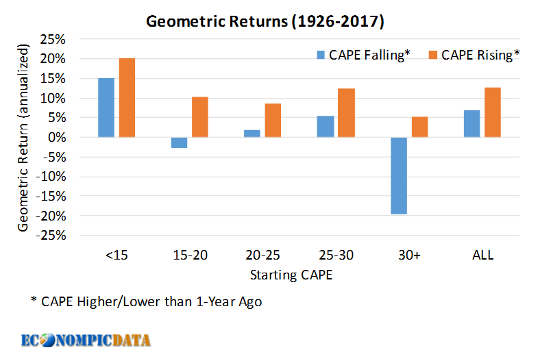
  3. Follow the Trend: utilize trend following to manage equity exposure 

The first two options are familiar to most investors, but trend following may be less so. In a nutshell, trend following is simply a means of determining if you will own an asset based on its recent price history. One simple set of trend following rules are: ­
  • If the S&P 500 Total Return Index > 12-Month Moving Average, Own Stocks ­
  • Otherwise Own Bonds 

Given this simple trend following model can never result in monthly outperformance vs the S&P 500 when the market is up, as the most it can own is 100% stocks, it will underperform during most bull markets relative to the S&P 500. However, it may still outperform a 60/40 portfolio in these environments as it is not weighed down by an allocation to bonds. Conversely, the strategy will outperform the S&P 500 in down markets over time and, importantly, it has the potential to side step a major market correction that impairs the compounding effect that has historically impacted long-term returns when valuations have been elevated (more on why trend / momentum works here).

The below chart updates the 30 year real growth of $1 with returns for this basic trend following strategy, comparing the returns generated to the original 60/40 buy-and-hold portfolio over similar periods.


While there are still material differences in the historical growth of $1 depending on the starting valuation, the trend following strategy generated dollar growth that was consistently higher than that of a 60/40 strategy and produced returns that were higher even at low starting yields than that of a 60/40 portfolio at much higher starting yield levels.


Conclusion 

Buy and hold strategies work best when stocks and/or bonds are cheap. When valuations are extended and starting yields are low, an investor should look to allocate to cheaper areas of the global market, rethink the value proposition of active management, and/or be prepared to reduce stock market exposure if profit margins, inflation, volatility of GDP, or 10 year treasury rates (that pushed valuations higher) reverse course.

Tuesday, November 28, 2017

Volatility May Feel More Painful the Next Time Around

Stock and bond markets have been extraordinarily quiet since February 2016 lows. How quiet? A 60/40 portfolio consisting of the S&P 500 and the Bloomberg Barclays Aggregate Bond Index has a 12-month standard deviation of (wait for it)… 2.2% ending October 2017. This is the lowest period of volatility since the inception of the aggregate bond index back in 1976.


My own behavior has been impacted by just how boring markets have been, as I’ve slowly seen my own risk tolerance ramp up. In addition to thinking that I really need to rebalance, I’ve been thinking about the consequences of a world in which many investors haven’t experienced a material drawdown in many years / potentially in their entire investment lifetime. For those of us that are relatively young, even if we've lived through the 2000-01 dot com bust or the 2008-09 global financial crisis, it’s likely many of us haven’t experienced any material loss of wealth.


Viewing Market Volatility Through a $$ Lens

Let me explain with an example…. I graduated from college in May 2000, thus the below drawdowns are what I would have experienced in a 60/40 portfolio since I started my working career.


A well weathered investor I must be having faced two of the largest drawdowns in US history? Well... let’s take a look at this return history from a different perspective.

Rather than in percent terms, let’s look at the drawdown in dollar terms assuming an investor put $1000 in the market at time = 0 and added an incremental $1000 more than the previous year... each year (i.e. $1000 at time = 0, $2000 at T + 1, $3000 at T +3, etc…).


We can see from the above chart that the 2000-02 downturn may have seemed painful, but may as well not have existed in terms of consequence to an investor this early in their wealth accumulation (not to mention this investor was much less likely to have the stress of providing for a family). Even the 2008/09 downturn was quite minor in the grand scheme of things, matching the dollar drawdown of the tiny 5% drawdown experienced in late 2015. In addition, during the early stages of wealth accumulation, the ability for contributions to materially make up for market declines helps with the mental issue of otherwise seeing the value in your investment account fall (i.e. $10k is a huge contribution when your balance is $50k, $20k is much less so when your balance is $300k).

And where do many of us sit now?

For those of us fortunate to have accrued wealth over the last 10-20 years, we should anticipate a high likelihood of experiencing the largest dollar downturn of our lives at some point in the near future. In fact, in the scenario outlined above, a 15% drawdown from here would result in a loss ~4x larger than that experienced during the global financial crisis.

The implications to me are as follows:
  • Reevaluate your risk tolerance: not by the comfort level experienced over the past few years or even your entire investment life, but by what you should expect in the years to come given your current financial and life situations 
  • Create a game plan: for how you should / will react when market volatility “normalizes” (trend can be your friend)
  • Prepare for market volatility that doesn’t just “normalize”: but instead overshoots to the upside if / when markets do correct
We have a lot of market participants (myself included) that have never experienced any real turmoil and poor behavior always follows.

Friday, September 22, 2017

Compound Your Face Off

My buddy Wes Gray shared one of my favorite investment mantras when he was interviewed on Patrick O’Shaughnessy's stellar podcast Invest Like the Best. Simply put... the goal for investors should be to:

"Compound Your Face Off" 
There is a lot of content outlining just how powerful compounding is on the interweb... Investopedia summarizes it well (bold mine):
Compounding is the process of generating more return on an asset's reinvested earnings. To work, it requires two things: the reinvestment of earnings and time. Compound interest can help your initial investment grow exponentially. For younger investors, it is the greatest investing tool possible, and the #1 argument for starting as early as possible. 
This post will outline the benefit further, as well as show some examples of how large this benefit can be when an investor is focused on maximizing their compounded return. I'll then finish with some thoughts on how investors can more effectively compound their returns through tax aware investing.


BACKDROP: THE MATH BEHIND COMPOUNDING

The compounding formula is straight forward enough:
Ending $$ = Beginning $$ * (1 + return) ^ total time frame of compounding
The most important aspect of this formula is the exponential benefit of time (i.e. compounding shifts gains from a linear path to one that becomes more and more rapid in dollar terms). The result is that the level of annual return can matter less to long-term results than the ability to reinvest at that level of return.


Example: Growth of $100 assuming 6% / 8% returns with no reinvestment and with reinvestment.


Example Cont'd: Difference in the growth of $100 at 6% and 8% returns with no reinvestment and with reinvestment


CAPTURING THE IMPACT OF COMPOUNDING

This isn't to say that the level of return doesn't matter. Not at all. While most investors can grasp that limiting the impact of taxes can increase the level of total returns captured, I am not as sure many investors truly understand how this benefit can increase over time. The below chart is my attempt to clearly articulate how tax efficient investing can increase the rate of return that becomes embedded in the compounding machine (I used lots of simplifications in the below including no dividends to deal with and assuming all gains are long-term at the highest 20% tax bracket)


  • The line corresponding to no tax is straight forward enough. If an investment returns 8% annualized, there are no taxes, and you reinvest all proceeds... you receive 8%. 
  • If you sell at the end of each year and are taxed at a 20% rate, you receive 8% * (1- 20%) = 6.4%... also straight forward. 
  • Where things get interesting are for those that can postpone taxes in the 'sell at the end' line. Here the annualized figure starts in a similar situation as sell annually (i.e. if your holding period is 1 year it is identical), but for each year you postpone the payment of taxes, the more returns can compound before paying them out. 
Thus, the annualized return captured by an investor shifts higher, getting closer to the return for an investor with no taxes at all than those taxed annually (in this example, the sell at end annualized return is 7.3% in year 30, closer to the 8% return of no taxes than the 6.4% return if taxed annually).

In each case, the investor is avoiding short-term capital gains (i.e. keeping their tax rate at the minimum level), but the result is still material. 


THE IMPACT IS LARGER PER UNIT OF RETURN IN BONDS

Stocks happen to be a very tax efficient asset class if done right. An owner of a stock for more than a year pays "only" 20% at the highest current tax rate. Things are much less reasonable in other areas of the market... notably with taxable bonds where all income is taxed at the investor's income tax rate. The chart below is an example of the impact for an investor assuming high yield bonds return the current yield to worst (5.5%) for the foreseeable future and that the returns are taxed at the top 39.6% tax bracket (5.5% return becomes a 3.3% return after taxes - and the taxes cannot be postponed for bonds in a taxable account). In this example, the impact of taxes on bonds is greater on a dollar per dollar basis than it is for stocks despite lower returns... in the stock example above, stocks returned 8% while in this example bonds returned 5.5%, but the variance moved from a $185 difference to a $232 difference.


The interesting comparison thus becomes stocks vs bonds. A buy and long-term hold investor only needs a 3.9% pre-tax annualized return in stocks to get to the same 3.3% after-tax compounded return over 30 years. In other words, at the highest tax bracket, the pre-tax returns for a long-term investment in taxable bonds needs to be 30% higher than for stocks to get the same after-tax return.


SOME INITIAL TAKEAWAYS
  • Postpone gains: Do you really need to sell? If not... don't
  • Rebalance efficiently: Rather than sell gains (tax event), perhaps just allocate future proceeds into holdings that have underperformed
  • Use favorable structures: ETFs are a GREAT way to delay tax events for stock holdings (not so much for bonds)
  • Put money into tax efficient accounts: Deferring taxes or paying all taxes up front (i.e. Roth) in a retirement account or utilizing a 529 plan for your kid's education expenses allows your money to compound at a higher rate
  • Put tax inefficient assets /strategies in retirement accounts: if you're going to own tax efficient assets or strategies that require frequent rebalancing, put them in your retirement account 
  • Allocate to tax efficient areas of the market: muni bonds are underrated for after-tax returns relative to both cash accounts and taxable bonds, while real estate allows the postponement of tax events forever (if you roll gains into new property), while reducing taxes on current income given interest deductions for residential property
  • Exposure replication: I hope to share some ways to replicate tax inefficient structures using more tax efficient structures at some point in the near future

Friday, August 4, 2017

US Stock Multiples Properly Reflect Sentiment, But It Doesn't Make Them Attractive

GMO's latest quarterly commentary is a must read, especially the second half where Jeremy Grantham attempts to model / answer the question "Why Are Stock Market Prices So High?". His first bullet point in the whole piece provides a good summary:

Contrary to theory, the market P/E level does not primarily reflect future prospects. It reflects current conditions.
Go read the whole thing, but inputs into the model include profit margins, inflation, volatility of GDP, a reflection of recent market performance, and 10 year treasury rates. The more investor friendly these inputs have been, the higher the multiple of the market. Given where we are in the cycle (high margins, low economic volatility, strong recent performance, low rates) investors have pushed multiples to elevated levels.


GMO has not attempted to predict future prices or performance with this information.
Our model does not attempt to justify the P/E levels as logical or deserved, nor does it attempt to predict future prices.
So this is where I come in...


WHAT TO DO WITH EXPENSIVE MARKETS

Rather than rely on their model which I don't have access to, I simply used the CAPE (cyclically adjusted price to earnings) given the strong enough 0.9 correlation to their model (which was only off during the late 90's bubble when the model underestimated investor risk appetite and interestingly enough a few years back when it overestimated investor sentiment).

Using S&P composite stock market data going back to 1926, I divided the data into 5 specific valuation buckets (starting CAPE of less than 15, 15-20, 20-25, 25-30, and 30+) and split this further by whether the CAPE itself was higher (multiple expansion) or lower (multiple contraction) than where it was 12 months ago. This is going to be VERY similar to trend analysis, but there can be differences (i.e. there is the possibility that multiples can contract even if returns are positive, especially at low valuations when earnings yield is so high). I then took a look at the next month's performance and annualized the applicable returns for these buckets.

The resulting returns in chart form


The resulting returns / standard deviation in table form


The takeaways are pretty clear to me. Invest in stocks when they are cheap or multiples are trending higher and when rich (i.e. at current levels) tread carefully, look to allocate to cheaper areas of the global market (GMO's commentary had a great case for emerging markets), and get the hell out of the way when profit margins, inflation, volatility of GDP, or 10 year treasury rates reverse course and multiples start to contract.

Thursday, July 27, 2017

When Big Numbers Attack: Corporate Defined Benefit Plans are Not the Problem

I started my career working closely with corporate pension plans, thus when I saw the following article in my twitter feed causing alarm I thought there might be an interest in some context and a reality check into the supposed corporate pension crisis. Note that state and local pensions are a completely different story.


Let's go to Bloomberg's article titled 'S&P 500’s Biggest Pension Plans Face $382 Billion Funding Gap':
People who rely on their company pension plans to fund their retirement may be in for a shock: Of the 200 biggest defined-benefit plans in the S&P 500 based on assets, 186 aren’t fully funded. Simply put, they don’t have enough money to fund current and future retirees.The situation worsened for more than half of these funds from fiscal 2015 to 2016. A big part of the reason is the poor returns they got from their assets in the superlow interest-rate environment that followed the financial crisis. It’s left a hole of $382 billion for the top 200 plans. 
The reality is corporate pension plan participants are completely fine and the article simply regurgitates a straw man argument that has cost employees the security that a defined benefit "DB" pension provides.


HOW DO CORPORATE PENSION PLANS WORK

I'm going to oversimplify things a bit, but at a high level corporate pensions have assets (straight forward - they are what they are) and liabilities which are the benefits that participants have earned and are owed. These liabilities are a bit more complex because even if you know roughly what is owed in the future, you don't know exactly what those liabilities will cost in today's dollars. 

The way a corporate pension backs into this value is through a discount rate. The end result is liabilities are worth less today than in the future given the present value of a dollar today is worth more than in the future. An example... assuming liabilities for a plan are $100 / year for 25 years discounted at 4.3% (more on that later), they are worth $1614 (less than $100 x 25 = $2500) as seen below.

Cash Flows Discounted Back to a Present Value at a 4.3% Discount Rate Each Year


Total value of 25 years of $100 / year discounted back at 4.3%


BUT THAT BIG NUMBER IN THE HEADLINE IS SCARY

$382 billion!!!! 

That number seems big, but notice there is no mention of the relative scale of that. According to P&I as of 9/30/16:
Among the 200 largest retirement plans, assets totaled $6.79 trillion as of Sept. 30, up 6.2% from the year earlier. Of this, $4.83 trillion belonged to DB plans (up 5.5%) and $1.96 trillion to DC plans (up 8%).
So that big $382 billion number was ~8% of total plan assets as of 9/30/16 (global stocks have also happened to go up ~17% since that time so the funded status has likely improved quite a bit since). 


BUT PLANS WOULD NEVER USE A 4.3% DISCOUNT RATE... MORE LIKE 10%, RIGHT?

Corporate pensions are required to discount liabilities at a rate roughly equal to a corporate bond of similar duration as their pension liabilities. The rationale being that's the rough rate a debtor would require, but also because when a plan is fully funded (i.e. 100% assets to cover future liabilities at this discount rate) the plan could simply invest the proceeds in long corporate bonds and call it a day (it's more complex than that, but close enough for this post - it also happens to be the basis of liability driven investing "LDI" and why pensions own a lot of long bonds). The discount rate is extraordinarily low right now given where market rates and spreads are and can be thought of how much it would cost a corporation to fund their underfunded status. So a big part of the reason some plans are underfunded hasn't been due to their asset performance in the "superlow interest-rate environment that followed the financial crisis" per Bloomberg, but rather because their liabilities have increased in present value terms due to the superlow interest-rate they are discounted by.

Looking at Intel's latest annual report (the poster child in the article as they are the most underfunded plan in % terms), we see they used a 4.3% discount rate at year-end. 


This rate has huge implications for the liability calculation. Assuming a move up in rates to just 5%, we can see that the present value of liabilities in the previous examples goes down more than 6%. In reality, assuming pensions have a duration of ~20 years, a ~40 bp higher rate as of 9/30/16 would have pushed the underfunded status of pensions to $0 without a change in asset valuations.


POOR ANECDOTES DON'T HELP

Back to Bloomberg:
Last month, the 70,000 participants in the United Parcel Service Inc. pension plan learned they won’t earn increased benefits if they work after 2022. Late last year DuPont Co. announced it would stop making payments into its pension plan for 13,000 active employees, and Yum! Brands Inc. offered some former employees a lump-sum buyout to offload some of its pension liabilities. General Electric Co. has a major problem. The company ended its defined benefit plan for new hires in 2012, but its primary plan, covering about 467,000 people, is one of the largest in the U.S. And at $31 billion, GE’s pension shortfall is the biggest in the S&P 500.
Now the reality of what this means...
  • UPS / DuPont: these moves have nothing to do with past pension liabilities or risk to participants. That has to do with corporations de-risking their balance sheets by moving future benefits from defined benefit (they have the obligation to pay an amount) to defined contribution (a one off payment into a 401k). Benefits that have already been earned are not changed.
  • Yum! Brands: this is an option for employees to leave their plans at the current present value of their liabilities. Options have positive values for option holders, so this is a good thing.
  • GE: $31 billion is certainly GE's problem, but it is not their employees issue unless the company goes bankrupt, cannot make the payment in bankruptcy, and the participant is above the threshold guaranteed by the PBGC (a government agency that backstops corporate pensions for a fee - and is required). None of this likely matters as GE has an equity cushion for participants of $222 billion (i.e. their market cap) and if GE wanted, they could simply add $31 billion in debt to fund their plan and make this optical issue go away (something they may be forced to do down the line in increments given rules)
As for Intel (the poster child as the least funded pension), they have unfunded obligation of $2 billion or less than one quarter of earnings.

Monday, July 24, 2017

The Case for the Harmonic Mean P/E Calculation

The most recent "analysis" seemingly spreading like wildfire across the perma-bear community was performed by Horizon Kinetics in their most recent quarterly commentary. Their claim is that the price-to-earnings of the Nasdaq (or any index really) is much higher than reported because we are being fed a manipulated harmonic mean rather than arithmetic mean for the price to earnings ratio (don't worry, I'll explain the difference). While the piece also claims excluding non-earners from the calculation is wrong (something I also don't agree with), I'll ignore that portion for now* as it is more nuanced, a separate argument in their piece, and because their specific argument for the arithmetic mean is so clearly wrong.


CASE STUDY #1

Let's start with a case study Horizon Kinetics provides outlining how they believe the P/E for an equal weighted three stock portfolio (with an investment of $1 million to each) should be calculated.

One business earns $100,000 per year, so it has a price‐to‐earnings ratio of 10x; the second earns $50,000, for a P/E ratio of 20, and the third earns only $20,000 and so has a P/E of 50. This last one is probably situated on a high‐ growth street corner. Averaging the three P/E ratios of 10, 20 and 50 means that the average P/E of the 3‐ company portfolio is 26.7x. So far, so good.
Not a good start...

The 3-company portfolio clearly does not have a P/E of 26.7x when you take a step back and think about what you as an investor own in aggregate. The companies in the case study earn $100,000 (10% yield on $1 million) + $50,000 (5% yield on $1 million) + $20,000 (2% yield on $1 million) = $170,000, which is a 5.7% yield on $3 million total investment. A $3 million total investment divided by $170,000 of earnings = (1/ 5.7% yield) = a P/E of 17.65x, which is 66% LOWER than their calculation.

The easy way to view the correct harmonic mean calculation is to think about what you own in terms of earnings yield (getting to an average earnings yield and then backing into the P/E is the harmonic mean calculation). In this example:
  • Company A: 10x P/E = 10% earnings yield (1/10)
  • Company B: 20x P/E = 5% earnings yield (1/20)
  • Company C: 50x P/E = 2% earnings yield (1/50)
(10% + 5% + 2%) = average yield of 5.67%. 1/5.67% = the correct 17.65x aggregate P/E.

Visualizing this makes it clearer. The left-hand chart shows the earnings yield for each company, while the right hand chart shows the contribution from each company in total (the earnings of each company divided by the whole $3 million investment - then stacked). We'll revisit the right hand chart to show how an extreme multiple can overly influence the arithmetic mean of the P/Es when we review their second case study.


CASE STUDY #2

Horizon Kinetic's next case study is worse because the error in the result is so obvious as it includes a company with an extreme high P/E ratio.
Observe the following hypothetical equal‐weighted 4‐stock portfolio consisting of a range of low, somewhat high and egregiously high‐valuations, ranging from 10x to 300x. A simple average results in a portfolio P/E of 90x.
  • Company A: 10x P/E or 10% yield
  • Company B: 20x P/E or 5% yield
  • Company C: 30x P/E or 3.3% yield
  • Company D: 300x P/E or 0.33% yield
An average P/E of (10x + 20x + 30x + 300x) / 4 = 90x implies an earnings yield of just over 1% (1/90). Compare this to the average earnings yield of 10% + 5% + 3.3% + 0.33% = 4.67% average, which gets you to a correct aggregate portfolio P/E of 21.4x (1 / 4.67%).

Visualizing this case study again shows their error more clearly. On the right hand side we can see that the earnings contribution of a 25% weight to the first three stocks alone yields more than 4.5% (10% x 25% + 5% x 25% + 3.3% + 25% = 4.575%), so by their rationale the earnings of company D contributes -3% to the overall portfolio (i.e. something akin to company D losing $140,000 on their $1,000,000 investment instead of having small, but positive earnings).


And of course, their ridiculous conclusion.
That completes the strange journey of transforming a fairly understandable, if alarming, P/E of 90x into the more comforting Harmonic Mean P/E ratio of only 21.5x.
And the even more bearish takeaway of an investment in the Nasdaq 100.
No active manager would be permitted to manage a concentrated, high‐P/E portfolio for an institutional client.

* you are paying a price to own the lack of historical earnings (which is a case for including these companies), but the fact is these non-earners have often been the fastest growing companies in the Nasdaq, thus including their negative historical earnings ignores their future potential (a case for excluding these companies from the valuations calculation)

Tuesday, July 18, 2017

EconomVIX...A Summary of Past VIX Posts

RCM Alternatives has a great piece (HT Tadas) outlining what the VIX is, the market for VIX related products, and how to think about volatility as an asset class. It also happens to contain my new favorite quote for anyone thinking about trading volatility:

Still, if you cannot see the VIX futures curve in your head, burning $100 bills is probably more profitable than trading them.
I'll piggyback on the RCM piece given the interest in volatility trading strategies (due to the remarkable run of some of the short VIX ETPs) and link to old posts that I've previously done on the subject that I thought might be helpful.


What Exactly Does the VIX Tell Us?


How a Low VIX Can Remain an Expensive Hedge


A Framework for a Short VIX Allocation


Breaking Down Volatility of the VIX


Utilizing the Money Sucking $UVXY to Improve Risk Adjusted Returns


Using the VIX Futures Term Structure to Reduce Equity Exposure


Adding a VIX Signal to Momentum


The Case for a Steady Volatility-State Managed Portfolio


Thursday, May 25, 2017

Yes. Demographics and Economic Growth Matter for Equity Returns

Quick note... for those not already listening, my buddy Patrick O’Shaughnessy has one of the (if not the) best investing podcasts out there with his podcast Invest Like the Best. Each week he sits down with some of the best capital allocators, investment thinkers, etc... in the world and really allows his guests to share deep insights. I highly recommend it to anyone reading this who isn't already doing so.


"Real GDP Growth Doesn't Matter for Equity Returns" is Wrong 

Patrick's guest this week was David Salem, the founding president and CIO for The Investment Fund for Foundations. The discussion was great as always, but I would like to focus on one small aspect related to where in the world he currently finds value. He specifically makes the case for Asia ex-Japan ex-China for a number of reasons I agree with (value and alignment of management with shareholders), but he seemingly gets one aspect (which he views as a negative) wrong based on his view of what historical analysis reveals. The point of this post is to outline this flaw with supporting data because it's a common theory and one that can seemingly be dismissed when the data itself is viewed. It also happens to makes his case for an allocation to Asia ex-Japan ex-China even stronger.


First to David (bold mine):
We also have some money allocated under present conditions to I’ll call it Asia ex-Japan ex-China. Here’s where a careful study of long-term capital market history will tell you, and my favorite source of this is of course is Elroy Dimson, Paul Marsh, and Mike Staunton’s book Triumph of the Optimist and all the sequels to it, will tell you that high growth economies that are flattered by relatively high growth rates of the GDP level and by favorable demography tend to generate surprisingly, perhaps to many people, sub-par returns. So. You’re a value guy, I’m a value guy. We get that. 
So, why would we be chasing return for long-term capital in Asia ex-Japan and even ex-China, and it’s because I’d say almost notwithstanding the favorable demographics and the relatively favorable debt profile the prices, the current prices at which interest can be acquired in well managed businesses where the managements have a sufficient, not perfect, but sufficient alignment of interest with outside shareholders, they tend to be family controlled and family dominated.
To summarize… he has found value in Asia ex-Japan ex-China DESPITE its favorable growth and demographics. To be blunt… this appears to be a common mistake and one that is likely flat out wrong. Here are other heavy hitters quoting Dimon, Marsh, and Staunton making the same case.


The Financial Times, Rising GDP not always a boon for equities (bold mine):
Analysis by Elroy Dimson, Paul Marsh and Mike Staunton of the London Business School of 19 major countries between 1900 and 2011 shows that the correlation between the compound real rate of return on equities and the compound growth rate of real per capita GDP is minus 0.39. Investors would have been best off investing in the most sluggish economies.  
Similar analysis of 15 major emerging markets between 1988 and 2011 produces a remarkably similar negative correlation of minus 0.41. To be fair, some other combinations produce correlations nearer to zero. 
But, to the chagrin of emerging market bulls, whichever way the data are interrogated, a meaningful positive correlation between GDP growth and equity returns remains elusive.

The Economist, A Puzzling Discrepancy:
The annual report on markets by Elroy Dimson, Paul Marsh, and Mike Staunton of the London Business School (produced in association with Credit Suisse) is always good value and this year's effort is no exception. The main theme is related to emerging markets and will be the focus of this week's column. But one oddity emerged in the course of the report that is quite difficult to explain and is worth exploring in more detail. 
An oft-quoted argument for investing in emerging markets is their superior economic growth. But the professors have pointed out in the past that economic growth and equity returns are not correlated at all. 
This Economist article was in reference to the 2014 Credit Suisse Yearbook (which contains all the pertinent data) and is fortunately still available online. Let's take a look. The data for the following charts were all pulled from Table 1 in the pdf (reproduced below for any of you nerds that wants easy access).

Decomposition of Real GDP Growth and Economic Returns (1900-2013)

Real GDP Population Growth Per Capita Real GDP Real Return on Equities
Canada 3.63% 1.65% 1.95% 5.75%
Australia 3.35% 1.61% 1.71% 7.37%
USA 3.29% 1.27% 1.99% 6.45%
South Africa 3.20% 2.08% 1.10% 7.39%
New Zealand 2.89% 1.53% 1.34% 6.01%
Mean 3.27% 1.63% 1.62% 6.59%
Ireland 2.83% 0.05% 2.77% 4.09%
Portugal 2.70% 0.61% 2.08% 3.66%
Sweden 2.70% 0.54% 2.15% 5.77%
Spain 2.66% 0.82% 1.82% 3.62%
Switzerland 2.16% 0.80% 1.36% 4.41%
Mean 2.61% 0.56% 2.04% 4.31%
Japan 3.68% 0.94% 2.71% 4.11%
Norway 3.19% 0.70% 2.47% 4.26%
Finland 3.04% 0.63% 2.39% 5.31%
Netherlands 2.83% 1.06% 1.75% 4.95%
Italy 2.71% 0.53% 2.17% 1.91%
Denmark 2.49% 0.70% 1.78% 5.21%
France 2.30% 0.43% 1.87% 3.17%
Belgium 2.25% 0.43% 1.81% 2.63%
Austria 2.21% 0.31% 1.89% 0.67%
Germany 2.03% 0.37% 1.66% 3.23%
UK 1.84% 0.39% 1.45% 5.33%
Source: Dimson, Marsh, and Staunton


The Issue: Per Capita GDP is the Wrong Measure

The first chart is a reproduction of the chart from the yearbook that is commonly shared to make the case that real GDP and real equity returns have a limited or negative relationship. Even Dimson, Marsh and Staunton state investors do not capture economic growth (bold mine) based on the downward slope and r-square of 0.10.
The horizontal axis measures the growth in per capita real GDP, while the vertical axis displays the annualized real return, including reinvested dividends, from each equity market over the entire period since 1900. In the cross section of countries, it appears that equity investors do not capture benefits as a result of economic advancement, as measured by per capita real GDP.


Let's think about the apples to oranges issue here. Per capita GDP is the level of GDP per person, whereas equity growth is the equity returns in aggregate. This would be like wondering why you can't lose weight after eating a full pizza every night because it only has 300 calories per slice. What matters isn't the calories per slice, its what is the calorie level (economic output) in aggregate for the full pie.


Real GDP Accounts for THE Most Important Piece... Population Growth

Now let's take a look at an apples to apples comparison... the total real economic output produced (real GDP) vs the total real equity return over the same period. We now see a scatter plot that moves up and to the right (vs down to the right). I would note that this exact chart is produced ON THE SAME PAGE as the above chart in their 2014 yearbook, but has seemingly been ignored.


Despite the stronger relationship between real GDP and real equity returns, there is an even stronger relationship out there... population growth (i.e. the piece REMOVED from the per capita GDP calculation). I have not found this specific chart produced anywhere else in their yearbooks, but at a 0.56 r-square it is clearly the strongest relationship of the three (despite the lowest r-square result most often quoted), thus explains when you remove it why you get a non-existent relationship.


Summary: The Case for Asia ex-Japan ex-China is even Stronger

To bring this full circle, David Salem outlined that he has found value in Asia ex-Japan ex-China despite its favorable growth and demographics. Instead, there is a case to be made that the allocation may make sense ONLY due to the favorable growth and demographics (it certainly does not appear to be a reason not to own this region). Combined with the attractive valuations in these markets, especially relative to the developed world, there is a very strong case to be made for diversifying to emerging / high growth countries.

Monday, March 20, 2017

Capturing Mean Reversion Via Momentum

Ben from A Wealth of Common Sense recently posted an update of his "favorite chart", which stacks the calendar year performance of a variety of asset classes.


As Ben points out:
There’s little rhyme or reason for how these things play out from year-to-year so it provides a good reminder for investors to understand that any single year’s performance in the markets is fairly meaningless.
While the year to year performance is rather random, this post will weigh the benefit of mean reversion (allocating to risk assets that have underperformed and stack low on the quilt) vs momentum (allocating to risk assets that have worked well and rank high on the quilt).


Asset Class Performance Over Longer Time Frames

The chart below shows the same asset classes that Ben highlighted, but rather than rank the asset classes by calendar year performance, it ranks them by rolling five year returns as of the end of February for each year (I picked end of February simply because that was the last data point).


There is a lot of interesting information here. One of the more interesting aspects is how mean reversion AND momentum can be seen over various time frames. Asset classes appear to be mean-reverting over longer periods (note the strong relative performance of US equities at the beginning of the 2000's, the poor relative performance through the mid to late 2000's, and the strong relative performance we are currently experiencing - while EM and international stocks were the opposite) and asset classes that have done well continue to do well (momentum) over shorter periods (note that if something did well the previous five years, it tended to stick around in the years to follow).


Allocating by Mean Reversion and Momentum

Using the February 1997 data as a starting point, we can look at the performance over several different time frames to determine whether mean reversion or momentum makes more sense. In this example I narrowed the universe down to equity-like holdings (US - small, mid, large-, International, EM, and REITs) as I personally don't necessarily believe commodities, cash, or even bonds should always be long-term strategic investment holdings (a conversation for another day).

Five year allocation: In this example, an allocation to the worst two performing asset classes over the last 5 years (mean reversion) and the best two performing asset classes (momentum) are held for the next five years. There is a HUGE caveat in this analysis as since 1997 there have been only 3 periods of rebalancing (so take the exact results with a grain of salt, though this has been verified in past research performed by Meb Faber).

Mean Reversion Momentum
2002-2007 21.10% 10.81%
2007-2012 1.80% 2.30%
2012-2017 8.67% 6.80%
Geometric Return 10.24% 6.58%


One year allocation: The reason I didn't bother to build out the five year allocation analysis further (to remove the issue outlined above) is that it doesn't really matter once you see the shorter-term results. In this example, we allocated to the bottom two / top two performing asset classes from the previous five years, but held on for the following 12-months (more data points than above, but we'll have a lot more below).

Mean Reversion Momentum
2003 -15.3% -19.9%
2004 64.5% 50.9%
2005 13.3% 21.0%
2006 13.9% 21.3%
2007 16.9% 23.5%
2008 -8.1% 4.4%
2009 -43.0% -53.0%
2010 76.9% 73.7%
2011 30.8% 26.2%
2012 -1.1% 1.4%
2013 15.2% 7.8%
2014 7.0% 18.7%
2015 2.9% 17.1%
2016 -19.0% -7.8%
2017 23.1% 22.0%
Geometric Return 8.0% 9.7%

Monthly allocation: In this case we allocated to the bottom two / top two performing asset classes from the previous five years, but held on for the following one month (performance is shown for the 12-months ending February of each year).

Mean Reversion Momentum
2003 -15.2% -14.7%
2004 48.7% 57.4%
2005 13.2% 12.3%
2006 13.9% 34.9%
2007 14.1% 23.9%
2008 -8.2% 5.4%
2009 -42.1% -56.1%
2010 78.8% 73.1%
2011 35.5% 24.4%
2012 -1.2% 1.6%
2013 17.4% 5.7%
2014 4.4% 24.3%
2015 3.0% 13.8%
2016 -18.9% -9.8%
2017 23.2% 23.6%
Geometric Return 7.5% 10.1%

Mean Reversion Captured via Momentum

Asset classes mean revert over longer periods, but this analysis provides a good starting point for the hypothesis that it can can be captured more effectively through momentum than by allocating to a down-an-out area of the market. The chart below shows that the best performing asset class was emerging markets for an extended period roughly 5 years after being the worst ranked asset class in 2002, REITs in 2012 were the best after being the worst ranked asset class during the financial crisis, and US stocks more recently were the best after ranking poorly for much of the period following the financial crisis.


For an investor the takeaway is good news... rather having to allocate to an underperforming asset class over the past x years, simply wait for that underperforming / cheap asset class to start performing well. While you may miss the exact turn, you may be able to capture the longer run success when the asset class starts working without having to deal with the pain that created the opportunity. 

Thursday, February 23, 2017

The Potential Return-Free Risk of Bonds

I've read too many posts / articles that outline why a rise in rates is good for long-term bond investors (as that would allow reinvestment at higher rates). While this can be true depending on the duration of bonds owned and/or for nominal returns over an extended period of time, it is certainly not true over shorter periods of time and absolutely not true for an investor in most real return scenarios... even over very long periods of time.


BACKDROP

I'll take a step back and go to an interesting question posed by George Pearkes the other day (abbreviations removed for clarity):

Anyone care to estimate how big losses would be if you rolled 10 year US Treasuries at constant maturity for next 10 years w/ 25 bps of rate rise per quarter?
My response (completely translated from Twitter speak for clarity) was:
  • A 25 bp move per quarter is roughly a 2% loss per move given the current duration of around 8 years (0.25% x 8 = 2%).
  • So an investment would lose money each quarter until the yield (currently 2.4%) is greater than 8% (8% / 4 quarters in a year = 2%, which would offset the loss from the rate hike). 
  • Given an 8% yield would happen during year 6 (6 years x 4 quarters x 0.25% = 6% hike + current 2.4% = 8.4% at the end of year 6).
  • Year 6 is around midway of the 10 year horizon, so total return would be close to 0% cumulative over the ten years.
This was pretty close to being correct. The chart on the right shows the path of rates assuming a 0.25% rise per quarter, while the chart on the left shows the cumulative return for an investor (slightly above 0% over this period).


In the above example, a 0.25% rise per quarter (1% per year) is pretty extreme, but even a smaller 50 bp / year rise would result in lower returns (~10%) than no move (1.024^10-1 = ~27%).


YOU CAN'T EAT NOMINAL RETURNS

Another problem for investors is that a rise in nominal rates does not occur in isolation. A rise is typically a function of a credit concern (much more likely with corporate / muni debt than treasuries), supply / demand imbalance, or inflation. For this exercise, I'll focus on the impact of inflation.

Nominal rates moved relatively closely with inflation from the late 1980's until the global financial crisis as investors demanded a real rate (nominal rate less inflation) of ~2% over that period (the recent period of QE pushed them much lower). It's the 1970's that highlights the real risk of inflation in a rising rate scenario; inflation overshot expectations, which created an environment in which inflation pushed real rates into negative territory (bond investors lost from rising rates and negative real carry).


Back to the scenarios... taking the same 0.25% rise in rates per quarter (1% / year) shown above and applying two alternative inflation paths, the left hand chart below shows the return profile if real returns were a constant 5% (i.e. inflation was consistently 5% below nominal treasury yields - in itself very optimistic for investors), while the right hand chart shows the return profile if real returns were a constant 2% (i.e. 3% higher inflation on the right hand side than left). In either scenario, the returns are decimated (not surprisingly... when inflation is higher, they are decimated more).


If you think the nominal return paths are too pessimistic (likely), let's take a look at a few scenarios that seem like pretty realistic possibilities based on market expectations for both rates and inflation. On the left hand chart we show a 20 bp rise per year with 1.5% real yields (settling at ~4.5% yields with 3% inflation) and on the right hand chart we show a 15 bp rise per year scenario with 0.5% real yields (settling at ~4% yields with 3.5% inflation). In each of these scenarios there are cumulative losses over ten years in real terms.


My takeaway... if you think rates are poised to rise in the future... think twice about owning them. While the risk-free return of cash is hard to accept at current levels, that return may end up being more attractive than the return-free risk of bonds if rates do rise.