
Morningstar released the latest version of Mind the Gap, an annual piece which shares with its readers analysis that "measures the costs of bad timing".
In this post I'll attempt to clearly explain the math behind the investor gap calculation, share a few examples of how flows impact the investor gap, and outline why I believe these flows (thus investor gap) have little (to no) relation to investor behavior.
The result of this analysis is potential good news for investors with implications for how money is managed as 1) advisors who market their value add as "fixing bad behavior" may be selling a fix to a smaller problem than thought and 2) this may help further explain the performance of factors that have struggled in recent years IF those factors rely on poor investor behavior as some research believes.
What is the "Investor Gap"?
Morningstar shares the calculation:
To calculate fund investor returns, we adjust the official returns by using monthly flows in and out of the fund. Thus, we calculate a rate of return generated by a fund’s investors. As with an internal rate of return calculation, investor return is the constant monthly rate of return that makes the beginning assets equal to the ending assets, with all monthly cash flows accounted for.In other words, the calculation shows "how did the average dollar in a fund do over a certain time period".
The table below walks through the internal rate of return “IRR” calculation for an investor in a fund with returns that perfectly match those of the S&P 500 for calendar years 2008-2017 with an initial $1,000,000 investment at the end of 2008 and $50,000 taken out each year (i.e. the fund had consistent outflows). I use the period ending 2017 as I want to align results with Mind the Gap analysis from 2014 (the first year published) through the end of 2017. I'll get to the period ending 2018 in a later section.
The IRR weights each years cash flow (the initial $1,000,000 put in, the $50,000 / year taken out, the final balance taken out) and calculates the constant return that would have matched the cash flows an investor would have received given those flows (i.e. it matches the same final balance with the same cash flows).
The table's far right two columns match in terms of beginning and ending balance at a constant 6.92% return (with the same $50,000 / year outflows), meaning this is the investors dollar weighted return assuming the returns of the S&P 500 and outflows in this specific period. Note in this example the investor return (i.e. the IRR) < time weighted return (also called the geometric return), which means Morningstar would bucket this as a fund with a negative investor gap for this period.

Conversely, a fund with $50,000 / year inflows in this same period would have an investor return (i.e. IRR) of 9.50%, which is greater than the time weighted return, thus this fund would now be bucketed as one with a positive investor gap for this period.

How Do Flows and Returns Impact IRR?
Taking a step back, let’s first look at the weight of each year’s return if we were calculating the arithmetic return of a fund. In this case, each of the 10 years would have an equal 10% impact. In this example, the arithmetric return of the S&P 500 over the ten years ending 2017 would be 10.39% (the simple average return for each year in this period).

In the next example we show the weight of each year’s return over this same 10-year period, but now assuming the weights are impacted by S&P 500 returns even with no flows (this is as simple as taking each years ending asset level and weighting them relative to one another while capping all 10 years at 100%). The shift each year is driven by the performance of the S&P 500... you can see the drop off from 2008 to 2009 due to the 37% decline and the subsequent higher balance as the S&P 500 rallied back to new highs in later years.


The -37% market return in 2008 had an outsized negative impact to IRR for US equity funds with outflows (a headwind to investor returns) and an outsized positive impact to IRR for US equity funds with inflows (a tailwind to investor returns) during the 2008-2017 period. Given the path of returns within fixed income, the opposite was true for this period as absolute returns from 2008-2013 were higher than returns from 2013-2017. Below is a table summarizing the impacts to US equities and fixed income in more detail where "bad" = a headwind to investor returns and "good" = a tailwind to investor returns.

Recent drivers of flows
Any dollar vs time weighted return analysis relies on the view that flows are driven mostly by investor behavior. My view is investor behavior ranks materially below each of the following in terms of aggregate impact:
- Rebalancing: as stocks appreciate, investors sell stocks (selling stocks had a negative impact on investor gap in this window) to rebalance to bonds (buying bonds had a negative impact on investor gap in this window)
- Demographics / cash demands: investors may sell stocks (selling stocks had a negative impact on investor gap in this window) to derisk into bonds (buying bonds had a negative impact on investor gap in this window), while most investors also make ongoing deposits on the way in and outflows on the way out. Given the age of the US population, Federal data shows households have been net sellers of equities for decades (selling stocks had a negative impact on investor gap in this window and older demographics were more likely to hold higher fee mutual funds).
- Shift to passive / ETFs: this causes outflows in active (selling stocks had a negative impact on investor gap in this window) and inflows to passive (buying stocks had a positive impact on investor gap in this window).
- Shift to AUM advisors: this shifts investors from various higher fee share classes (selling stocks had a negative impact on investor gap in this window) to low fee (buying stocks had a positive impact on investor gap in this window)

- Returns and flows narrowed the investor gap in the 2008-2017 period for passive equity mutual funds
- Returns + flows widened the investor gap in the 2008-2017 period for active equity mutual funds, active fixed income, and passive fixed income
Real Life Example: The Case of the PIMCO Income Fund
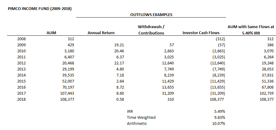
The PIMCO Income Fund is a good example of this flaw in the investor gap calculation given it has been one of the top performing bond funds over the past decade, outperforming its aggregate bond index every single year from 2009-2018. This means an investor that allocated to the fund relative to an allocation to its core aggregate bond benchmark would have benefited if they made an allocation 1) in any year in this period, while holding for 2) any time frame in this period. Flows to this fund also happened to be positive EVERY single year from 2009-2018.

Yet this strong relative performance and timing translated to a HUGE negative investor gap given the absolute performance from 2009-2013 for the fund was larger than 2014-2018 (the latter period was overweight in the IRR calculation given the strong flows). Thus, despite the fund outperforming for EVERY single investor in dollar terms relative to its index, the investor gap was more than -4% / year. The table below uses the fund's real starting AUM and annual flows and gets to an investor gap result that is pretty close to reality.
10-Year Period Ending 2018: Did Investor Behavior Really Improve?
Given the investor gap calculation had been weighed down by the return during the global financial crisis since Morningstar started putting together their Mind the Gap analysis in 2014, I have been anticipating the results for the period ending December 2018 given 2008 would roll off of the 10 year calculation. The table below shows that outflows for this period would now actually help the IRR calculation relative to time weighted returns given the lower return of US equities in more recent years in this more current 10 year window.

And here is an updated high level table outlining the expected impact.

Given these expected results would seemingly invert many of the takeaways from the previous Morningstar reports (low fee, indexing, etc... investors had smaller investor gaps for a number of potential behavior reasons), I was interested to see how an investor gap that flipped for US equities would be evaluated.
But a change in methodology of the calculation kicked that can a few years down the road given the analysis no longer looks at ten-year periods, but instead looks at the ten-year periods ending the previous 5 years. This effectively weights the studies ending 2014, 2015, 2016, and 2017 (i.e. periods positively impacted by flows) at 80% and the new period ending 2018 (that now favors outflows) at 20%.
Jeff Ptak (a great follow on Twitter not only for his investment takes, but also his music takes... and co-host of The Long View podcast) has been especially generous with his time responding to my questions over the years, as well as the change in methodology. He was gracious enough to share what the results would have been under the old methodology for the period ending 2018.
The following chart shows the investor gap by fee quintile for each of the 10 years ending 2014-2018 (the periods averaged for the new official investor gap measure) for US equities. Here we can clearly see the narrowing of the gap for all quintiles as the global financial crisis has rolled off 2018 figures, as well as the sharp reversal in terms of which investors have performed better on a dollar weighted basis by fee quintile (higher fee funds actually exhibited a positive investor gap as the analysis outlined above had expected).

The question becomes... which time frames are right? Or (in my opinion), are any of the time frames right?
My take is 1) investors clearly haven’t suddenly (year over year) gone from bad behavior to good behavior, 2) if the investor gap can be positively correlated to poor behavior at certain times and negatively correlated to poor behavior at other times, then it should probably not be viewed as something besides noise, and 3) perhaps investor behavior has improved over time and we just haven't properly measured it (investors moving from high fee to low fee, shifting towards target dates funds / robos, rebalancing as stocks have moved higher, etc... all qualitatively point the right direction).
IF we have been overstating the poor behavior of investors and/or missed their improvement, this seemingly has material implications to the scale of the value proposition advisors often use to justify exorbitant advisory fees (i.e. the need for investors to have their hands held by advisors on a continuous basis). In addition, if certain investment factors have historically relied on poor investor behavior (in the aggregate) to outperform, perhaps improved investment behavior has contributed to what has been one of the more challenging time frames for these factors in history.


