Tuesday, May 12, 2015

The Case Against High Yield

Following up on my post The Relationship Between Stocks and Bonds, which outlined why it is probable that stocks will outperform Treasury Bonds over the next 10 years, let's take a look at another expensive area of the bond universe... high yield U.S. corporate bonds.


High yield bonds: Where's the high yield?

As the right-hand chart below highlights, the 5.95% yield to worst of the Barclays U.S. High Yield Index (as of 4/30/15) is near its all-time low. Due to defaults, this yield should be thought of as the best case return that can be expected over a 5-10 year period, rather than the likely forward return.

Why? Over ten year periods since 1986 (the furthest back I could gather yield to worst data):
  • The forward ten-year return of the Barclays U.S. High Yield Index has under-performed its yield 93% of the time
  • The forward ten-year return of the Barclays U.S. High Yield Index has under-performed its yield by an average of 3.5% / year (with a 3.5% standard deviation) 

While there are certainly no guarantees, given the 5.95% yield, history "implies" a ten year forward annualized return of 2.5% with a one-standard deviation range of -1% to 6%.


High yield vs. stocks: The story gets worse

While U.S. stocks appear expensive by most measures, they have nothing on high yield. Using the same format as above, the below compares the excess yield of high yield relative to stocks vs. the excess return of high yield relative to stocks.

The first thing you may notice in the right-hand chart below is that high yield's excess yield vs. stocks is only slightly above 2%, well shy of the 7% average from 1987 through 2005 and not even in the same ball park as the 15% level reached during the early 1990's and financial crisis. Note... the below uses the CAPE yield (more details here); using the S&P 500's current earnings yield gets you to a sub 1% figure, slightly above the negative level that occurred in 2013.

Relative performance results look even worse than high yield in isolation:
  • High yield's forward ten-year relative performance vs. stocks has under-performed its excess yield 100% of the time
  • High yield's forward ten-year relative performance vs. stocks has under-performed its excess yield by an average of 8.3% / year, with a 5.2% standard deviation 


Given the current 2.2% excess yield of high yield bonds vs. stocks (as of 4/30/15), history "implies" a -6% ten-year annualized underperformance vs. stocks with a one-standard deviation range of annualized underperformance of -11% to -1%.


"History doesn't repeat itself, but it does rhyme" - Mark Twain

Looking back at the performance of high yield corporate bonds since the crisis, we see remarkably strong performance among the lowest credit quality segments of the market. It wasn't long ago that we found ourselves in a similar situation of lower quality outperformance; the chart below highlights the almost five year run from late 2002 through mid-2007 that looks awfully similar to the returns we've experienced since the end of 2008. In between these two time frames was a massive flight to quality / junk sell-off that took place during the financial crisis, which created the opportunity for the most recent period of junk outperformance (and NOBODY wanted to allocate to high yield in early 2009).


There are times when high yield bonds present an attractive opportunity in absolute or relative terms. Today does not appear to be one of them.

Thursday, May 7, 2015

A Guide to Creating Your Own Hedge Fund

As a follow-up to A Guide to Creating Your Own Smart Beta Fund, let's dive into the high flying paying world of hedge fund management.

 Per Investopedia:
Hedge funds are alternative investments using pooled funds that may use a number of different strategies in order to earn active return, or alpha, for their investors. Hedge funds may be aggressively managed or make use of derivatives and leverage in both domestic and international markets with the goal of generating high returns (either in an absolute sense or over a specified market benchmark). Because hedge funds may have low correlations with a traditional portfolio of stocks and bonds, allocating an exposure to hedge funds can be a good diversifier. 
Hedge funds shouldn't be thought of as an asset class, rather (in aggregate) they are simply go anywhere investment vehicles that attempt to provide absolute returns with low correlation to traditional asset classes. As an investment vehicle, they just happen to charge an absurdly high fee (a 2% management fee + 20% of excess returns above some threshold is generally accepted as a reasonable starting point).

As an aside, there is a case for managers that can produce consistent, excess returns (i.e. high Sharpe ratios) that are uncorrelated to traditional asset classes to be paid at least 2% / 20%, but there are far and few managers that come close to producing these type of returns legally. For those managers that can, access is limited to the brightest and/or best connected capital allocators. In other words, if you are a retail investor or financial advisor with assets less than $10 billion without a Rolodex that needs its own warehouse... don't bother. 

What is an investor to do? I'll show you.

In this case I'll create a "solution" using funds from the world of liquid alternatives. Actually... I'll go one step further and use the two worst performing funds from Morningstar's multialternative category for the ten years ending 3/31/15.


Turning Lemons into Lemonade

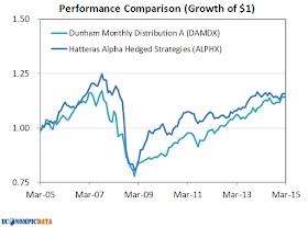
I won't pick on the Dunham Distribution Fund or Hatteras Alpha Hedged Strategies Fund too much... I'll simply show the objectives and present the ten-year equity curve for each fund before outlining how we'll use these funds to create an improved risk-adjusted, uncorrelated, return stream.

Fund Objectives:
  • Dunham Monthly Distribution: Seeks to provide positive returns in rising and falling market environments.
  • Hatteras Alpha Hedged Strategies: Seeks to achieve consistent returns with low correlation to traditional financial market indices while maintaining a high correlation to the Hedge Fund Research, Inc.(“HFRI”) Fund of Funds Composite Index.

Performance Results (3/31/2005-3/31/2015)


Okay, I need to pick on them a bit more as expenses for both funds were higher than their ten year annualized returns by a significant margin, meaning the investment manager received more money than any buy and hold investor (and this ignores the 5.75% front-end load on the Dunham fund). In addition to producing a negative Sharpe over this time frame with returns that had a very high correlation to equities (go here for details outlining the importance of a high Sharpe ratio and/or low correlation within a broader asset allocation), they have experienced material drawdowns. Despite these returns, the Dunham Fund has grown their asset base to almost $300 million (from less than $100 million in 2010), while the Hatteras fund is slightly above $500 million in assets. If you're one of those investors... would love to know why.


Momentum... Momentum... Momentum... Momentum...

As outlined in my post The Case for Hussman Strategic Growth, a dual momentum approach as introduced in Gary Antonacci's white paper Risk Premia Harvesting Through Dual Momentum (follow Gary at Optimal Momentum), provides the possibility of capturing the absolute performance of an asset (or fund), while avoiding extended periods of underperformance. In this instance, I allocated to either the Dunham Distribution Fund, Hatteras Alpha Hedged Strategies Fund, or short-term bond (ETF IEI) based on whichever was the most above it's 9-month moving average. The resulting time series is then compared with the Barclay Hedge Fund Index, which shows 'the average return of all hedge funds (excepting Funds of Funds) in the Barclay database'.


The result... a dual momentum approach to the two worst performing funds in the multialternative universe has provided all of the absolute return of the average hedge fund, with lower standard deviation, and materially lower drawdown / correlation / beta, all with better liquidity.

What's next? Applying the same framework on a segment of the market that is likely to lead to similar levels of correlation, but with materially higher levels of performance.

Monday, May 4, 2015

No... Investors Haven't Underperformed Every Asset Class

The following chart has been floating around for more than a year, supposedly showing investors have not only performed poorly, but even worse than almost any asset class. As Richard Bernstein stated:
The average investor underperformed nearly every asset class. They could have improved performance by simply buying and holding any asset class other than Asian emerging market or Japanese equities.

Let's start with my conclusion. This chart is highly misleading in that it compares apples (geometric time-weighted returns of assets classes) to an orange (dollar weighted returns of the average investor) since 1993, resulting in asset class performance that is materially higher than any investor buying into the market would have received.

This post walks through the error and shows how to get to returns that are a more appropriate comparison. The conclusion is that the discrepancy between the geometric time-weighted asset class returns and investor dollar-weighted returns has not been driven by poor investor behavior, but rather by the path of asset class returns. A huge and important distinction.


Starting Point: What are Geometric Returns?

The blue bars shown in the Richard Bernstein chart are geometric weighted returns (i.e. time weighted returns), which unlike average returns take into account the effects of compounding (a good thing), but do not account for dollar flows.

A quick example....

Let's assume an investor returns 100% in year 1 and is down 50% in year 2. While the average return is 25% / year = (100% - 50%) / 2 = 25%, geometric returns were 0% (as follows):
  • Year 1: the $1 turns into $2 (100% return)
  • Year 2: the $2 turns into $1 (50% loss)
  • The $1 invested at time 0 = $1 at time 2 = 0% geometric return
As Investopedia points out
Investment returns are not independent of each other, so they require a geometric average to represent their mean.
As an aside... beware any manager only showing average returns. At a minimum they are reporting returns too high (average returns are always > geometric returns).


THE ISSUE: Geometric Returns vs. Dollar Weighted Return: Comparing Apples to an Orange

Now to the major issue with Richard Bernstein's chart... it contains two different types of return calculations; (1) time weighted geometric average returns for the various asset classes and (2) dollar weighted for investor returns (these two should NEVER be compared).

dailyVest explains dollar-weighted returns (bold and bullet format mine):
In contrast with a time-weighted approach, the dollar-weighted rate of return calculation method does measure the size and timing of cash flows, as well as the investment performance. Thus,
  1. Periods in which more monies are invested contribute more heavily to the overall return – hence the term “dollar-weighted” 
  2. In this case, investors are rewarded more for larger investments made during periods of greater price appreciation 
To reiterate... dollar weighted returns put more emphasis on recent performance than time weighted returns when market flows are positive. For example, going back to the investor with a 100% return in year 1 and a -50% return in year 2, but this time showing dollar-weighted returns for an investor that dollar cost averages $1 each year:
  • Year 1: the $1 turns into $2 (100% return); the investor then adds another $1 to their $2 investment, so they have $3 total investments heading into year 2
  • Year 2: the $3 turns into $1.50 (50% loss)
  • The $2 total investment is now worth only $1.50 
A -13.3% annualized dollar-weighted loss, despite the same 0% geometric return.


The Path of Returns Over the 20-year Period Mattered

Returns were MUCH higher at the beginning of the 20-year period ending 12/31/2013 than the end due to (1) the 1990's equity bubble and (2) two material drawdowns that took place between 2000 and 2009. The chart below shows annualized geometric returns of the S&P 500 at various points in time using 12/31/1993 as the starting point for all those periods. For example, as of 1998, the annualized geometric returns of the S&P 500 from 12/31/1993 through 1998 was almost 25% annualized. By comparison, by the end of 2013 the S&P 500 returned ~9% annualized from 12/31/1993 - 12/31/2013 (as shown in Richard Bernstein's chart and below).


Dollar-Weighted Returns Have Been Similar to Investor Returns

Since dollar weighted returns put more emphasis on recent performance, we would EXPECT dollar-weighted returns to be lower. For the 20-year period ending 12/31/2013, the S&P 500's geometric returns were 9% annualized, while dollar weighted returns (assuming the same amount investment each month from 1993-2013) were a full 4% lower. Again, this 4% discrepancy assumes completely unemotional dollar cost averaging and is another 1% lower if you assume the contribution rate grew by the rate of inflation over that time frame. Performance dispersion for asset classes where recent performance has been relatively worse (think developed international and emerging markets), was further amplified by the time-weighted / dollar-weighted comparison.


This does work both ways; the chart above was recreated below using data from June 2007 through April 2015, a period when equity returns were much HIGHER in the more recent portion of that time frame.


As a result, dollar-weighted equity returns have actually been higher than geometric returns and my guess is that investor performance would appear "much improved" vs the original Richard Bernstein piece. This, despite what has likely been a period highlighted by poor investment behavior through and since the crisis.