Friday, April 29, 2016

Know What You Own: Alternative Funds Edition (Streamlined)

For the full wonky version of the below, please go here.

Below are the objectives / investment strategies of two different “alternative” funds pulled from the prospectus and/or annual report for each, along with high level details of how they were actually positioned as of their most recent semi-annual reports on 12/31/15. In this post I'll leave historical performance out of it (one has been horrific, one has been solid - which makes sense when you realize they are opposing strategies), as this post is meant to highlight the importance of looking under the hood, only allocating to strategies that you understand, and ensuring that the manager follows what has been outlined in their prospectus. This is especially important when it comes to alternative funds with less defined limitations (though in the case of Fund A... they seem to simply ignore these limitations).


DESCRIPTIONS OF WHAT THESE FUNDS SAY THEY DO

Fund A: 
  • The Fund seeks to achieve long-term capital appreciation, with added emphasis on the protection of capital during unfavorable market conditions (page 1).  
  • The total notional value of the Fund’s hedge positions is not expected to exceed the value of stocks owned by the Fund (page 3).
Fund B: 
  • "Always hedged, all the time, using put options" (source)
  • "With no reliance on market timing or stock selection" (source)
To summarize, Fund A states it it can not have negative market exposure, while Fund B is described as always being hedged to the market (i.e. implies a 0% market exposure).


WHAT THEY REALLY DO

The chart below is my attempt to simplify the payoff structure of each Fund inclusive of all the options they have bought or written (go here for a full breakdown of the fund positions). Fund A sold deep-in-the-money calls that effectively neutralized the stocks held, leaving only the puts (meaning it is short the market). Fund B is a bit more complex, but is long the market on the way up (though less than 100%) and exposed to the market (though less than 100%) on the way down (with a relatively neutral position when the market is down ~5-10%).


THE ISSUE
  • Fund A states it can not have market exposure of less than 0%, yet was materially short the market 
  • Fund B implies it is has 0% market exposure, yet was materially long the market
So the two funds basically have:
  • The exact opposite stated investment strategies as one another
  • The exact opposite positioning as one another
  • The exact opposite positioning as their own stated investment strategy
And we wonder why there is investor confusion / disappointment?


As an aside... I find Fund B's strategy interesting.

Know What You Own: Alternative Funds Edition

Warning... I got way too wonky in this post. If you want a streamlined version of the below, go here.

Below are the objectives / investment strategies of two different “alternative” funds pulled from the prospectus and/or annual report of each, along with detailed analysis of how they were actually positioned as of their most recent semi-annual reports on 12/31/15. In this post I'll leave their actual performance out of it (one has been horrific, one has been solid - which makes sense when you realize they are opposing strategies), as this post is meant to highlight the importance of looking under the hood, only allocating to strategies that you understand, and ensuring that the manager follows what has been outlined in their prospectus, This is especially important when it comes to alternative funds with less defined limitations (though in the case of Fund A... they seem to simply ignore these limitations).


DESCRIPTIONS OF WHAT THESE FUNDS SAY THEY DO

Fund A: 
Objective: The Fund seeks to achieve long-term capital appreciation, with added emphasis on the protection of capital during unfavorable market conditions. It pursues this objective by investing primarily in common stocks, and uses hedging strategies to vary the exposure of the Fund to general market fluctuations (page 1).  
Investment strategy: The investment manager expects to intentionally “leverage” or increase the stock market exposure of the Fund in environments where the expected returns from market risk is believed to be high, and may reduce or “hedge” the exposure of the Fund to market fluctuations in environments where the expected return from market risk is believed to be unfavorable (page 3). 
To make it abundantly clear how this fund defines leverage and hedging, the prospectus states.
Leverage: "The maximum exposure of the Fund to stocks, either directly through purchases of stock or indirectly through option positions is not expected to exceed 150% of its net assets" (page 3). 
Hedging: "The total notional value of the Fund’s hedge positions is not expected to exceed the value of stocks owned by the Fund, so that the most defensive position expected by the Fund will be a “fully hedged” position in which the notional values of long and short exposures are of equal size" (page 3).

Fund B: 
Objective: The Fund seeks income and growth of capital (page 1).  
Investment strategy: "The Fund's core strategy has been and will always be to purchase an underlying hedge at 100% of the notional value of the underlying through corresponding LEAPS put options and proportionally write shorter-term options against the long underlying equity ETFs and LEAPS puts. Premiums received from writing options represent income-type positions that are designed to take advantage of time decay and help pay for the cost of the hedge"(page 2). 
Elsewhere, Fund B is described as:
  • "Always hedged, all the time, using put options" (source)
  • "With no reliance on market timing or stock selection" (source)

To summarize... fund A states the fund can have exposure ranging from 0% to 150% (i.e. cannot go short), while Fund B is described as always being hedged the the market (i.e. implies a 0% market exposure) and uses the time decay (i.e. they are long theta) to pay for the hedge.


WHAT THEY REALLY DO

While I hoped to stay out of the weeds with regards to option pricing, the tables below break down the fund exposures inclusive of the options bought or written as of 12/31/15. While funds often mark options at market value (i.e. how much you can buy or sell them at that day's close), economic exposure is what matters to an investor (i.e. if the market moves up or down, what is the impact to the portfolio). As an example, stock futures are marked-to-market every day, meaning they have a market value of ~$0 at the end of the day. Yet I think we can all agree that a fund with 3x notional exposure to stocks (i.e. triple levered ETFs) have 300% exposure to the stock market, not 0%.

To calculate the real exposure, you first need to calculate the notional exposure of the options and delta adjust them to account for how in or out of the money the options are (delta is the degree to which an option is exposed to shifts in the price of the underlying asset). Walking through the table columns from left to right...
  • Contracts: # held or written as of 12/31/15
  • Expiry: when the option contracts expire
  • Index Value: the value as of 12/31/15
  • Strike: the level at which the stock is in- or out-of-the money; puts are in-the-money when they are below the strike, calls when they are above
  • Notional: contracts x 100 (notional value of $100 times the index value per the terms of these option contracts)
  • Delta: the degree to which an option is exposed to shifts in the price of the underlying asset (a deep in the money call option has a delta of 1 meaning it provides the same exposure as the underlying stock market, while a negative sign indicates it is short that exposure which results from buying puts or selling calls); note I assumed an 18% volatility figure to calculate the options for all periods, which is right around where the VIX was as of 12/31/15 as is close enough for this.
  • Delta Adjusted Exposure: this is the economic exposure that investors are actually exposed to

Now let's take a look at what exposure the two funds had as of 12/31/15 (if anyone sees an issue with any of my calculations, please let me know).


Fund A (source)

Delta adjusted option exposure of -$900 million relative to the $600 million market value of the fund's stocks as of 12/31/15 = net -$300 million market exposure (i.e. it was 50% short the market as fund AUM was ~$600 million).


Fund B (source)

Delta adjusted option exposure of around -$500 million relative to the ~$1.27 billion market value of the fund's stocks as of 12/31/15 = net $777 million market exposure (i.e. it was ~60% long the market as fund AUM was ~$1.3 billion).

Long Option Exposure


Short Option Exposure / Net Fund Exposure


The chart below is my attempt to simplify the payoff structure of each, ignoring the time decay of options held (time decay is a huge drag on Fund A and a substantial tailwind for Fund B). Fund A sold deep-in-the-money calls that effectively neutralized the stocks held, leaving only the puts and a net short position. Fund B is a bit more complex, but is long the market on the way up (though less than 100%) and exposed to the market (though less than 100%) on the way down (with a relatively neutral position when the market is down ~5-10%).


SUMMARY

  • Fund A, which states it can have market exposure between 0% to 150%, was materially short the market 
  • Fund B, which implies it is has 0% market exposure, was materially long the market
So the two funds basically have:
  • The exact opposite stated investment strategies as one another
  • The exact opposite positioning as one another
  • The exact opposite positioning as their own stated investment strategy
And we wonder why there is investor confusion / disappointment?


As an aside... I find Fund B's strategy interesting.

Tuesday, April 12, 2016

What You Pay Matters Less than What You're Paying For

Patrick O’Shaughnessy has a great post, The More Unique Your Portfolio, The Greater Its Potential, outlining how active share is what drives the level of potential before fee excess return for an active manager. If you allocate to active managers... go through it twice. As Patrick notes:
If there is a lot of overlap between your portfolio and the market, there is only so much alpha you can earn. This is obvious. Still, when you visualize this potential it sends a powerful message. Active share—the preferred measure of how different a portfolio is from its benchmark—is not a predictor of future performance, but it is a good indicator of any strategy’s potential excess return.
In other words, active share is an important metric as it shows what an investor is actually paying for (especially true now that the cost of beta is essentially zero). So, while an investor still needs to fully understand and believe in an active manager's philosophy, process, and discipline, the cost paid may be less important in isolation. What may be more important is the cost paid relative to what you are paying for.


You don't always get what you pay for

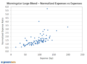
Using Morningstar Large Blend category data (the most plain vanilla of the plain vanilla), the below charts look at the relationship between fund expenses and active share for funds with active share > 20 to see what an investor is actually paying for. I narrowed the universe down further to funds benchmarked against the S&P 500 and then I did my best to strip out funds with style tilts (i.e. there were some growth, value, and dividend funds that fell in the category). One issue that remains is the below is screened by oldest share class to exclude duplicates, so there is some apples to oranges comparisons going on in terms of share class (though almost all of the funds are A share).

The first chart highlights the weak relationship between expenses charged and active share provided. An extreme example that was stripped out of the analysis that I came across was an S&P 500 index fund charging 1.60% with a 4.75% load.


The second chart compares the expense ratio against expenses normalized for active share (i.e. expenses charged divided by active share). Given the weak relationship between expenses and active share from the first chart, it should be no surprise that higher expenses generally mean higher normalized expenses too. This is a reason why funds with higher fees are less likely to outperform than funds with lower fees... investors are generally not getting a higher active share product for those higher costs.


Things get more interesting when you compare normalized expenses against active share. Here you can clearly see that the normalized expense ratio generally moves lower as active share increases. In fact, some of the cheapest normalized funds are those that have a much higher active share and may charge a slight premium.


Taking advantage of the "fungibility" of funds

While active share is a good indicator of a strategy's potential excess return gross of fees, an investor may not want to take as much relative risk or pay the fees embedded in the highest active share products. The good news is an investor can create a lower cost / lower active share solution through an allocation to higher active share managers and index funds... even if the cost may initially appear slightly higher in absolute terms.

For example... assuming an investor believes the capabilities of manager A and B are identical and has a 20% active share target. Yet:
  • Manager A costs 50 bps for 20% active share = 50/20 = 2.5 bp normalized expense ratio
  • Manager B costs 100 bps for 50% active share = 100/50 = 2.0 bp normalized expense ratio
While manger A is cheaper in terms of the absolute expense charged, manager B is clearly cheaper it terms of the expense per unit of active share. As a result, an investor can allocate 40% to manager B and 60% to a ~0 bps passive ETF, The result is the same 20% active share (40% allocation x 50% active share = 20% active share) at a lower cost (100 bps x 40% + 0 bps x 60% = 40 bps vs. the 50 bps for manager A).


Takeaway

When choosing an active manager, confidence in the team, the process, and the discipline the team has in following that process through various market cycles continues to be of obvious importance. As important is not the cost you pay in absolute terms, but rather what you pay for each unit of the skill they are selling.

Thursday, April 7, 2016

Active Management is Far From Dead

Eric Balchunas has an article on Bloomberg titled The Financial Industry Is Having Its Napster Moment asking "Has the music stopped for the financial industry?", sharing the following chart of flows since 2007.


He forecasts ~$1 trillion in outflows from higher fee active management every 4 to 5 years from here, which he believes will cause a material decline in revenue for investment management firms.
In other words, about $2.5 trillion in assets could migrate out of active mutual funds over the next decade. That money will shift from producing $18 billion in revenue to producing just $5 billion. That’s $13 billion less in revenue in the next decade and upward of $30 billion over the next 20 years. All this could be expedited by the new fiduciary standard—as well as a parallel trend that sees institutional funds moving toward passively managed investments, too.
As I'll outline below, while this is true in a vacuum... it misses an important aspect of what really drives asset growth (hint... for established players, it's not flows).


Flows Do Not Equal Asset Growth = The Industry is Still Thriving

Given this level of flows to passive from active, you would likely guess that the level of AUM for passive solutions would have grown by a much greater amount than active mutual funds, especially following the failure of active managers to protect investors during the financial crisis... right?

Wrong.

Given the huge AUM "advantage" of the much more mature mutual fund business, market appreciation has allowed domestic equity active managers to grow AUM by exactly the same amount within the domestic equity category, almost $1.8 trillion each since March 2009 market lows (data from Morningstar).


And while the Bloomberg article focused on domestic equities, let's take a look at the whole mutual fund / ETF complex..


That's a HUGE jump in AUM (and revenues) for investment management firms and given the huge operating leverage these managers employ (i.e. scale is huge for the bottom line) they are printing money.

So... unlike the music industry that has seen revenues slump as the preference for a high fee record slice has shifted to low fee digital, all while the overall music pie remains small (or has gotten smaller), the preference for a passive slice of the investment pie has occurred while that pizza has grown from a small to a large one.


If you believe capitalism isn't dead (I don't), then overall AUM in domestic equities (and especially across all global assets) will continue to expand... likely faster pace than active will be replaced.

Long live active management!