Tuesday, June 23, 2015

Fad Investments (the Case of Good Harbor)

Investment News outlines an arbitration request by an investor seeking damages for being placed in two funds; one to F-Squared (an outright fraud) and another to Good Harbor's U.S. Tactical Core Fund (GHUIX).
The adviser placed approximately $900,000 of the investor's savings, which his lawyer said was the vast majority, in products managed by two so-called ETF strategists. More than half went into an F-Squared's AlphaSector Allocator Select, and the remainder went into Good Harbor Financial's U.S. Tactical Core product.
A quick look at the insanely good returns of the black box Good Harbor strategy prior to their fund launch (this was for Good Harbor's non-wrap and wrap accounts).


BACKGROUND
At roughly that time, a salesman at my former firm would rave about the returns of the strategy / drool at the commissions their quickly expanding distribution team was capturing (see fund flows below). I remember him sharing that flows were in the billion plus per quarter range (I can't verify that figure, but given the fund is only a fraction of firm's AUM that seems plausible).


To no surprise of anyone that knows me, I tried to figure out what they were actually doing, using the following Good Harbor objectives as my starting point.
  • Long-only stock exposure with reduced beta
  • Seeks to outperform the Standard & Poor's 500 Total Return Index by allocating investments tactically across various asset classes
  • Designed to align with US stocks during sustained bull markets
  • Designed to move defensively to US Treasuries during sustained bear markets
  • Use of leverage

Through a bit of trial and error, I backed into results that looked awfully similar using the following simplistic rules:
  • 3 and 6 month rolling returns (i.e. 2 paths)
  • If S&P 500 > Long Treasuries, allocate to the S&P 500
  • If S&P 500 < Long Treasuries, allocate to the Long Treasuries
  • 1.2x leverage

I hadn't thought about the above model (or Good Harbor for that measure) in more than 2 years, but when I came across the article I thought it would be interesting to dust off the model and compare the results of Good Harbor's strategy vs. my own (in the below, returns past January 2013 are the institutional fund). 

The results are pretty brutal; either their model's signal(s) were tied to momentum and that relationship broke down or... well, they simply changed how they followed the model (perhaps behavioral issues tied to managing billions vs millions). Either way, returns since January 2013 were 65% for the EconomPic replication model, 55% for the S&P 500, and -3% for the Good Harbor strategy.


As for the investors that piled in billions of dollars, this is seemingly yet another example of performance chasing. In this specific case by an advisor who should have known better than to chase returns with the majority of a client's portfolio (concentration that should not be done irrespective of past performance or future performance expectations). 

What's interesting to me is that performance chasing is especially prevalent for investments that are too good to be true, either with the potential of a new technology (biopharma comes to mind), the superiority of an investment manager (the case of Marketfield comes to mind), or (in this case) in the form of a black box that always beats the market (hedge funds also come to mind). 

In this specific case, you add in the 5.75% load of the A-share and this may be a situation where past performance is not the only issue:
The claim said that Wells Fargo earned about $19,000 in fees for recommending the products, eroding potential capital gains. According to a copy of the claim reviewed by InvestmentNews that created "a conflict in recommending such high commission investments.”
Source: S&P, Barclays

Monday, June 15, 2015

The Case for a Steady Volatility-State Managed Portfolio

The always interesting quant aggregator Quantocracy linked to an interesting post by John Orford (follow John on Twitter at @mmport80) outlining a 'Steady Volatility Strategy' that targets a constant volatility target based on the most recent VIX index as follows:
Stock weight = Target volatility / VIX 
For example, if an investor is targeting a portfolio volatility of 10% and the current VIX is 20, then the investor would weight stocks at x = 10 / 20 = 50% weight.
I've actually been working on something similar (actually... almost exactly the same thing), thus I thought it might be helpful to share some thoughts on why this strategy likely leads to a portfolio with an improved Sharpe ratio over time relative to the S&P 500.


Market Volatility is Sticky

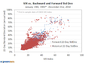
High levels of market volatility tend to lead to continued high levels of market volatility (at least over short periods of time before mean-reversion does its magic). As the chart below highlights, higher levels of the VIX have largely been the result of high market volatility over the previous month, while high levels of VIX tend to lead to higher levels of market volatility over the next month. Putting the old A = B and B = C, so A = C thought process to work, we get to high levels of historical market volatility leading to high levels of future market volatility.


Sharpe Ratios are Higher During Low Volatility Environments

While returns have in fact been a bit higher when volatility is elevated, the relationship has been much weaker than the relationship between historical and forward volatility. As a result, the S&P 500 has had a Sharpe ratio almost 2x higher when the VIX was less than 20 than when it was above 20. As a reminder, Sharpe ratio is excess performance to cash over standard deviation. The lower denominator when volatility is low more than offsets the impact of slightly lower returns on the Sharpe ratio calculation.


Allocating More to Equities when the Sharpe Ratio is Higher = Improved Return Profile

As a result of a higher Sharpe ratio when the VIX is less than 20, an investor could produce higher risk-adjusted returns by allocating more to stocks when the VIX is less than 20 and less when the VIX is above 20. In the example below, stock weights were increased 50% to 150% when the VIX was less than 20 and decreased 50% to 67% when the VIX was above 20 (financed by 3-month t-bills when levered / allocated to 3-month t-bills when unlevered).


While the introduction of leverage brings in a whole assortment of other risks I'll ignore here, the result of the steady volatility allocation over the above time frame is a portfolio with:
  • More consistent year-to-year performance: 12-month standard deviation ranged from 11% to 31% for steady volatility vs. 8% to 45% for the S&P 500
  • Lower drawdown: -47% for steady volatility vs. -55% for the S&P 500
  • Lower overall volatility and higher returns: see above


Source: CBOE, S&P, Federal Reserve

Wednesday, June 10, 2015

The Relationship Between TIPS, Treasuries, and Inflation

TIPS "treasury inflation protected securities" currently provide very little upside (return), but that exact statement can be made about just about any area of the fixed income market. Where they do present a potential opportunity is in relative terms against traditional Treasury bonds. Regardless, this post is less about the opportunity within TIPS and more about the return profile they provide. For a deeper dive into how TIPS function, I recommend this Vanguard piece.


What are TIPS?

TIPS provide an investor with real (i.e. after inflation) returns guaranteed by the U.S. government. You buy TIPS at a real rate, which is lower than traditional Treasuries by a 'break-even' inflation rate determined by the marketplace. For example, in the below post I will assume the nominal rate on a Treasury bond of 2.5% and a break-even inflation rate of 2.0%, resulting in a TIPS real yield of 0.50% (all relatively close to current levels for bonds with a 10 year maturity).


Return Profile of Treasuries vs. TIPS

The below chart is without a doubt an oversimplification, but the most important aspect is that nominal bonds (i.e. Treasuries) provide a nominal return (over a time frame equal to their duration) that is extraordinarily close to their yield to maturity. For this exercise we will ignore the path of returns (i.e. how they got there... which is important), so that we can focus solely on the relationship between inflation and returns (nominal and real).


Treasury Bonds

At the current yield of 2.5% and an 8-year duration, a 10-year maturity Treasury bond WILL provide an investor a nominal return very close to 2.5% over the next 8 years regardless of inflation. As Treasuries do not adjust for inflation, assuming an inflation rate at a constant level over the life of the Treasury bond, the real return of a Treasury bond is simply the nominal rate less the inflation rate. For example, if inflation is 3% and the Treasury bonds only return 2.5%, then real returns are negative -0.5%. On the other hand, if there is deflation, then the real return moves higher. For example, if deflation is -1% and the nominal yield is 2.5%, then the real return is 3.5%.


TIPS

Inflationary Environment
At a real yield of 0.5%, TIPS provide an investor with a real return equal to 0.5% if there is inflation, while the nominal return will increase by the rate of inflation. For example, if the inflation rate is a constant 2%, then TIPS provide the same nominal return as Treasuries (the fact they are the same, means the break-even is 2%). If inflation is above 2%, then TIPS provide a greater nominal return than Treasuries... if less, they provide a smaller nominal return than Treasuries. 

Deflationary Environment
A TIPS investor is guaranteed to receive PAR at maturity, thus is given an embedded "deflation floor" option. As outlined in this Vanguard piece:
TIPS also provide some deflation protection to the principal (but not to the coupon payments). At maturity, if consumer prices have fallen so much that the inflation-adjusted principal would be below par, the Treasury will repay the principal at par value. In this manner, TIPS provide a “deflation floor.”
As a result, while nominal bond real returns move in a linear fashion to changes in inflation rates, TIPS cannot move negative (unless the real yield at purchase was negative) in nominal terms, thus the real return also increases in a deflationary environment (a ~0% nominal return when deflation is 3% = to a 3% real return). 


Conclusion

In normal market environments when inflation is relatively stable, long-term returns tend to be similar for both Treasuries and TIPS. However, TIPS materially outperform in an inflationary environment, while Treasury outperformance is capped by a rate roughly equal to the break-even inflation rate in a deflationary environment. Thus, assuming a view that an inflationary and deflationary scenario are equally likely, the unlimited potential outperformance of TIPS vs. Treasuries in an inflationary environment and limited upside of Treasuries vs. TIPS in a deflation environment would sway an investor towards TIPS.

Wednesday, June 3, 2015

An Improved High Yield Alternative

I really don't like the high yield asset class. Not just in the current environment with near-low historical yields and the potential for material liquidity issues, but in general. As an asset class, I think high yield:
  1. Often caters to unsophisticated investors that only look at the yield
  2. Is riskier than its returns suggest due to an opaque credit market that doesn't as regularly reprice bonds (as they do within equities)
  3. Has unfavorable tax consequences relative to stocks as coupons are taxed at a much higher rate than the capital appreciation of stocks

Historical Performance Comparison to Stocks

One draw of high yield is the view that its performance is from a known yield (vs. the less guaranteed market appreciation of equities). In addition, the Sharpe ratio of the asset class has historically been superior to stocks (i.e. more return per unit of risk). The counter points to that argument is that the Sharpe ratio is overstated as volatility of high yield is under-reported (see point 2 above), as well as the fact that high yield returns are the result of two factors (credit and rates) that can be replicated with an allocation to stocks and bonds (thus a high yield vs. stocks comparison is apples to oranges). Case in point being that a 54% S&P 500 / 46% treasury portfolio since the Barclays High Yield 1983 inception has the same standard deviation and higher returns vs high yield... thus a higher Sharpe ratio. 


Decomposing High Yield Returns

Before getting into details of a high yield alternative, let's decompose historical high yield returns to get a better sense of what an investment in high yield actually provides. 

High yield benefits from the return of two main factors, credit and rates (actually as we'll see it mainly benefits from rates). As the chart outlines below, the credit (spread) component of high yield and the rates component are often well balanced, making high yield a "risk-parity" like allocation between the two factors. As a result, comparing high yield to a blended stock/bond allocation rather than a stand-alone stock or bond allocation makes sense. Or as we'll outline below, there may be an opportunity to replace one of the factors with a more efficient / more liquid component. The below charts break down the returns into these two factors over the past 25 years (as far back as Barclays reports them separately).

Despite a higher contribution to portfolio level risk from the credit (spread) component...

Credit (spread) has provided a materially smaller contribution to the long-term performance of high yield

Swapping in Credit Risk via Equities vs. Bonds

If high yield is a sub-optimal way to access credit risk an investor utilizing leverage can replicate high yield via treasuries for the rate factor and the S&P 500 for the credit / spread factor.

The below chart shows the equity curve of two such options going back to 1983...
  • High Yield Alternative A: scale stocks to provide similar return as high yield: 100% treasuries, 24% S&P 500 financed at 3-month t-bills 
  • High Yield Alternative B: scale stocks to provide similar risk as high yield: 100% treasuries, 46% S&P 500 financed at 3-month t-bills


The Results

Historical results are certainly promising on an absolute and relative basis. Not only were Sharpe ratios improved, drawdowns were materially reduced. In addition, a portfolio consisting of treasuries and the S&P 500 will likely be MUCH more liquid than high yield during periods of turmoil.


Sources: S&P, Barclays, Federal Reserve

Monday, June 1, 2015

Ignore the Margin Debt Alarm

The margin debt alarm has seemingly been sounded every few months when investors realize absolute levels of margin debt have reached new all-time highs (inferring that risk taking has too reached all-time high levels). This brief post highlights why any such alarm (and any future margin debt alarm) should likely be ignored.


Oversimplified Analogy

Absolute levels of debt simply don't matter. As anyone who took an accounting or corporate finance course in high school or college understands, what is relevant are levels of debt relative to asset and equity levels. Taken to the extreme... does someone worth $2000 with $5000 of credit card debt have the same debt problems as someone worth $2 million with $5000 of credit card debt? Of course not. What matters is the level of debt to the assets that debt is supporting.


Relative Margin Debt is the More Appropriate Calculation

Doug Short put together the below chart outlining NYSE debt and S&P 500 equity levels going back 20 years. When viewed in isolation, NYSE Margin Debt levels (red) have risen sharply since 2009 lows. What has also risen sharply since 2009 are equity valuations.


Context matters... while debt levels did rise more quickly than equity valuations from 2001 through 2007, since 2007 margin debt has moved in complete unison with stock valuations; margin debt has consistently stayed between 2.0% and 2.5% of the value of the S&P 500 index. This means margin debt has not increased at all when you account for assets that margin debt is supporting.


Do Absolute or Relative Margin Debt Levels Even Matter?

The only thing an increase / decrease in absolute margin levels tells you is how the stock market has done in the past. As markets rise, margin levels rise. As markets fall, margin levels fall.  This can be seen in the bottom left chart (red), where 46% of the relationship over the past 20 years (the time frame in Doug's chart) has been driven by market movements.

As all the other R-square levels attest, there has been very limited relationship with changes in margin levels and future market movements over the last 20 years and absolutely no relationship between historical or future market movements with the very small changes that have occurred in the relative levels of margin debt to S&P 500 valuations.

Returns vs. Margin Debt (1995-2015)


So next time you hear anything about absolute levels of margin debt... ignore it.

Sources: NYSE Data / Yahoo Finance