Thursday, September 30, 2010

Chicago Manufacturing Index Jumps

Barron's details:

The Institute for Supply Management reported its business barometer for Chicago-area manufacturing, the Chicago PMI, rose to a reading of 60.4 in September, seasonally adjusted, from 56.7 in August, surpassing economists’ expectations for the index to remain roughly flat month to month.

The index reading for new orders rose to 61.4 from 55 in September, while inventories inched up to 49.5 from 46.5. Employment in the Chicago area, however, dipped to 53.4 from a prior 55.5.


September must have been a huge jump as the above is a three month rolling average and included the downturn in August. It will be interesting to see how this plays out in the National ISM figure.

Source: ISM Chicago

Wednesday, September 29, 2010

September to Remember


Fun fact... the last time the Dow jumped this much in a month (assuming the market doesn't crash tomorrow) was September 1939 when it hit 150... a level it fell from almost immediately by 20% (within 9 months) and 35%+ within three years.

Just saying...

Source: Yahoo Finance

Tuesday, September 28, 2010

Down 38K

Stock Traders Almanac calling for Dow 38,820 in 2025 (per the Big Picture)

As markets and economies struggle over the next several years, remember to keep your eye on the future and get ready for the Next Super Boom and the next 500% move in the market. From the last bottom in 1974 it took eight years before the market really took off in 1982 and then another eight to move up the rest of the 500%, in line with Yale Hirsch’s prediction in 1976 for a 500% market move by 1990. A 500% rise in the Dow over 16 years from the intraday low of 6470 on March 6, 2009 would put the Dow at 38,820 in 2025.
That is an 8.8% annualized change (based on yesterday's close) in the index for the next 15 years (excluding dividends).

How does that compare to history? It is very high, but not completely out of question based on history. Since 1890, the 15 year S&P 500 annualized change in the index has been greater than 8.8% 25% of the time, BUT the average is about half of that at 4.8% annualized.


The main driver of long term equity performance is nominal GDP (see here for details). Thus, this would imply either multiple expansion or much higher growth in inflation or real GDP than we have seen in decades.

Source: Irrational Exuberance

Consumers Confident... That They Lack Confidence

Says Lynn Franco, Director of The Conference Board Consumer Research Center:

“September’s pull-back in confidence was due to less favorable business and labor market conditions, coupled with a more pessimistic short-term outlook. Overall, consumers’ confidence in the state of the economy remains quite grim. And, with so few expecting conditions to improve in the near term, the pace of economic growth is not likely to pick up in the coming months.”

Case Shiller: Home Prices Stagnant

FT details:

US house prices slipped in July in a sign that the residential real estate market continues to face challenging headwinds.

Prices in the biggest US cities fell by a seasonally adjusted 0.1 per cent from June to July, according to the S&P/Case-Shiller home price index. That was in line with Wall Street analysts’ predictions and left house prices up 3.2 per cent from the same month a year ago.

The figures show that home price growth on an annual basis is decelerating as the effects of government stimulus measures to support the market fade.


Going forward, expect continued pressure on the index.

Case-Shiller’s index uses a three-month moving average, so the impact of the first-time homebuyer tax credit was still reflected in the data. Without seasonal adjustments, prices ticked up by 0.6 per cent from June to July.
Source: S&P

Monday, September 27, 2010

The Importance of Yield

The equity markets have moved incredibly in sync with the high yield bond market (hat tip Calafia Beach Pundit).


But, that doesn't mean an investment in each has had the same result. The below shows the same ETF's, but now includes dividends received from those ETFs (due to dividends for the S&P 500, coupon payments for high yield).


Source: Yahoo Finance

More on Mean Reversion

Michael Santoli in this week's Streetwise column:

The trailing 10-year return for U.S. equities through the first half of this year has been as poor only six previous times since 1835–and the latest decade was worse than any of those others. The subsequent 10-year annualized total return from those earlier low-water marks was 13.3%, notes Bel Air Investment Advisors. Based on the returns the public is now happily accepting from bonds, most folks would probably be ecstatic with half that.
EconomPic has shown a similar chart as the one below before, which provides details of ten year annualized total return of the S&P 500 on the x-axis and the corresponding ten year forward returns on the y-axis (note that returns are only through 2000 as that is the last year that ten year forward returns are available).


As Michael mentioned, when returns were negative over a ten year period, the ten year forward returns have been very strong. Also interesting (to me) is that no ten year period in which annualized returns were less than 5% had a resulting ten year forward returns that were negative.

Source: Google Docs

Friday, September 24, 2010

EconomPics of the Week (9/24/10)

Economic Data
Growth Recession
The Case Against Austerity
Durable (Not So) Goods
Leading Indicators: Low Borrowing Rates... Languising Jobs Market
End of Recession / No End of Private Sector Delevering

Investing / Asset Classes
Am I Deaf? Gold Up... Inflation Down Edition
Microsoft... Borrowing on the CHEAP
European Manufacturing Rebound Hits Speed Bump
QE2 is Coming
Housing Off Lows... Slightly
Correction: Momentum.... Shmomentum

Random
What Parity?

Your video of the week, some good old Weezer with Don't Let Go...

The Case Against Austerity

For those pushing for austerity in the U.S., lets take a look at one real-life (perhaps more extreme) example of austerity in action... Ireland.


First the initial case for Irish austerity, which seems to match some of the sentiment we are hearing in the U.S. (per The National):

"Ireland is seen as having done better than most others in restoring market credibility," said Eurasia Group analyst Jon Levy. "There are still some worries but the feeling is they have done better than most and with a reasonable degree of internal consensus.

"Ultimately, Ireland's trade unions say they know deficit reduction is vital if Ireland is not to be priced out of international bond markets like Greece, but they want a greater burden to be paid by the rich through higher taxes.

So austerity would be good for bonds? Lets see the other side of the initial argument... Paul Krugman from April:
Let me also say that Ireland’s recent policy moves — raising taxes and cutting spending in the face of a severe recession, so as to reassure nervous lenders — are an extremely disturbing omen. Iceland was one thing; but now another advanced economy, with a 7-digit population, has hit the limits of anti-recession policy.
Lets see how it has turned out. Marketwatch details:

Ireland proved unable to shake off rising sovereign-debt fears Thursday, with bond yields jumping as investors reacted to indications some Anglo Irish Bank bondholders may not get all their money back and official data showed the economy contracted unexpectedly in the second quarter.

The yield premium demanded by investors to hold 10-year Irish government bonds over German bunds topped 4.3 percentage points Thursday, the highest on record and up from around 4.1 percentage points on Wednesday. The cost of insuring Irish government debt against default hit a new record Thursday.

The spread on five-year Irish credit-default swaps was seen at 490 basis points in late morning action, up from around 460 on Wednesday, according to data provider Markit. That means it would cost around $490,000 a year to insure $10 million of Irish debt against default for five years, up from $460,000 Wednesday. The spread hit 500 basis points for the first time earlier in the day, Markit said.


Source: Barclays Capital

Durable (Not So) Goods

I apologize in advance for the title... it's a Friday and I'm in a weird mood. WSJ details:

Demand for U.S. manufactured durable goods tumbled more than expected in August, held back by steep drops in airplanes and cars.

Durable-goods orders declined by 1.3% to a seasonally adjusted $191.17 billion, the Commerce Department said Friday. This is the biggest drop since August 2009.

Economists surveyed by Dow Jones Newswires expected a 1.0% decline. Friday's report was mixed, as there were gains in machinery, computers and fabricated metal products. Also, a barometer of capital spending by businesses rose; orders for nondefense capital goods excluding aircraft increased by 4.1%.

Still, overall transportation equipment orders dropped 10.3% in August -- restrained by a 40.3% decline in orders for nondefense aircraft and parts. Motor vehicles and parts were also down, falling 4.4%.
August was not as bad as the headline figure would indicate... without non-defense aircraft, durable goods were up 0.6% and without all transportation, durable goods were up 2%.

HOWEVER, the overall trend is ugly with the three month change in durable goods new orders down -0.8% and only two categories showing growth (electronics [thanks Apple!] and fabricated metals).


Source: Census

Thursday, September 23, 2010

Am I Deaf? Gold Up... Inflation Down Edition

Mark Gilbert over at Bloomberg in an article titled Investors are 'Deaf to the Screams of Gold, Cotton':

If you told Rip van Bondtrader that gold had risen to a record during his decade-long slumber, he’d want to know what the inflation outlook was, and how badly he’d gotten killed on his bond investments. He’d be astonished to discover that he’s made a total return of about 8 percent since January on Treasuries maturing in more than a year.

“What makes the gold story so interesting is that bullion has so many different correlations -- with inflation, with the dollar, with interest rates, with political uncertainty,” according to David Rosenberg, chief economist at Gluskin Sheff & Associates in Toronto. “This year, for example, gold has shifted from being a commodity toward being a currency -- the classic role as a monetary metal that is no government’s liability.”

Gold may be screaming more about a general mistrust of the securities markets than about the prospect of rising prices. Rip, though, would be similarly horrified to see cotton trading near a 15-year high at more than $1 a pound, or wheat surging more than 30 percent in the past year, helping to drive a UBS/Bloomberg index of food prices up by about 28 percent. The official figures say inflation is dormant; the phrase “lies, damned lies and statistics” springs to mind.


While his points are interesting, I don't see the paradox that he does (i.e. call me deaf).

Why?
  • Tons of liquidity
  • A slow(ing) economy
  • A deleveraging economy
  • Very few remaining places for that liquidity to go
Mark and many others believe this liquidity should have / will lead to an increase in headline inflation. While I think it can (and hopefully will) lead to inflation, it hasn’t for simple reasons. In the actual economy, there has been no excess demand (or liquidity) plowing into goods, services, investments (in fact capacity far outweighs demand) or for hiring (price of labor is a large feed to price levels in the U.S.).

As for the “conundrum” of commodities (including gold) and Treasuries both outperforming, look no further than the above simple reasons... the liquidity in the market has not being used to buy things for actual use / investment. Combined with the fear of putting the money to risk in financial assets (i.e. stocks) and the inability to buy a levered asset (i.e. real estate) and there remains very few places for it to go.


Summary

Money is not going to:
  • The economy
  • Financial assets
  • Levered assets

And is going to:

  • Commodities (including gold)
  • Paying down debt (which reduces supply of debt outstanding – a benefit similar to demand for debt)
  • Fixed income (including Treasuries)
  • Cash
For more, please search for gold or Treasuries in the EconomPic search for details of why I have been bullish on both since the inception of this blog back in early 2008 (also please see Investing in a Low Return Environment for more detail of my thoughts on investing in this market environment more broadly).

I am less bullish on both as they have both done quite well on both an absolute and relative basis, I am in not a bear on either now.

Source: BLS

Leading Indicators: Low Borrowing Rates... Languishing Jobs Market

Marketwatch details:

The U.S. economy is vulnerable to sliding back into a recession, the Conference Board said on Thursday as it reported that its index of leading economic indicators rose 0.3% in August.

The index — a composite gauge of ten indicators including weekly jobless claims, stock prices and the money supply — rose further after registering a 0.1% increase in July. August’s improvement was stronger than the 0.2% increase that economists polled by MarketWatch expected.

Nonetheless, the index has slowed to 2% in the six months to August, down from 4.8% in the preceding six months.

The biggest positive contribution to the New York-based Conference Board’s leading economic index in August came from the interest-rate spread between 10-year Treasury notes and the federal funds rate, while the biggest drag came from the weekly rise in average initial filings for jobless benefits.

That neatly encapsulates the current economic environment, which sports record-low borrowing rates but also a languishing jobs market.


Source: Conference Board

Wednesday, September 22, 2010

Microsoft... Borrowing on the CHEAP

Bloomberg details:

Microsoft Corp., one of four non- financial U.S. companies with AAA ratings, sold $4.75 billion of bonds, including three- and five-year maturities at the lowest coupons on record.

The company’s $1 billion of 0.875 percent notes due in 2013 and $1.75 billion of 1.625 percent debt maturing in 2015 have the lowest interest rates of more than 3,500 securities in the Barclays Capital U.S. Corporate Index of investment-grade company debt.

Microsoft, based in Redmond, Washington, also sold $1 billion each of 10- and 30-year bonds, according to data compiled by Bloomberg. The 4.5 percent, 30-year debt tied for the lowest coupon with an issue last month from Johnson & Johnson.

European Manufacturing Rebound Hits Speed Bump

WSJ details:

New industrial orders in the euro zone posted their sharpest monthly drop for 19 months in July, led by a slump in orders for capital goods, official data showed Wednesday.

Factory orders dropped 2.4% from June—the sharpest decline since December 2008—but were 11.2% higher than in July a year earlier, the European Union's Eurostat statistics agency said. June's figures were also revised down slightly to show orders rose 2.4% month-to-month and 22.7% year-to-year.

The July figures were weaker than expected. Economists had predicted orders would be 1.6% lower from the previous month and 16.3% higher than a year earlier, according to a Dow Jones Newswires survey last week.

The figures appear to support the view that the euro zone's economic recovery is likely to lose some steam in the second half of the year, in part because of government spending cuts designed to reduce the size of countries' budget deficits.
Ignore Denmark below, which had grown 23.9% in June and is volatile due to aerospace purchases.


Over the longer term, we see that although production has rebounded significantly off lows, intermediate and capital goods production is still way below previous peaks.


A slow down combined with the recent surge in the Euro that will impact export price levels means that Europe will be facing some severe headwinds in coming months.

Source: Eurostat

Tuesday, September 21, 2010

What Parity?


Reader Tom Lindmark asked:

Now graph the Won/Lost record so far this season. It kind of looks like money can't buy you not only love but wins in the NFL.
I responded that the season was too young (though the Buc and Chiefs both have two wins in this young season, while the Cowboys and Vikings have none). What I did put together was 2010 payroll vs. 2009 win total, which presents a slightly different perspective... perhaps those teams that won in 2009 were more likely to spend in 2010.


Source: ProFootballTalk

QE2 is Coming

QE as in quantitative easing. The "money" sentence from the FOMC statement:

The Committee will continue to monitor the economic outlook and financial developments and is prepared to provide additional accommodation if needed to support the economic recovery and to return inflation, over time, to levels consistent with its mandate.
Not a surprise that Treasuries (including TIPS) rallied along with gold and the Euro, but interesting that commodities (including oil), REITs, and financials sold off post-announcement. Perhaps a sign that QE is a sign of desperation and desperation isn't good a good sign for global demand.


Source: Yahoo

Housing Off Lows... Slightly

The AP details:

Home construction increased last month and applications for building permits also grew. But the gains were driven mainly by apartment and condominium construction, not the much larger single-family homes sector.

Construction of new homes and apartments rose 10.5 percent in August from a month earlier to a seasonally adjusted annual rate of 598,000, the Commerce Department said Tuesday. That's the highest level since April.

Pulling the figures up was a 32 percent monthly increase in the condominium and apartment market, a small portion of the market. Single-family homes, which represent about 80 percent of the market, grew more than 4 percent.
Below we see that "jump".


And now... a little perspective.
Housing starts are up 25 percent from their bottom in April 2009, but are still down 74 percent from their peak in January 2006.
New Home Starts Over the LONG Term


What's this all mean? Calculated Risk sums it up best:
As I've mentioned many times - this low level of starts is good news for the housing market longer term (there are too many housing units already), but bad news for the economy and employment short term.
Source: Census

Monday, September 20, 2010

Correction: Momentum.... Shmomentum

The beauty of this blog is that my readers are smarter than me.

End of Recession / No End of Private Sector Deleveraging

From NBER:

The Business Cycle Dating Committee of the National Bureau of Economic Research determined that a trough in business activity occurred in the U.S. economy in June 2009. The trough marks the end of the recession that began in December 2007 and the beginning of an expansion. The recession lasted 18 months, which makes it the longest of any recession since World War II.

In determining that a trough occurred in June 2009, the committee did not conclude that economic conditions since that month have been favorable or that the economy has returned to operating at normal capacity. Rather, the committee determined only that the recession ended and a recovery began in that month.

And how were we able to get this non-recovery, recovery? The federal government (from exhibit D.3 of the recent Federal Reserve flow of funds report):


End of recession or not, any sector not labeled government or corporate continues to delever (and local government and corporations are dwarfed by the federal government), which to me says any domestic led recovery from here will be limited.

Source: Federal Reserve

Growth Recession

Bloomberg details:

The possibility of a sub-par expansion poses a dilemma for the central bank’s policy-making Federal Open Market Committee when it meets tomorrow. While the economy isn’t so weak that it’s clearly in need of more monetary stimulus, it may not be strong enough to keep unemployment from increasing.
In other words... we are in a "growth recession":
The late Solomon Fabricant, a professor of economics at New York University, coined the term growth recession to describe an economy that isn’t expanding fast enough to keep unemployment from rising. The minutes of the Fed’s last meeting, on August 10, suggested the central-bank staff didn’t see that happening next year.
The chart below shows this "growth recession". Specifically, it shows how many years of employment growth have been given up, defined as the number of years since the level of employment first hit the current level (i.e. August household employment was 139.25 million people; the first time we saw employment above that level was July 2004 or a bit more than 6 years ago).


Thus, even though we have recently been adding jobs, we are not "catching up" and have actually been losing ground the last few months.

Source: BLS

Friday, September 17, 2010

EconomPics of the Week (9/17/10)

There were some major RSS issues this week (posts took 2+ days to post in some cases), so for those last missed it and can provide me with some currency insight, please see: Help Jake Understand: Yen Intervention Edition.

Otherwise, enjoy the weekend!

Investing
The Power of Momentum
VIX Curve Whacked
On the Value of Treasuries
Housing over the LONG Term
China is NOT Selling Treasuries
Mortgage Rates and Housing Prices
Help Jake Understand: Yen Intervention Edition

Economic Data
No Inflation or Disinflation?
Producer Prices Up Due to Energy
Manufacturing Rebound Stalling
Are Retail Sales Overstated?
Retail Sales: Bifurcated Growth
Industrial Production over the LONG Term
Stay in School
Trade Balance Narrows in July
Employment: Is this Time Different?

And your video of the week... the Dirty Heads with Lay Me Down (fun fact, singer Rome Ramirez is the new front man for a reformed Sublime)

No Inflation or Disinflation?

If these higher energy prices roll off... looks like disinflation to me.

Marketwatch details:

The index for U.S. consumer prices rose 0.3% in August for the second straight month, pulled higher by energy prices, the Labor Department reported Friday. The
energy index in August rose 2.3% after a 2.6% gain in July. Meanwhile, food prices rose 0.2%, the largest increase since April. The core rate, which excludes volatile food and energy prices, was flat in August.

Economists surveyed by MarketWatch had expected the overall CPI to rise 0.3%, and for the core to gain 0.1%. Over the past 12 months, overall consumer prices have climbed 1.1% in August, down from 1.2% in July. Core prices have gained 0.9%, the same rate as the last five months. Prices for shelter were unchanged in August after rising 0.1% in each of the prior three months.


Source: BLS

VIX Curve Whacked

Bill Luby (of Vix and More blog) details in Barrons what a steep VIX forward curve implies (also detailed previously on EconomPic):

When it comes to the Chicago Board Options Exchange's Volatility Index (ticker: VIX), however, investors have much more difficulty getting their arms around what an elevated VIX means. With the "cash VIX" (the widely quoted index) hovering around 22, many are struggling with how to interpret the meaning of VIX futures that are calling for a VIX of 32 in 2011.

So what does a VIX of 32 foretell?

In terms of a strict definition, a VIX of 32 means that approximately one-third of the time the Standard & Poor's 500 index (SPX) will have a daily change of at least 2%. To put the 2% figure in perspective, during the last 20 years the SPX has experienced a daily change of 2% a little over 7% of the time. Even during tumultuous markets in 2008, when stocks experienced unprecedented volatility for an extended period of time, daily changes of 2% or more occurred less than 29% of the time.

Seen in this light, the VIX futures are predicting that 2011 will bring volatility that is comparable to what was experienced in 2008, a year of financial calamity.
How does this 32 level compare to historical "actual" levels?

Taking the rolling 12-month standard deviation of daily returns of the S&P 500 (annualized) going back to 1950, we see that a realized 12-month volatility level of 32 has only happened on two occasions:

1) 1987-88, which is the period that includes Black Monday (i.e. a 20% market crash in a single day)
2) The recent financial crisis


While I don't think current economic / financial conditions are rosy, the other side of a mean-reverting trade (i.e. when VIX jumps, it eventually moves down), that is priced 50% higher than current levels (i.e. a VIX of 32 vs the ~21 current level), and has only happened on two occasions since 1950 seems awfully intriguing.

Source: Yahoo Finance

Thursday, September 16, 2010

Housing over the LONG Term

Below is a chart of housing prices in a number of regions over the long term (i.e. 10, 15, and 20 year periods). As can be seen, changes in the price have been widely varied by city and a number actually appear "cheap" relative to the 20 year inflation rate of 2.5%. Interesting (to me) is that while a lot of markets still appear to be extended over 10 and 15 year periods, prices look quite reasonable over a 20 year period.


Source: S&P / BLS

China is NOT Selling Treasuries

Peter Boockvar (via The Big Picture) doesn't read EconomPic:

Within the July TIC data where $61.2b of net US assets were bought by foreigners, above expectations of $47.5b, the Japanese continued to close the gap with China in terms of their holdings of US Treasuries. Japan was the biggest buyer in July, purchasing a net $17.4b and taking their holdings to $821b.

Mainland China (as opposed to Hong Kong where there was net selling in July) bought $3b of Treasuries but only $873mm of it was in notes and bonds with most of it going into short term bills. The net inflow from China follows net selling of a total of $56.5b in the prior two months. Mainland China’s holdings now total $846.7b after peaking at $900.2b in April. Hong Kong’s holdings of US Treasuries peaked in Feb at $152.4b and now total $135.2b.

If he did, he would know that China buys Treasuries through the United Kingdom (and the figures get revised later... see here), thus the picture changes.


Source: Treasury

Producer Prices Up Due to Energy

ABC news reports:

The Labor Department said the seasonally adjusted index for prices paid at the farm and factory gate increased 0.4 percent, the largest increase in five months, after gaining 0.2 percent in July.

Analysts polled by Reuters had expected producer prices to rise 0.3 percent last month. In the 12 months to August, producer prices increased 3.1 percent, slowing from the prior month's 4.2 percent increase.

Producer prices last month were bumped up by a 2.2 percent jump in energy costs. Gasoline prices surged 7.5 percent, the largest increase since January, after falling 2.2 percent in July. Food prices fell 0.3 percent after rising 0.7 percent in July.

Stripping out volatile food and energy costs, core producer prices edged up 0.1 percent last month, matching market expectations. Core PPI increased 0.3 percent in July.

Inflation remains muted amid lackluster domestic demand, which is constraining producers' ability to pass on increases to consumers. The Federal Reserve is expected to renew its pledge to keep monetary policy accommodative to support the economic recovery at a regular meeting next Tuesday.


Source: BLS

Wednesday, September 15, 2010

Help Jake Understand: Yen Intervention Edition

The WSJ details:

The yen plummeted against the dollar Wednesday after Japan intervened in currency markets for the first time in more than six years.

The dollar gained more than 3% against the Japanese currency after having dropped Tuesday to its lowest level in 15 years vs. the yen. Japan's Ministry of Finance said it would intervene again Thursday in currency markets if necessary.

Concerns over the pace of the U.S. recovery have recently sent investors flocking to the perceived safety of the yen, especially as investors speculate whether the Federal Reserve could implement another round of asset purchases to kick-start a moribund economy, which would likely weigh further on the dollar.


First of all... I am many things and a currency expert is not one of them...

With that said... I completely understand why Japan is intervening in the currency markets for economic purposes (a strong yen is hurting exports), BUT isn't the ability to literally print an overvalued piece of paper the ultimate prize?

For years, counter-fitters have printed worthless paper in the hopes of using it to buy things of value, but with Japan they can do this legally! Why not open up the printing presses and use that new currency to buy goods of value from abroad (I'm not talking other currencies, I'm talking REAL assets)?

To me this will result in at least one of the following (though, I'm sure there are 1000 more):
  • A weaker Yen (i.e. the goal)
  • Inflation (i.e. the best thing that could happen to Japan so that monetary policy would actually work)
  • Nothing to the Yen or to inflation, which means you got a bunch of real assets... for free.

What am I missing?

Source: Yahoo Finance

Industrial Production over the LONG Term

Reuters details:

U.S. industrial output rose at a slower pace in August and a measure of New York
state business conditions slipped to the lowest level in more than a year, according to data on Wednesday that suggested the economy was cooling but not stalling.

Industrial production rose 0.2 percent in August, matching economists' forecasts for a sharp slowdown from July when unusually strong auto manufacturing lifted output, Federal Reserve data showed. July's gain was revised down to 0.6 percent from 1 percent.
And the long-term...

Manufacturing Rebound Stalling

The Street details:

The New York Federal Reserve's key manufacturing index that measures activity in the New York region came up short Wednesday morning. The Empire State Manufacturing Survey index dropped 3 points to 4.1 for early September, after rising 2 points for a reading of 7.1 in August. Economists expected the index to decline to a reading of 6.4, according to Briefing.com, though any reading above zero indicates growth.


Source: NY Fed

Tuesday, September 14, 2010

Are Retail Sales Overstated?

Mish doesn't buy the recent retails sales figures (hat tip reader Mike Hardy):

The issue...

I don't buy it. If retail sales were back to within 4.3% of the pre-recession peak, sales tax collections would be back towards the pre-recession peak, if not exceeding the pre-recession peak.

Why might they exceed the peak? Because of numerous state sales tax hikes.
But...
In spite of numerous sales tax hikes, tax collections are still 5.9% lower than two years ago. Moreover, June of 2008 was not the pre-recession peak. November of 2007 was the pre-recession peak.
The conclusion?
Retail sales are down 10% or more from the pre-recession peak, especially if one factors in tax hikes.
Many states look at the Census report trying to figure out why their sales are lagging the national averages. The problem is the Census Bureau national averages are a blatant distortion of reality. The key to the states' conundrum is Census Bureau sampling methodology does not take into consideration stores that have gone out of business. Sales tax collections obviously do. Closed stores make no sales and collect no taxes.
In other words, same store sales are up because the overall number of stores has declined more than the level of overall sales (a smaller pie, but larger slices). The thought is the Census is then extrapolating those higher same stores figures to a base that is no longer there.

My sanity check on his hypothesis is to compare the decline in retail sales relative to business, manufacturer, and wholesale sales (under the assumption that retail stores have closed at a faster pace / are more numerous and harder to track than businesses, manufacturers, and wholesalers).


While there could be alternative reasons (i.e. price levels, type of sale, etc...), it will be worth following this to see if he may be on to something...


UPDATE:

It looks like my "smell test" may have holes. Mish reached out and noted retail sales peaked in November 2007. In looking at the data since that peak, a different trend can be seen:


In a nutshell, it appears retail sales slipped first, then sales of business, manufacturing, and wholesale followed (thinking these sales "react" to the end consumer). More recently, it looks like retail sales have rebounded first and again, have been followed by business, manufacturing, and wholesale.

So what may cause the discrepency between retails sales and tax collections? Back to Mish:

1. Sales Tax holidays
2. Online sales
3. Government purchases

Source: Census

Retail Sales: Bifurcated Growth

Marketwatch details:

Retail sales showed decent growth in August, economic data showed Tuesday, easing fears that the U.S. economy would stall out in coming months.

Retail sales rose 0.4% on the month, the Commerce Department said. It marked the second straight increase and was the largest gain since March.
Good news... BUT, the breakdown is interesting.


The largest jumps were in gas and food purchases (due to a jump in gas prices and food in August), then some solid growth in small purchases (clothing, sporting goods, health care), followed by a a decline in credit related purchases (furniture, autos, and electronics).

One month is likely just noise, but it will be interesting to see if large credit oriented purchases, in a credit tightening environment, are on the decline to pay for smaller purchases.

Source: Census

Monday, September 13, 2010

Stay in School

Interesting analysis from the BLS detailing the average number of weeks worked for all individuals over a 30 year period (1978-2008). As we've seen before, education has a HUGE impact on the percent employed for those very uneducated, but surprisingly not for those finishing high school (I personally expect the high school category to be dragged down in coming years ).


Source: BLS

Sunday, September 12, 2010

The Power of Momentum

9/20 Update:

It looks like the results using Shiller's data are no good as Shiller uses monthly average data for his index (rather than month-end), which apparently morphs the results from positive to negative in this case. Many thanks to Michael from MarketSci blog for the info.

In looking at results using actual month-end data,
it looks like the only way a month-to-month momentum strategy has outperformed is with substantially higher down month triggers (between 5-10% down months).

Initial thoughts... downward momentum trading strategies likely only work in severe down markets. Otherwise, it is rather dangerous to short an asset class over the long term that tends to be noisy (i.e. volatile / mean-reverting) and "should" have a bias to rise over the long term.


Note: Updated figures, which changes the results.


All data used in the below charts created by EconomPic was adapted from historical S&P 500 data (index + dividends) from Irrational Exuberance. I have uploaded the adapted data to Google Docs and all three indices (total return, momentum, and momentum -1.85%) to share and to serve as a check (if there are errors, let me know) for all my readers here.

To the post...


Bank of England’s Andrew Haldane (hat tip Felix Salmon) with some rather jaw dropping analysis showing that a momentum investment strategy consisting simply of buying when the previous month was positive and shorting when negative, significantly outperforms a simple value investing strategy based on the dividend discount model.

The chart below is Andrew's (for more background on the chart, go here):


Felix ponders how the results would look relative to a simple buy and hold strategy:

Still, I would have loved to see a third line, showing the results of a simple buy-and-hold strategy. Sometimes the easiest things to do are also the most profitable of all.
Here it is (going back all the way to 1871)... it turns out that the easiest thing to do (i.e. a buy and hold listed below as 'total return') was NOT the most profitable by a factor of 80 (according to my calculations, a $1 investment in 1871 is worth ~$125,000 in a buy and hold strategy vs. ~$240,000 for the simple momentum strategy described above over that same time frame).


BUT, the reason for the huge discrepancy in return is due almost solely to what happened during the Great Depression, when a buy and hold investor would have lost more than 80% of their investment, while a momentum investor would have tripled their investment over that same period.

To show how huge an impact... if we take the same data starting in 1940 (i.e. post Great Depression), the buy and hold "total return" investor would have actually outperformed by a factor of more than 8 (~$1350 vs ~$150).


BUT.... when one data mines the historical data (always a fun thing to do) and only shorts the market following monthly returns down more than 1.85% (prevents whipsawing I guess), the momentum strategy is a huge winner turning $1 from 1871 into more than $7,000,000 dollars today and significantly outperforming a buy and hold investment both pre and post 1940.


Source: Irrational Exuberance

Thursday, September 9, 2010

Trade Balance Narrows in July

The WSJ details:

The U.S. trade deficit contracted sharply in July, posting its biggest drop in 17 months as exports of airplanes surged and U.S. demand for imports fell across the board.

The U.S. deficit in international trade of goods and services narrowed by 14% to $42.78 billion from a downwardly revised $49.76 billion the month before, the Commerce Department said Thursday. The June trade gap was originally reported as $49.90 billion.

U.S. exports expanded 1.8% to $153.33 billion, the highest level since August 2008, from $150.57 billion in June. Imports registered their biggest decline since February of last year, falling 2.1% to $196.11 billion from $200.33 billion in June.


Source: Census

Wednesday, September 8, 2010

Mortgage Rates and Housing Prices

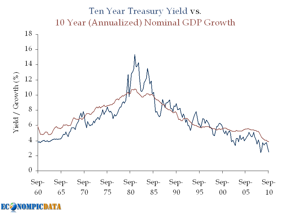
David Leonhardt at NY Times Economix (hat tip Calculated Risk) discusses the relationship between mortgage rates and housing prices:

Anyone who argues that home prices do not seem headed for another big decline will probably hear some version of this question. Interest rates are historically low right now. They will surely rise at some point. All else equal, higher rates should push home prices down.

Yet compare the national median home price to 30-year fixed mortgage rates over the last three decades (with both indexed to 1 in 1971)
And shows the following chart:


And concludes:
It’s not easy to see much of a relationship. The fall in rates appears to have helped the housing boom of the last decade. On the other hand, the spike in rates in the 1980s had little apparent effect on prices.

My best guess for why the two don’t correlate more closely is the role that psychology plays in housing markets. Prices just don’t move as quickly as economic theory suggests they should.

My immediate thought... why are you comparing REAL price levels with NOMINAL rates?

Lets see the relationship of real housing prices (in this case Case Shiller discounted by CPI) vs. real mortgage rates less year over year CPI (note that the right y-axis is flipped to show the inverse relationship between the two).


A much stronger relationship appears when viewed on a real to real basis.

Note that the relationship appears to be non-existent from around 1972 to 1980 (pre-Case Shiller index data), which can be explained in part that government agency mortgages (i.e. subsidized financing rates that made housing affordable on a monthly payment rather than price level basis) jumped from just 10% of the market in 1980 to almost 50% by 2000 (see page 5 of the Fed's paper Securitization and the Efficacy of Monetary Policy for more).

Calculated Risk seems to vehemently disagree with my view that there is in fact a relationship between rates and price:
I've tried to explain this several times in several different ways. Price is what you pay for something. Interest rates are related to how the item is financed. Some people pay cash for a house. Would they pay more because interest rates are low? Nope.
My disagreement to his disagreement can be found in last month's post The Importance of Mortgage Rates, but his argument is in a nutshell the following question:
Would people pay more for a car if interests rates are low?
My simple answer to that question... OF COURSE (and I did for my first car from a sleazy used car dealer).

Why? Because I could not afford to pay cash for the full price of a car at the time, thus I paid with credit, rather than fiat money (we live in a credit, not a fiat economy - see Steve Keen's epic piece that changed my understanding of the economic collapse here for more).

Details of my first car purchase:
  • 1990 Dodge Shadow (yikes)
  • Cost: ~$3200
  • Savings available for a car = ~$0
  • Monthly disposable income available for a car = ~$100 / month
Without financing, I could not afford the car I ended up with. With financing, I was able to afford it across a range of sticker prices, depending on financing rates, all at the same $100 / month payment. And unlike case-by-case deals on auto rates, anyone with decent credit and 20% down (harder to come by these days, but not limited) can access the subsidized mortgage rate.


Which brings me back to my conclusion in my post on rates and housing:
Since the key contributor to housing affordability is not the current list price, but rather the mortgage rate, anyone looking to buy should seriously consider the alternative (i.e. renting) if they don't plan to use that contributing factor (again... the mortgage rate) for the life of the loan (i.e. to keep their house for 15-30 years).

If you do plan to buy a house for a smaller window of time (i.e. 1-10 years) with the idea of flipping it into a larger house, be careful. That per month clearing price may mean a much lower home value when you are trying to sell...

Source: S&P, BLS

Employment: Is this Time Different?

Motoko Rich at the NY Times Economix details:

Starting last winter and into this spring, the hiring of temporary workers surged, giving hope that companies were poised to convert those hires to permanent ones.

Of course we know by now that the economic recovery has hit a rough patch, with private sector hiring only just remaining positive.

Temporary hiring has slowed as well, although it was actually one of the stronger performing categories in the monthly snapshot of labor statistics released by the government last Friday. Temporary help services added 16,800 jobs, out of a total of 67,000 private-sector jobs added on net in August.
As can be seen below, the number of part-time workers as a percent of the total private workforce spiked at the start of the recession, but the level has since stagnated.


Unfortunately, the stagnation has not necessarily been due to a spike in the denominator (i.e. the level of private employment). At least it still appears to me that the bottom has been found.


After such a large fall, it is worrying that there is still so much uncertainty over how long (or if) the recovery will take:
The subdued picture on temporary hiring adds to the uncertainty that is gripping the economy, with everybody trying to guess whether the slowdown in hiring is a prelude to a halt or even a backslide, or merely a pause before a pickup.

“We would have expected nine to 12 months after the turn of the economic cycle, is when you’d start seeing jobs coming back in a more substantial way,” said Jonas Prising, president of the Americas for Manpower Inc., one of the largest temporary hiring firms. “We’re not seeing that. So then the question is, is it just delayed by another six months because of some issues we faced in this recession that are different than most other recessions, or have some things changed structurally? I think the jury is out.”
Source: BLS

Tuesday, September 7, 2010

On the Value of Treasuries

In recent weeks, a number of investors I respect have commented that Treasuries are rich and should be avoided (or even outright shorted). Recent examples include Doug Kass and James Montier, both of whom claim current yields put too much weight on expectations of a double dip. I simply don't agree...

While I am not a Treasury bull, it is my view that at a 2.7% yield Treasury bonds are fairly valued when one takes into account the low growth / low inflation outlook, the Fed's extended easing policy, and the potential for capital appreciation rolling down the steep yield curve. Below we'll take a look at these three points in more detail.

Point #1) Nominal Growth Matters

This point was first shown in the following chart a few weeks ago.


In Doug's post he compares historical real GDP to Treasury yields and notes that bonds should be yielding more (he notes that Treasuries have historically yielded ~360 bps more than real GDP). The problem with this analysis outside of an apples (real GDP) to oranges (nominal Treasury yield) approach, is that a large portion of this "spread" was due to the inflation spike seen in the chart above during the late 1970's / early 1980's; a period marked by high nominal Treasury yields and low real GDP.


Point #2) The Importance of Monetary Easing Policy


A bond investor that does not take duration risk can only earn VERY low rates over the next few years as long as the Fed is on hold. If an investor earns VERY low rates for each of the next two years, they will need to earn a much higher return for the remaining 8 years just to break-even with the Treasury investment. The key is that the market is pricing this in.

Example:

Assuming a "zero" interest policy for two years (by zero, lets assume 0.25%), this means that a 2.7% yield can be achieved as follows:

  • The first 2 years at 0.25%
  • The last 8 years at 3.32%
The formula: (1 + 2.7%)^10 / (1 + .25%)^2 = 1.29878^(1/8) = 3.32%
The chart:


The relevance? The market is not forecasting rates will stay as low as they are now (i.e. forward rates are higher... closer to that 3.32% rate than 2.71%), which means capital losses will not happen simply if rates rise from current levels, but rather rise above levels expected by the market going forward.


Point #3) Don't Forget the Rolldown


The yield curve is VERY steep (i.e. upward sloping). This means that the 10 year bond will not only return its yield over the next 12 months if nothing changes (i.e. if the yield curve is exactly where it is today in 12 months), it will return more.

How much more?

Using current figures, the 10 year Treasury is yielding 2.71% while the 9 year Treasury is yielding 2.54% (17 bps difference). Assuming that nothing changes, performance of a 10 year bond over the next 12 months will be made up of the 2.71% yield plus the capital appreciation from moving from a required yield of 2.71% to 2.54% (i.e. a bond with a 2.71% coupon and a required yield of 2.54% will be worth more than par). This specific 17 bp move would add an additional 1.5% (assuming a duration of 8.75 years on a ten year Treasury) over the next 12 months, which means a 4.2% return for the 10 year note if nothing changes.


Source: Federal Reserve / BEA